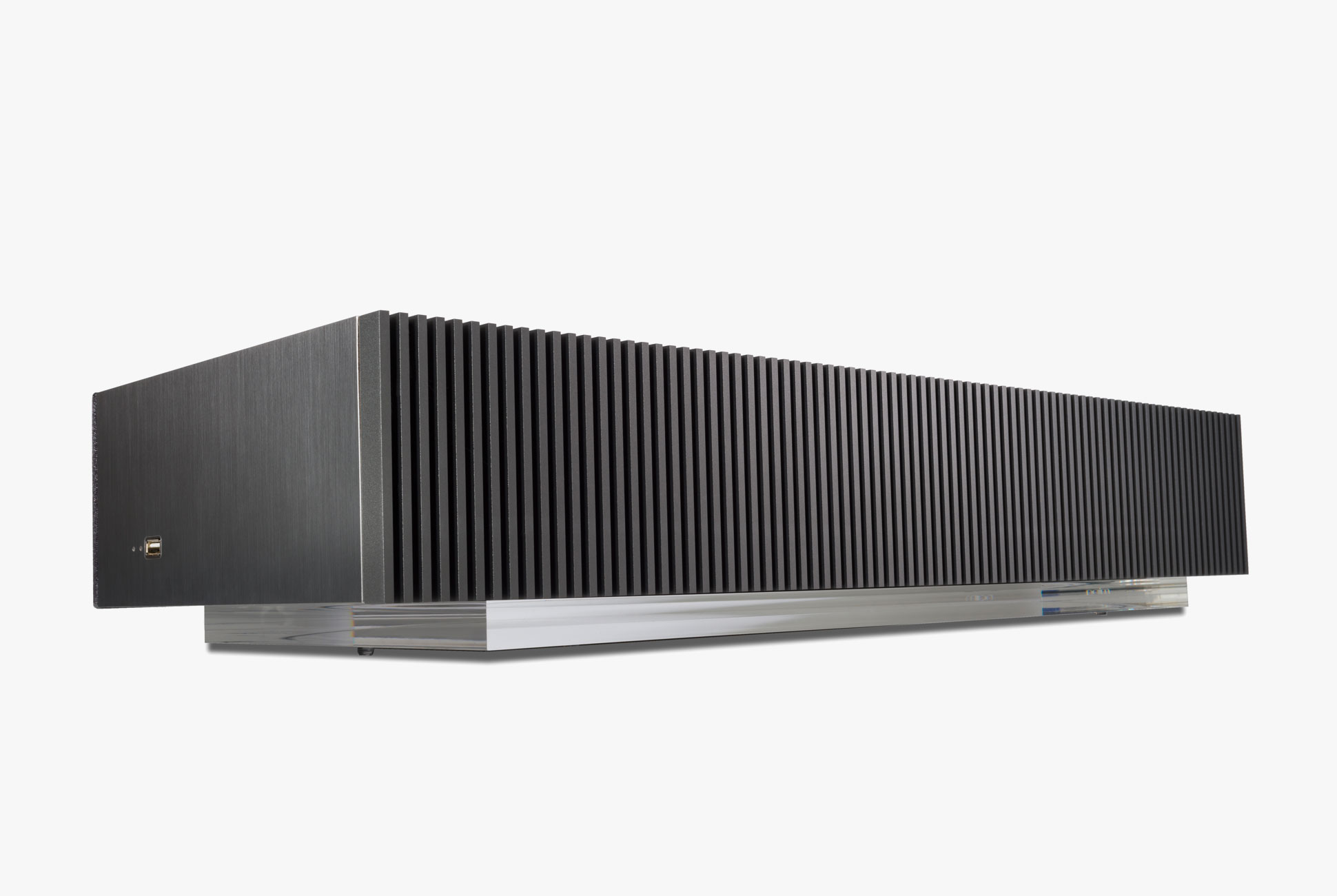
The high-end British audio company Naim Audio makes some of the best audiophile-grade wireless speaker systems you’re likely to find. Its Mu-so range, consisting of the Mu-so and smaller Mu-so Qb, is also notable for the huge glowing volume dial on top of both speakers. If you’re a big fan of volume dials and love some great “knob feel,” then the Mu-so speakers and their associated dial are simply as good as it gets.
Earlier this year, Naim Audio announced the Mu-so 2 ($1,599), which is second-generation version of the original Mu-so ($999) that was released roughly five years ago. Though the two speakers look strikingly similar the Mu-so 2 has been totally gutted and revamped. It has six, new, individually amplified drivers, a new processor with 10 times the power, the ability to stream tracks up to 32bit/384kHz, support for AirPlay 2 and Chromecast, support for Tidal, Spotify Connect, Roon, and Bluetooth, all topped off with HDMI ARC and optical connections so you can use it as a soundbar. And yes, also a new volume dial.
The new dial on the Mu-so 2 has an entire new interphase and more functionalities, including 15 touch sensitive buttons to quickly play favorite playlists or switch inputs. Its famed “halo” light that forms a ring around the dial now has a proximity sensor and automatically lights up when you hover your hand over it. It’s undoubtedly the coolest thing on the whole speaker.
On the Mu-so’s volume dial, the new interphase allows you to save playlists from Spotify or Tidal, or even radio stations. This way you can play music without needing to pull out your smartphone or open your computer.
Simon Matthews, the design director at Naim Audio, is one of the main brains behind all of Naim Audio’s products. I was able to chat with him about the new Mu-so 2, as well as what makes what I consider to be one of the coolest volume dials in all of speakers, so special.
The below interview has been edited for brevity and clarity.
Q: How did you look to improve the volume dial on Mu-so 2?
A: Well, firstly, it’s important to say that we certainly set the bar high with the original Mu-so’s volume dial. Customers have really expressed with enthusiasm that they love our tactile, well-executed volume dial and that it delivers precision and pleasure in equal measure in use. There is a very funny and equally disturbing Youtube review of the volume know of gen 1 Mu-so called ‘knob feel review.’ It’s had 100,000 hits. Watch it at your own discretion, here.
So although we really nailed the principle of an oversized, bearing driven and highly responsive volume dial, with all product user interface elements internally located, for Mu-so 2 we completely redesigned all the elements from the ground up. Firstly, we needed to do this to accommodate all the new features and connectivity that Mu-so 2 offers over the original Mu-so. Secondly, we wanted to get closer to the iconic design language of volume control on our $270,000 Statement amplifier. So now we have an acrylic cylinder, mirrored on the inside, which transmits light magically from deep in the product to create a very distinctive ‘halo’ design language which clearly differentiates the Mu-so 2 from what has come before.

Key specs
Speaker: wireless multiroom stereo speaker system
Drivers: six drivers; six 75-watt Class D amplifiers
Total power: 450 watts
Connectivity: Apple AirPlay 2, Chromecast Built-in, Spotify Connect, Tidal, Roon Ready, Bluetooth, Internet Radio, 3.5mm (headphone jack), optical, HDMI ARC
Price: $1,599
Q: Why did you add the proximity sensor?
A: In terms of proximity, it wasn’t a customer-driven requirement but we could see a lot of benefits to the end user. Now the product can present itself as ‘always ready’ and wakes up magically with the waft of a hand. It just feels like there is now one less obstacle between the user and the music that means so much to them.
Q: Are there any volume dials on other speakers or vintage audio components that inspired the Mu-so?
A: For sure, there is a world of sexy volume dials over the years that have stuck in my mind. Dieter Rams’s work tends to be ‘ground zero’ for me in terms of perfection of placement and form. Every designer in the audio industry owes some debt to his groundbreaking work. Jonathan Ives and the development at Apple of the iPod wheel is also an iconic ‘portal’ into a music collection and deserves a round of applause. Beyond audio, I am always inspired by great science fiction and its representation of an exciting future way of living. If a little of the monolith and HAL 900 from 2001 slipped into my subconscious during the design phase then I won’t complain!
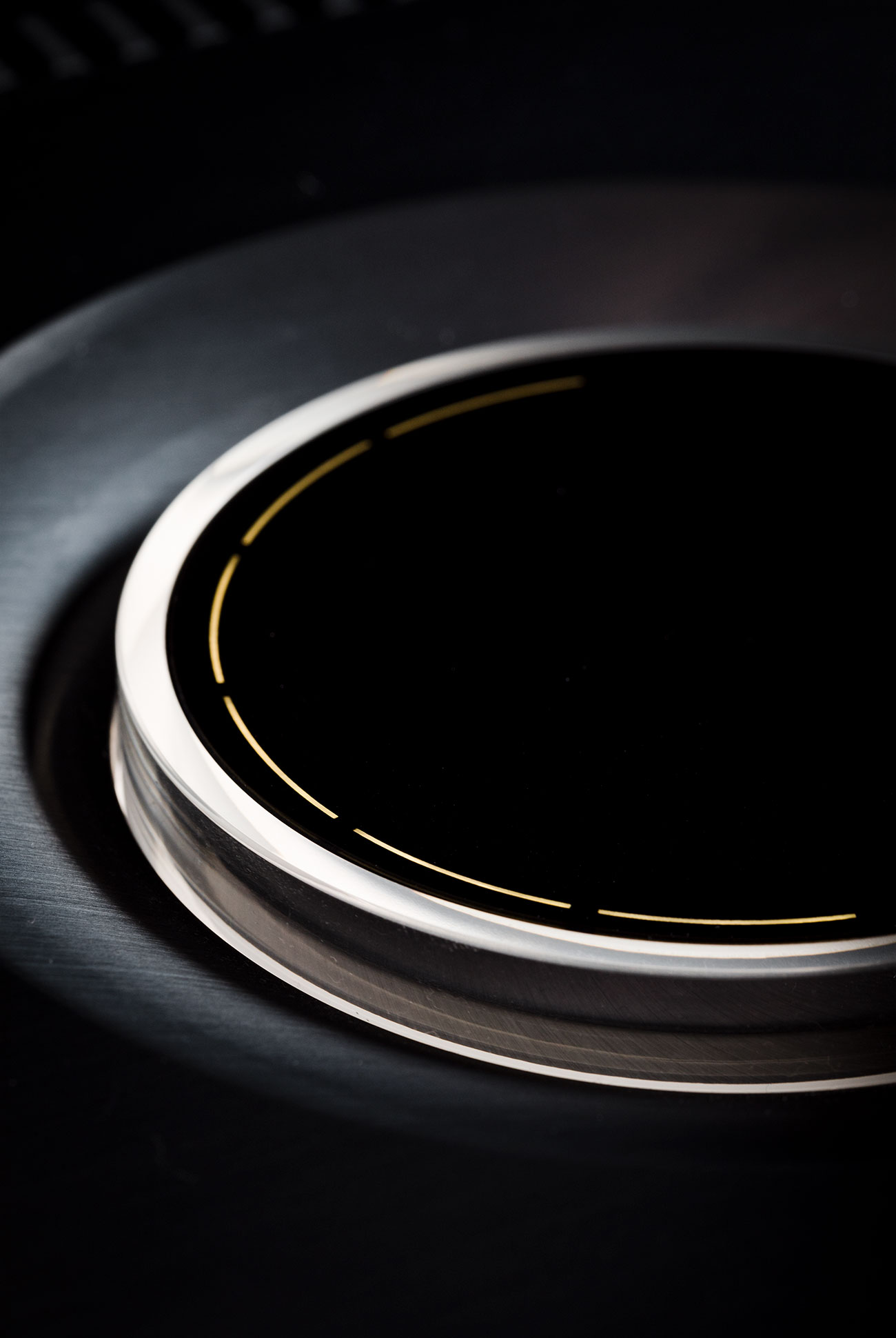
Q: What about sensitivity of the volume dial?
A: Sensitivity across both generations is the same. We have 100 discreet step changes with very sophisticated algorithms controlling bass management and loudness to ensure that when the volume changes the character of the song always remains the same. Sensitivity was determined by a complex set of criteria looking at all likely input sources, understanding the gain of our state of the art digital architecture, and mathematically ensuring we always operate within safe boundaries whilst not always respecting the neighbors. In the end, all the science is in service to the music and that’s what gets the Naim R&D team out of bed every day.
Q: In this age of streaming, where most people are either adjusting the volume via an app or using voice commands, what is the importance of Naim’s volume dial?
A: I think that as we take on more and more all digital experiences then it is clear to see that people crave a reaction to this trend, and the “analog” experience of a gorgeous tactile volume dial answers that need beautifully. It appeals to the child in all of us and it’s important we always find time to listen to that child because it’s often when we are our happiest.

