All posts in “review”

2022 Porsche 911 GT3: Ultimate Guide

Introduction

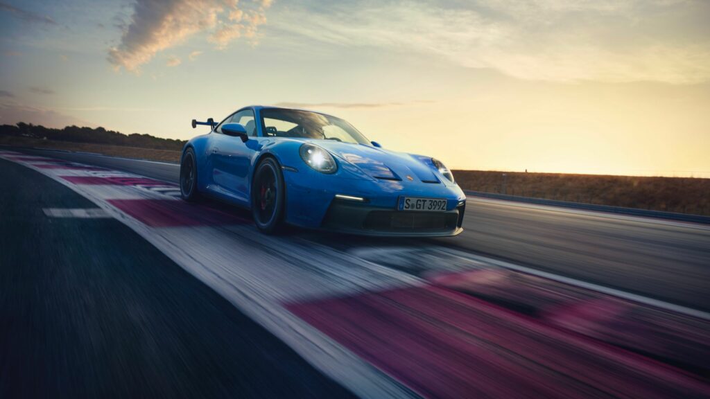
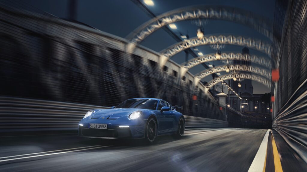
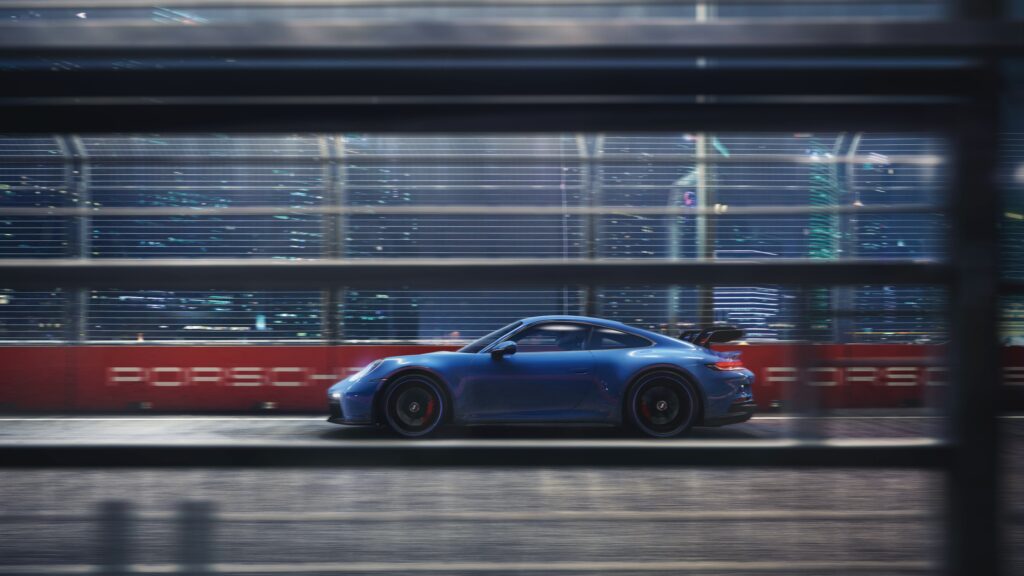
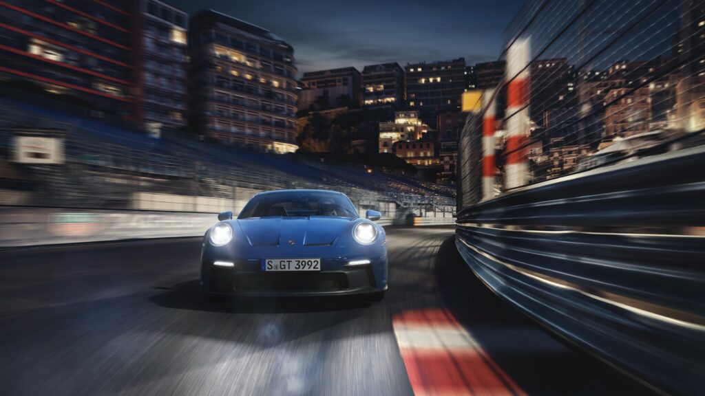
Earlier today, Porsche unveiled its new 992-generation Porsche 911 GT3 via digital livestream on YouTube. First deliveries are currently scheduled to begin sometime in the later half of 2021, where it may likely be designated as a 2022 model. This new GT3 becomes the seventh iteration of one of Porsche’s most established and beloved automobiles. More importantly, it continues to embody the spirit of previous GT3 models by amalgamating all that is awesome about the 911 – and the Porsche brand – in a single road car.

The first Porsche bigwig introduced by presenter Sarah Elsser to offer insight into the project, was Dr. Frank-Steffen Walliser – former Porsche-Motorsport chief and current VP of the 911 model line. Dr. Walliser began by speaking candidly about the pressures associated with perpetually improving the GT3, but felt that the development team has fulfilled this goal with hard work; all of this, while facing the monumental challenge of navigating stricter emissions regulations and an industry-wide transition to EVs.

Andreas Preuninger – Director of Porsche’s GT program – was the next appear, first by driving the GT3 from behind the curtains and onto the stage, while making sure to throw in a few revs of the engine to excite the viewers. Once out of the car, he immediately reiterates the tremendous undertaking that was required to create the 992 GT3 , stating that it was “…the most complex, demanding task over the last three and a half years…” but asserts that “…the end product is the most extreme and exciting GT3 ever made.”

Finally, testimonials by Porsche racing legends Jörg Bergmeister, Lars Kern and Walter Röhrl really hit home just how incredible the car is, from sources that are as credible as it gets. All of them were particularly impressed by how much an improvement the car was compared to its predecessors, justifying the earlier proclamations made by Walliser and Preuninger.

Below are some key takeaways from the presentation.

Presentation Synopsis

Walliser: He talks about improving the naturally-aspirated engine, aerodynamics, chassis and suspension for the 992 GT3. Aside from the obvious technical features needed to make the GT3 better than ever, Walliser displays his deep-rooted understanding of driving enjoyment, depicting how important it was to preserve the spirit of the GT3 car from previous years, and “…bring this baby to life”.

To him, the GT3 is the 911. This is something he says “…can be immediately understood when driving in the countryside, or at the race track. That is the essence of the GT3 and what has made it so special over all the years.”

Getting back into the technical side of things, Dr. Walliser would go on to iterate that while the new GT3 has a bigger footprint, the extensive use of lightweight materials throughout have kept the weight the same as its predecessor. He glosses over a number or items, such as a carbon-fiber roof, carbon-fiber hood and ultra-thin glass, which Preuninger would go into a bit more detail later on.

Preuninger: When speaking about the technical details of the GT3, Preuninger starts by mentioning the 4.0L naturally-aspirated engine with a 9,000 rpm redline, which carries over from its predecessor with some improvements. The 510 PS (502 hp) engine he says, is “…one of the most emotionally involving engines out there.”

But the enhancements don’t stop there. “Bigger wheels, bigger brakes, wider rims.” In normal circumstances, this means more weight, which he addresses by stating “It’s a little bigger…a little bit more competent. It needed some lightweight trickery to keep the weight down, and that is dispersed all over the car. So, all boxes ticked.”

How is this achieved? He points to the carbon-fiber hood, roof and rear wing mentioned earlier by Walliser. Also introduced were some things that weren’t shown up close, such as a super lightweight battery, lighter wheels, carbon-fiber cross members, lightweight interior appointments, etc.  The weight reduction was very much an exercise of shedding “5 kg here, another 1 kg there, 3 kg somewhere else, and so on”.

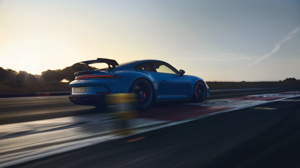
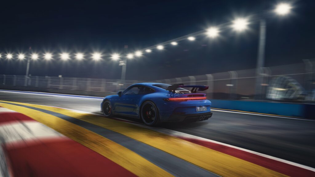
The end result is a weight of just 1,435 kg, hitting the “sweet spot for a driver’s car and perfect track tool for the weekend.” Essentially, the 992 GT3 has achieved the same weight as its predecessor, but is loaded with a lot more technology. For the first time, a double wishbone suspension configuration is used in the front of the car. One of the most visually notable changes is the swan-neck rear wing derived from the 911 RSR competition car, which further emphasizes the link between Porsche’s race cars and its road cars. “What works on a race car, works on a street car, doesn’t it?”

Bergmeister: “Obviously, as a race car driver, when you get in a street car you have to lower your expectations. But on that car especially, I was shocked, how good it is… it’s so close to a race car, it’s really, really impressive.” As part of a response during the Q&A session, Bergmeister remarked that the GT3 impressed him most in the high speed sections of the Nürburgring, and that it was comparable to the 991.2 GT3 RS. “It hardly pitches when you brake, transition phases are very neutral. It has more downforce. It is the best street car we’ve ever driven in our lives“.

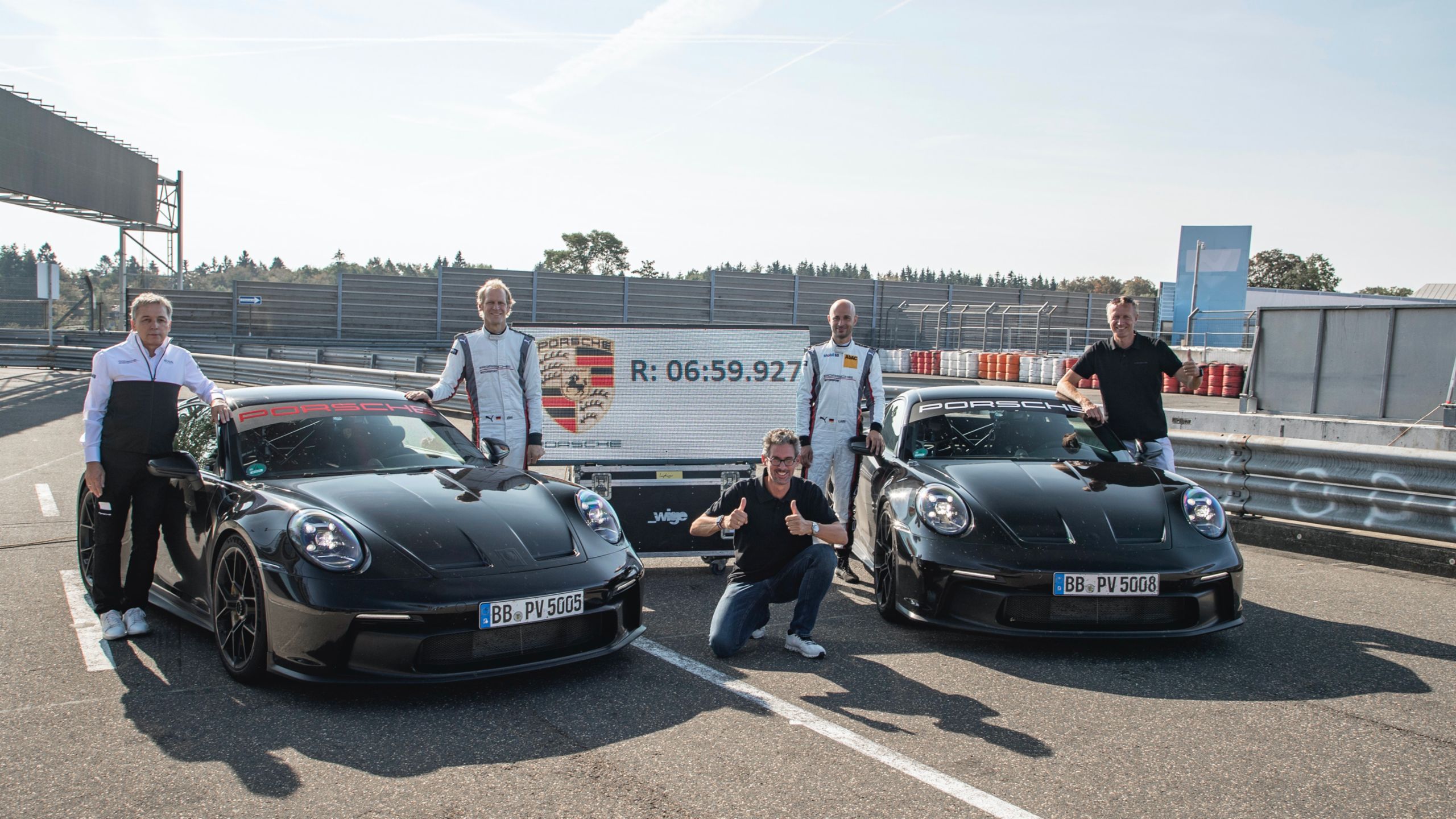
The 992 GT3 achieved a sub-7-minute (6:59.927) lap time at the Nürburgring. This is an absolutely insane, 17-seconds-faster than its predecessor and essentially the same time as the 991.2 GT3 RS, backing up all statements made by Bergmeister, Kern and Röhrl. This also sets the tone for the soon-to-follow GT3 RS – will a 6:40 lap time be possible?! Shortly after the livestream, Porsche uploaded onboard footage at the Nordschleife with Lars Kern behind the wheel, as well as the official ad for the car.

Engine & Performance

  • Engine Type & Size: 4.0L naturally-aspirated flat-6
  • Horsepower: 502 hp @ 8,400 rpm
  • Torque: 346 lb-ft @ 6,250 rpm
  • Transmission: 7-speed PDK, 6-speed manual
  • 0-60 mph: 3.2 seconds (PDK), 3.7 seconds (manual)
  • Top Speed: 197 mph

Porsche has continued the use of the naturally-aspirated 4.0L 9A1 flat-6 power plant in the 2022 Porsche 911 GT3. The only key differences between the engine used in the race car and the one used in the 992 GT3, are the exhaust system and ECU. Otherwise, the two engines share virtually all the same components, such as individual throttle bodies. As such, the new GT3 needed no “sound engineering” and inherently sounds amazing. With its astronomical 9,000 rpm redline, the GT3 produces 502 hp @ 8,400 rpm and 346 lb-ft of torque @ 6,250 rpm. 

The GT3 will continue using the 7-speed PDK transmission, instead of a version of the 8-speed used in the rest of the 992 line-up. In essence, this saves weight (40 lbs) and makes for a better synergy with the GT3 and its intended application. But if you’d like a more hands-on approach, Porsche will offer the new GT3 with an optional 6-speed manual transmission as well.

Purists, rejoice! Walliser said that we shouldn’t count on the GT3 going electric or even hybrid, anytime too soon. It is much more likely that Porsche will transition to using synthetic fuels for motorsport and its GT line of production cars, before even considering going full-on EV. This aligns with Porsche’s intention to keep the naturally-aspirated engine alive for as long as possible – regulations and emissions standards will serve as the eventual ultimatum.

Chassis & Handling

Aerodynamics & Weight Reduction

The new 992 GT3 spent more than 160 hours across 700 simulation sessions in the wind tunnel. It generates 50% more downforce than its predecessor, and up to 150% more downforce in its “high downforce” setting. For the first time, the GT3 features an adjustable front diffuser and a fully closed rear diffuser, which on its own generates 60 kg of downforce at top speed. This means that now, both front and rear aerodynamic components are fully adjustable and can be manually set to one of four positions.

Its low weight of just 1,435 kg is achieved with a myriad lightweight components. This is includes a carbon-fiber hood, roof and rear wing, along with other items such as a super lightweight battery, lighter wheels, ultra-thin glass, carbon-fiber cross members, and lightweight interior appointments. Essentially, the 992 GT3 has achieved the same weight as its predecessor, but is loaded with a lot more technology.

Suspension & Chassis Control Systems

Porsche’s seventh iteration of the GT3, shows an unwavering dedication to the precision that has influenced the GT line of cars since day one. Inspired by the 2013 911 RSR competition car, the 2022 911 GT3 will receive a new front suspension setup consisting of unequal-length control arms instead of conventional struts, making it the first time a double wishbone suspension configuration is used in the front of a GT3. This will provide better tire contact through turns and during moments of compression and rebounding. Porsche’s new adaptive dampers are capable of adjusting every 10 milliseconds, which means the spring rates have doubled without affecting the ride quality of the GT3.

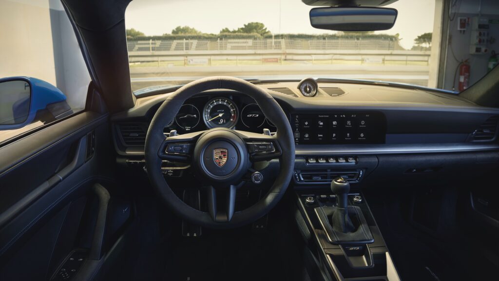
There are three available driving modes: Normal, Sport and Track ,which all provide varying degrees of driver-aid involvement and chassis settings. Aside from providing the most firm, performance-biased setup with the least amount of computer-control, initiating Track mode also changes the instrumentation and displays to “Track View”. This compiles all pertinent information to the immediate field-of-view of the driver. Important details such as oil temperature, oil pressure, tire pressures and shift indicators, are all in plain sight and easily visible.

Brakes & Tires

Porsche will continue to offer the GT3 standard with cast-iron rotors and Michelin Pilot Sport Cup 2 tires. Likewise, upgrading to carbon-ceramic brakes and Michelin Pilot Sport Cup 2R tires, remain as options.

Design, Styling & Interior

Overall, the silhouette of the new 911 GT3 remains a largely familiar one – and that’s not a bad thing.  In fact, this is probably great news for Porsche and GT3 enthusiasts, who would contend that there was never anything wrong with the previous GT3 in the first place. One of the most visually notable changes is the “swan-neck” rear wing derived from the 911 RSR competition car, which further emphasizes the link between Porsche’s race cars and its road cars.

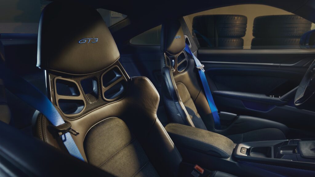
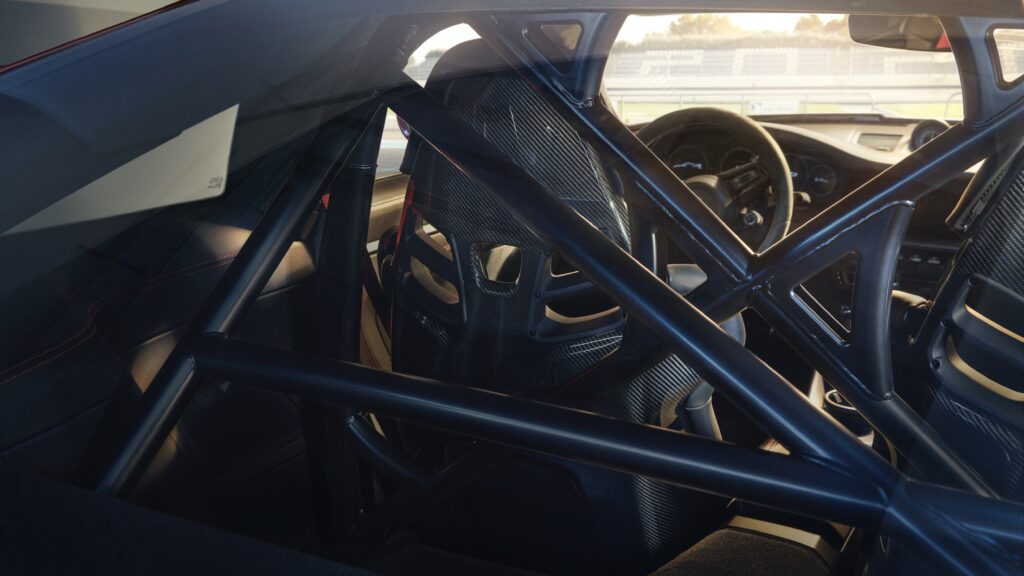
The Club Sport Package (roll cage, 4-pt harnesses) will be a no cost option. However, this will probably only be for the European markets. This package was not available on past iterations in North America due to safety regulations. I anticipate that the aftermarket will step-up to fill the void with some quality products, though.

The Touring trim was confirmed by Preuninger, and there’s no reason this won’t be available state-side once again. Though he believes the standard trim is the most complete representation of the GT3, he acknowledges the appeal of the GT3 Touring for the “gentleman” crowd, who want something a bit more understated. He goes on to affirm that the Touring trim is very popular, and will therefore make a definite return for the 992.

Walliser also announced that Paint to Sample (aka, custom paint colors) will be available for the GT3 line-up. The program will commence sometime later this year. On the subject of paint, the new GT3 will be available in 14 standard colors when orders are open. 

Galleries

Image Gallery

“The emotions and the joy of driving. That’s why we desire the car from the heart to the stomach” – Andreas Preuninger

Official Videos

[embedded content] [embedded content] [embedded content]

Video Review Gallery

[embedded content] [embedded content] [embedded content]

Official Press Release

02/16/2021

Porsche takes the new 911 GT3 off the leash. The seventh edition of this high-performance sports car was also developed in close collaboration with Porsche Motorsport. It transfers pure racing technology into a production model even more consistently than ever before.

The double wishbone front axle layout and sophisticated aerodynamics with swan neck rear wing and striking diffuser originate from the successful GT race car 911 RSR and the 375 kW (510 PS; 911 GT3: Fuel consumption combined 13.3 – 12.4 l/100 km, CO2 emissions combined 304 – 283 g/km) four-litre six-cylinder boxer engine is based on the drivetrain of the 911 GT3 R, tried and tested in endurance racing. The acoustically impressive, high-revving engine is also used practically unchanged in the new 911 GT3 Cup. The result is a brilliant driving machine: efficient and emotional, precise and high-performance – perfect for the circuit and superb for everyday use.

The distinctive strength of the 911 GT3 lies in the sum of its characteristics. With a top speed of 320 km/h (911 GT3 with MT: Fuel consumption combined 13.3 l/100 km, CO2 emissions combined 304 g/km) and 318 km/h with PDK (911 GT3 with PDK: Fuel consumption combined 12.4 l/100 km, CO2 emissions combined 283 g/km) it is even faster than the previous 911 GT3 RS. It accelerates from zero to 100 km/h in 3.4 seconds. Porsche also offers the new model with a six-speed manual transmission for a particularly puristic driving experience.

Aerodynamics from motor racing

The sophisticated aerodynamics benefit from the experiences gained from motor racing and generate significantly more downforce without noticeably affecting the drag coefficient. In the performance position, the manually set wing and diffuser elements significantly increase the aerodynamic pressure for high cornering speeds.

This is the new 911 GT3

This is, however, reserved strictly for outings on the circuit, as it is there that the 911 GT3 can play all its trump cards. During final testing, it lapped the Nuerburgring-Nordschleife, traditionally the ultimate proving ground for all sports cars developed by Porsche, over 17 seconds quicker than its predecessor. Development driver Lars Kern took just 6:59.927 minutes for a full 20.8-kilometre lap. The shorter 20.6-kilometre track, which had previously served as a benchmark, was completed by the 911 GT3 in 6:55.2 minutes. Running on the optionally available Michelin Pilot Sport Cup 2 R tyres, the new model consistently delivered its performance over several laps in the expert hands of Porsche brand ambassador Jörg Bergmeister. For Bergmeister, it is “by far the best production car” that the experienced professional driver has ever driven in the “Green Hell”.

Despite a wider body, larger wheels and additional technical features, the weight of the new GT3 is on a par with its predecessor. With manual gearbox it weighs 1.418 kilograms, with PDK 1.435 kilograms. The front bonnet made of carbon fibre-reinforced plastic (CFRP), lightweight glass windows, optimised brake discs and forged light-alloy wheels ensure weight discipline, as does the cover for the rear seat compartment. The lightweight sports exhaust system reduces the weight by no less than ten kilograms. With infinitely electrically adjustable exhaust flaps, it harmonises a highly emotional sound experience with the Euro 6d ISC FCM (EU6 AP) emissions standard. The combined consumption of the 911 GT3 is 13.3 litres/100 km (PDK 12.4).

Cockpit of the new 911 GT3 has racing genes

Its racing genes are expressed in practically all the details of the new 911 GT3. The cockpit is in line with the current model generation. A new feature is the track screen: at the touch of a button, it reduces the digital displays to the left and right of the central rev counter, which reaches up to 10,000 revs, to information such as tyre pressure indicator, oil pressure, oil temperature, fuel tank level and water temperature, which are essential when driving on the circuit. It also includes a visual shift assistant with coloured bars to the left and right of the rev counter and a shift light derived from Motorsport.

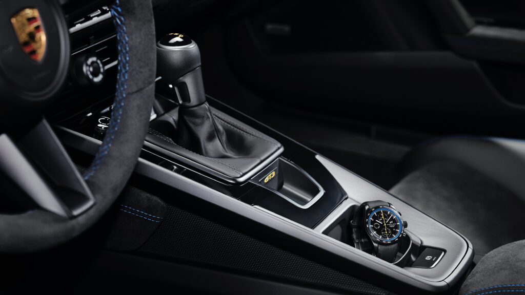
The interior of the new 911 GT3

Especially for the Porsche GT models, customers are increasingly requesting customised equipment. For this reason, the Porsche Exclusive Manufaktur range is also available for the new 911 GT3 and is supplemented by GT 3-specific options such as a lightweight roof made of exposed carbon fibre. Other highlights include exterior mirror tops made of carbon, darkened LED matrix main headlights and matching Exclusive design rear lights with an arc of light with no red components. Guards Red or Shark Blue painted wheel rims enhance the black alloy wheels. In the interior, equipment details such as the dials for the rev counter and Sport Chrono stopwatch, seatbelts and trim strips set elegant accents in the body colour or other desired colour.

As exclusive as the 911 GT3 itself is the individual chronograph that Porsche Design offers exclusively to customers of the high-performance sports car. Like its motorised role model, it boasts a dynamic design, consistent performance and high-quality workmanship. Its housing reflects its Motorsport genes. Just like the connecting rods of the GT3 engine, it consists of robust, lightweight titanium. The timepiece is powered by an individual winding rotor reminiscent of the wheels of the 911 GT3. The coloured ring of the dial can be customised in the paint colours of the 911 GT3.

Info

The delivery of the new 911 GT3 is set for May 2021.

A Look Back: The 2004 Chevy Nomad

Looking Back at the 2004 Chevy Nomad Concept Car

In the early 2000’s, many American car manufacturers began introducing re-imagined, retro-looking concept automobiles that were a literal “throwback” to the vehicles of the 1950s and 1960s.  Many of these cars served as the manufacturer’s featured centerpiece at their respective displays on the International Auto Show circuit.  Some of these cars – such as the Chevy Camaro, the Chrysler PT Cruiser, and the Dodge Challenger –  would find such favor at these shows that they’d move past the concept phase and actually see the proverbial “light at the end of the production tunnel.”  Unfortunately, a great many more of these automotive masterpieces served a singular purpose.  Namely, attract consumers to the shows so that they could see the future wares that automobile manufacturers planned to introduce for the coming model year.

The 2004 Chevy Nomad Concept car.

In 2004, Chevrolet introduced the world to a re-imagined Chevy Nomad.  The Nomad was first introduced at the 2004 North American International Auto Show in Detroit.  This concept vehicle, while inspired by the Chevy Nomad of the 1950s, was more closely related to General Motors new Kappa rear-wheel-drive platform and served as the precursor to both the Pontiac Solstice and the Saturn Curve concept cars.  The designers of the 2004 Chevrolet Nomad wanted to deliver a contemporary version of the classic 1954 Chevy Nomad Concept car, which in turn had been inspired by the 1953 Corvette.

The car featured round headlights gently curving front fenders, a Corvette-inspired grille, forward-leaning B-pillars, a single rolled fascia under the tailgate, and an exaggerated tailgate with chrome ribs that was very reminiscent of the car’s much older counterpart. While each of these design cues was reminiscent of and paid homage to the 1954 Motorama car, the 2004 version also integrated some of the latest 21st-century technology into its DNA.  This new Nomad featured LED headlight and taillight assemblies.  With both sets of lights (front and rear) fully integrated into the car’s aesthetic, the LED lighting was selected for its bright luminescence as well its high degree of visibility, even from a moderate distance.  Like the 1954 Nomad, the majority of the body panels on the 2004 version were constructed of fiberglass. The fitment of the panels was vastly improved over the original Corvettes of the early 1950s.

The 2004 Chevy Nomad Concept car.

Moving inward, the car’s interior featured a semi-circular speedometer with a top speed of 150 miles per hour.  This speedometer was integrated into an instrument cluster that gave the dashboard a three-dimensional appearance with its anodized blue aluminum background and special recessed lighting.  Other niceties of the car’s interior included black leather seats along with special “bowtie” insignias that ran the length of the dashboard.  Even the driver and passenger seats appeared to undergo a transformation.  For 2004, both the driver and passenger seats were given specialty badging on their headrests.

The latest Nomad featured a sport-car based platform akin to the Pontiac Solstice and the Saturn Skye, both of which were developed into production models around this same platform.  The car featured independent front and rear suspension attached to a rigid chassis that used a pair of full-length, hydroformed frame rails as its foundation.  The 2+2 passenger configuration (4 passengers total) sits on a 107-inch wheelbase.  The car was powered by a 250-horsepower DOHC turbocharged Ecotec 2.2-liter four-cylinder engine mated to a five-speed Hydramatic 5L40-E electronically controlled automatic transmission.

The 2004 Chevy Nomad Concept car.

Why introduce a 2+2 station wagon?  Why even bother designing one?  The answer is actually pretty straight-forward.  The Nomad was designed to be a “practical” sports car.  Unfortunately, General Motors had already made the decision to discontinue both the Pontiac and Saturn lines as part of a corporate restructuring.  As the Nomad would have likely been built at the same plants as the Sky and the Solstice, the project never moved beyond its concept phase.

Porsche Taycan 4S – 6-Month Ownership Review

Introduction

Hello again! For those of you who have been following “T’s Corner” closely, you would have become quite familiar with my adventures in a 2020 Porsche Taycan 4S. It has now been about 6 months since I first took possession of the vehicle. Along the way I have shared some of my experiences with the car; mainly, what it’s like to drive one on a daily basis, and even how it performed at the race track. 

Since I picked up the car in June, this meant I could go pretty gung-ho in first 3-4 months in terms of pushing the performance limits of the car and just enjoying it. In the first month of ownership, I had driven the car almost 3,000 km and had the opportunity to take the car to a local circuit before winter rolled in. Such was the fun that I was having, that taking a deeper dive into challenges with charging, the colder weather that was on its way (which significantly affects range), and the real cost of ownership, were put on the back burner – the latter two of which, just simply required more time to pass.

Since October, my experience with the Taycan has been a more hunkered-down one – the general global social climate as well as the winter season touching down where I live, serving as the one-two punch that has delivered these circumstances. Some would say that this is in essence, a more normalized and civil experience of the car, which likely more owners (current or prospective) can relate to – i.e. race track experiences and driving 3,000 km in a month, is probably something that a very small percentage of owners will really be interested in knowing about.

So in this post, instead of speaking in terms of lateral Gs, I’ll be focusing more on things like kWh/100 km (efficiency), general ownership costs, and what it’s like living with a Taycan during a cold (Canadian) winter season.

Cost of Ownership

Maintenance

First off, I should mention that the car has been into the dealership twice for service. Mainly for software updates, one recall for a water hose, and a PCM-related issue (which resolved itself). I don’t want to get into too much detail with the latter – which was a minor inconvenience rather than a material issue – but I will say that my local Porsche dealership (Porsche Centre Calgary), has been phenomenal to work with. I suppose it’s also important to mention that there has been no cost for any of my visits so far.

Electricity Costs

So with 6 months now passed – and with maintenance costs aside (of which there have been none) – the true cost of ownership falls entirely on what I’ve paid to keep the car juiced up. In terms of my charging habits, nothing much has changed since I’ve owned the car. I do 99% of my charging from home, and the other 1% at commercial charging stations. The latter method of charging could actually become much more important into the future, for reasons I will mention below.

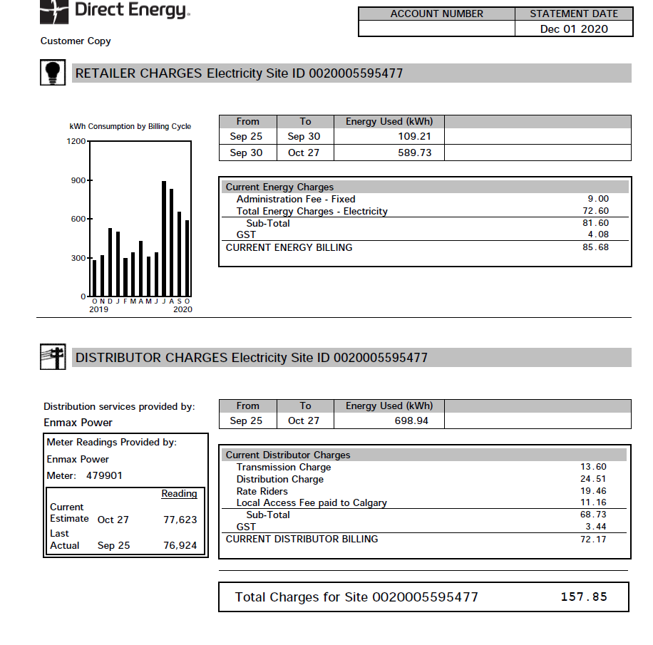
First, here are the last 3 months of my electricity usage and costs, per my utility bills starting in November 2020.

The November and December bills give a pretty good indication of what my total electricity costs were (keep in mind, this is for my entire household, not just for charging the car, so there are other variables at play here). It looks like the January bill accounted for some corrections from the previous months, but did not appear to affect my average costs too much. To offer some perspective (which I covered in one of my very first “charging experience” posts), my total household electricity costs seemed to average at about $60 per month before I ever had an EV to worry about.

Keeping things simple – and based on the data from these bills – I think it’s safe to say that keeping the Taycan charged at home is costing me on average, about $100 per month more than when I wasn’t charging it. Given that I was driving about an average of 1,200 km – 1,500 km per month during those months (which had some very brisk days, leading to higher charging demands), the cost of keeping a Taycan running remains both very low and a highly attractive feature of the car.

Rate Riding

A rate rider “is a temporary credit or charge that is added to your monthly bill on behalf of the electricity or gas distributor. A rate rider collects or refunds the difference between actual and estimated costs for delivering energy”.  I bring this up because I had a very informative conversation with a prospective Taycan owner and highly respected car enthusiast, and the topic of rate riding came up.

Now, this has not applied to me yet, but in simple terms it has meant that some Taycan owners in my city have incurred electricity bills with increases of around $1,000 or more. As mentioned before, there are obviously lots of variables at play here, but it looks as though these rate riding costs are tacked on when the utility company detects an abnormal level of energy consumption and charges users in anticipation of a much higher adjustment.

As I indicated before, these bills encompass distribution for entire households and not just the outlet for the car, so it’s never going to be easy to pinpoint why someone is paying so much more for electricity when the same car is being charged in their garage, ceterus paribus. 

There are a couple of things I will say for certain though. The first, is to become familiar with how utilities work in your local area – as has been evidenced, this can not only greatly differ within your own city, but is likely to vary significantly in different provinces, states, countries, etc. Perhaps contacting your energy provider ahead of time to let them know you will be charging an EV at home going forward, will change the scenario.

The second is to charge your car strategically. What I mean by this, as alluded to before, is by using commercial charging stations more often as part of your charging routine, if required. The local 800V charger – not too far from my house – can deliver a ~60% charge in about 20 mins, costing around $7.00. Use commercial chargers if you need to fill up a lot of juice at once (i.e. you’re sitting at about a 20% charge). Reserve the home charger for “top-up” use only, plugging it in only when you’re at about a 70% charge or higher. Assuming that this all works the way I think it does, you’ll be able to leave home everyday with a full charge and not worry about the huge dump of electricity required to go from 0% – 100% , which could trigger the rate riding.

With my driving habits the way they are and with my utility bills having stayed consistent, it is unlikely that I will have to explore this avenue. But it’s good to know the option is there if I ever need to exercise it, plus others should be aware of this potentially significant matter. After all, paying $1,000 per month to keep your EV charged will certainly defeat the purpose of owning one, amongst other things.

Winter Driving

I’ve had a good 3 months to really test the car in winter conditions, and I must say that the performance has been as good as expected if not better. Paired with a set of Continental WinterContact TS 860 S tires, grip has never been an issue for the Taycan 4S. The air-suspension is particularly useful when the snow is a bit deeper, as being able to raise the car in situations that call for it, has been extremely convenient to say the least.

The only issue during winter – which is an EV-wide one, and not just specific to the Taycan – is that of range.

Here are my findings, having been able to drive the Taycan in a variety of weather conditions and temperatures.

Disclaimer: Keep in mind these are all what I achieved while in Range mode, with a combination of city and highway driving speeds – i.e. realistic driving scenarios, not intentional hyper-miling exercises. 

Ideal/Warm Weather:

17-20 kWh/100 km = ~500 km of range

Cooler Weather (between -10°C and +5°C):

22-25 kWh/100 km = ~400 km of range

Extreme Cold Weather (between -30°C and -15°C):

28-32 kWh/100 km = ~300 km of range

As you can see here, range drop-off can be significant if it gets cold enough. Expect as much as a 40% drop in range in extreme cold weather conditions. From what I can tell, there has been no detriment to performance when driving in such conditions, but you will definitely need to be prepared for significantly heavier charging demands.

Does this make the Taycan less enjoyable in winter? Maybe, a little. If your range anxieties are getting the best of you, reserve driving your Taycan during the winter only for when it is a bit warmer out (i.e. cooler weather as opposed to extreme cold weather). If you want to use your Taycan for a longer excursion to the ski hills, I say go for it! – just plan your route, and charge-up accordingly.

6-Month Review

I’m really happy with the car.

Not having to pay for gas has been a real boon. My other cars – particularly my V8 SUV, which I use from time to time during winter – are certainly not sippers of the petrol stuff, so having an EV makes this feeling all the more distinguishable.

For all intents and purposes, it costs me $100 a month to keep the Taycan juiced-up – a more than reasonable cost to incur for the amount that I drive it, and the superb performance it has on tap at all times. At this juncture, it hasn’t cost me anything to own in terms of maintenance or repairs; although, being well within the warranty period is certainly helpful here.

I do also have to add that Porsche seems to be keeping tabs on issues that have arisen for Taycan early adopters. They get resolved quickly, or at the very least, Porsche is aware of the issues that get brought up, and are often already working on a fix when they do. That’s reassuring from the company, and is another factor of what has made owning a Taycan so enjoyable.

Issues that I have experienced personally are all what I would consider “first world problems.” – Apple Car Play intermittently not working, the LTE connection dropping, Range mode being finicky at times. Note: the latter two issues seem to have been permanently fixed. More compelling issues have been brought up by other owners on forums and Facebook groups, but I won’t delve into those; this is a blog about my own personal experiences, plus those problems seem to be very few, far between and often resolved immediately by Porsche. Some are even caused by user error.

The Porsche Taycan 4S remains a phenomenal car to drive, even in winter climates. During a big snow dump a few weeks back, lots of people were getting stuck in the snow. The Taycan just went about its business like the omnipotent force it is – it isn’t just a “California specialist”. I am looking forward to the summer, though!

-T

The Best and Worst Parts of the Most Extreme Phone Camera Yet

Brand: Samsung
Product: Galaxy S20 Ultra
Release Date: 03/13/20
Price: $1,400
From: samsung.com

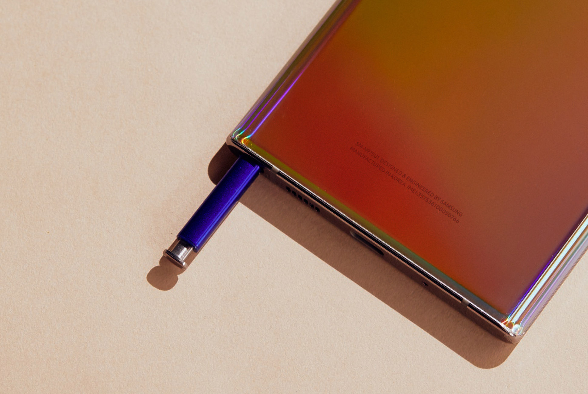
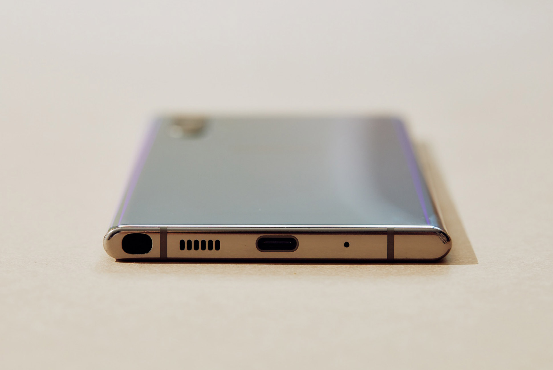
There are plenty of places to start a discussion about the Samsung Galaxy S20 Ultra, the new flagship phone of Samsung’s next, renamed generation of its Galaxy S line. There’s the dual-band 5G connectivity, the 120Hz screen. Also, of course, the sky-high $1,400 starting price. But the question that jumped out to me the most when I first saw this beast, with its impressive 10x optical zoom and unheard of 100x digital zoom, is whether that camera is a revelation or a gimmick. The answer? Well, it’s both.

The S20’s ability to zoom optically up to 10x is a terrific feature, and the ability to zoom that deep without destroying image quality is a freedom I enjoy even if I use it less than I expected in practice. Beyond, to the 100x and even the more modest 30x zoom, the downsides start to overpower any practical application. Yes, it is a great party trick, but I can hardly imagine, like, using it.

10X optical zoom is incredible, but niche.

In case you forgot, zooming works like this. Optical zoom uses physical lenses to magnify your picture, letting you get closer with no compromise in image quality. Digital zoom takes a picture, crops it and enlarges, giving you chunkier pixels the further you zoom. By using a sideways mounted lens and a prism to fit inside a large but manageable camera bump, the S20 lets you get that deep 10x zoom guilt free, which is definitely incredible.

Shooting around with the S20, I found this was great for a few of my pet projects, like getting crisp, close up pictures of interesting features on buildings, and I figure it would be similarly great for shooting wildlife from a distance, or getting close ups at a concert or sporting event. At 10x magnification, it is a little difficult to hold the camera still enough to get a clean shot, especially in low light conditions or with one hand. I spent more time using 5x purely for ease of use. But that impressive zoom can help you get shots you’d otherwise need an honest-to-god zoom lens on an actual camera to capture. It’s sick, even though I didn’t find quite as many uses for it as I expected.

100x zoom is as awesome as it is useless.

If you need a steady hand for 10x, you need an actual tripod for 100x. Once you get above 10x, keeping your target in the frame while you press the button feels more like balancing a broomstick on your finger than using a point-and-shoot. It is a hopeless exercise to try this one-handed, and it is still barely manageable with two. The camera app shows you a handy mini-map in the top of the screen that you can use for reference, which is crucial since the ultra-zoom picture from the viewfinder will be nigh unintelligible. But it can only help so much since the physical act of aiming is wildly challenging.

Now don’t forget this is also digital zoom, which means you are losing image quality at the same time. The S20 boasts some machine learning tech that ostensibly helps repair your ridiculously cropped image but it can’t work miracles. Your final images, if you somehow manage to stay on target to get the shot, are basically as high resolution as a watercolor painting. I can maybe, theoretically, imagine a case where this would be useful, if you were trying to get a faraway shot as evidence instead of art. I mean, it’s cool for a second! But at best it is a party trick.

The S20 Ultra is more than just its camera, obviously.

Of course, the S20 has more going on than just its camera. With dual-band 5G connectivity, the S20 Ultra and its little brother, the S20+, can deliver the face-melting 10 Gbps-and-higher speeds the best 5G connections will be able to offer, if you can find them. Meanwhile, the baseline S20 only supports the slowest flavor of 5G. Its screen, with a silky smooth 120hz refresh rate, is beautiful though tests indicate it robs you of about the hours of battery life to have it turned on. These are both features that, like the camera, are objectively impressive but maybe not practically useful for most people. And at a $1,400 price point to start ($1,600 with maxed out specs!!!!!!) it is very hard to recommend this phone as a sensible purchase, especially when the S20 and S20+ sport more modest prices ($1,000 and $1,200) and less intense cameras (3x optical, 30x digital) that still push the limit of practicality.

It’s still ultra cool though.

Samsung provided this product for review.

Note: Purchasing products through our links may earn us a portion of the sale, which supports our editorial team’s mission. Learn more here.
Eric Limer

Eric Limer is Gear Patrol’s tech editor. A resident of Weehawken, NJ, his current obsessions include mechanical keyboards, mechanical pencils and Formula 1.

More by Eric Limer | Follow on Instagram · Contact via Email

Is This Still the Perfect Entry-Level Smartwatch?

Last fall, Fitbit released the Fitbit Versa – and I loved it. It was a simple-to-use smartwatch that was slim and bespoke, relatively affordable, an excellent fitness tracker and it had a battery life that lasted nearly a week. It was a great entry-level smartwatch for basically anybody, but especially casual smartwatch wearers, and it worked equally well with both iPhone and Android.

The next generation of that smartwatch, the Versa 2, doesn’t mess too much with last year’s success. It has the same relative look and feel of the original Versa, but Fitbit updated in nearly every way. It has an even simpler design, a better processor, a new OLED display (a welcome improvement over the Versa’s LCD display), and improved sleep tracking. The most “touted” new feature is the addition of Alexa integration, so you can tell the smartwatch to do things like set alarms and control your other compatible smart home devices. Lastly is price: the Versa 2 comes exactly the same as last year’s Versa.

|

The Good: The Versa 2 is a better entry-level smartwatch than last year’s Versa, which is something you’d both expect and welcome. The two most important upgrades are that the Versa two now has an always-on display (if you select it) and superior sleep tracking feature, called Sleep Score, which gives you a nice little rating out of 100 – the higher the number, the better your sleep. If you’re fine wearing a smartwatch to bed and you want to track your sleep, the Versa 2 is exactly what you want.

As was true with the Versa, a huge selling point of the Versa 2 is its battery life. If you elect to not have an always-on display (it’s off by default) the Versa 2 can last between five and six days on a single charge; if you have the always-on display, it lasts around three days. Either way, this battery life which is huge, especially when you consider an Apple Watch lasts roughly 18 hours and is not designed to wear while you’re sleeping.

There are two other big reasons to buy a Versa 2. First, it’s solid and intuitive fitness-tracking abilities. It has an always-on heart-rate monitor and can accurately track things like steps and calories. It also, like the Apple Watch, has automatic workout detection, so if you forget to start a walk, run, bike ride or pool workout, the smartwatch won’t skip a beat. And secondly, the Versa 2 is very slim and lightweight, and it’s one of the most comfortable smartwatches that I’ve ever worn.

Who It’s For: The Versa 2 is an entry-level smartwatch designed for anybody who wants a good fitness tracker with some smartwatch-y features (like see call and text notifications, and control music). If you’re somebody who wants to keep track of your sleeping, the Versa 2 is particularly good. It works equally well for iPhone and Android users.

Watch Out For: The new Alexa integration might come as a welcome addition for some, but it really shouldn’t be the main reason to buy this smartwatch. The fact is that most people don’t really need (or want) to talk to Alexa when they’re outside the house. Also, talking to Alexa on the Versa 2 isn’t like talking to Siri on the Apple Watch. For instance, you can’t tell Alexa to send text messages, open certain apps or even play/pause music; all it can do is answer specific queries (“Alexa, what’s the weather?”), set timers and alarms, and control some of your connected smart home gadgets. The other thing is that there’s no speaker, so you won’t be able to hear Alexa and all its answers will just appear on the screen – it’s far from a seamless experience.

As was true with the Versa, the Versa 2 lacks a dedicated GPS, meaning if you want reliable workout data you’ll have to have your smartphone nearby. This is a big bummer for runners. There’s also no LTE model available for the Versa 2.

There’s a new Spotify app that’s available on the Versa 2, which isn’t available on the Versa, but it’s not super helpful. Like with the Apple Watch, the Spotify app on the Versa 2 doesn’t let you download anything (playlists, albums, songs, podcasts) for offline listening. If you’re a Spotify Premium subscriber, only a select few Garmin and Samsung smartwatches do this.

Also, the Versa 2 still comes with a proprietary charger. The annoying thing is that it looks and feels just like the proprietary charger that came with the original Versa, which I didn’t like to begin with, but it’s actually not the same and won’t work with previous Versa smartwatches. I still have and use my Versa, and mixed up the chargers on several occasions, which was obviously frustrating.

Alternatives: Fitbit has a right to feel frustrated after the latest Apple hardware announcements. That’s because, in addition to announcing new high-end Apple Watches, Apple also dramatically reduced the price of its two-year-old smartwatch – you can now buy an Apple Watch Series 3 for $200, which is the exact price of the Fitbit Versa 2. Basically, if you have an iPhone and you want an entry-level smartwatch that works well with it, the Series 3 is probably a better bet.

Verdict: The Versa 2 is a better version of last year’s Versa, which was the best entry-level smartwatch for most people, Android or iPhone owner, who just wanted an easy-to-use smartwatch to track fitness. A year later, the Versa 2’s main problem is that there’s more competition, especially within its $200 price range. The Versa 2’s best qualities are its 6-day battery life, its great fitness and sleep tracking, and it’s super-slim design. If you those things are important to you, then the Versa 2 remains one of the best – if not the best – entry-level smartwatches you can buy. However, the reality is that the Versa 2 will feel more like a glorified fitness tracker than an actual smartwatch, especially if you have an iPhone or Samsung smartphone.

What Others Are Saying:

• “If you’re not wedded to Fitbit’s platform, the Versa 2 is a harder sell when you compare it with other $200 smartwatches, such as the Samsung Galaxy Watch Active and the Apple Watch Series 3, which both have GPS, onboard music storage and contactless payments. One feature that could set the Versa 2 apart is Fitbit’s new subscription service, but it will take a lot to convince me to spend $80 more per year. Still, the Versa 2 is a very good fitness-focused smartwatch that offers plenty of insights into your overall health, subscription or not.” — Mike Prospero, Tom’s Guide

• “Overall, the Versa 2’s fitness tracking features are the best and most comprehensive you’ll find on any smartwatch, even though it doesn’t have a dedicated GPS radio and relies on your phone for GPS tracking.” — Dan Seifert, The Verge

• “If not for its connectivity problems, the Versa 2 would be an excellent smartwatch. It offers accurate, comprehensive fitness features and a nice design for a reasonable price. It’s also one of the longest-lasting smartwatches around, while the Alexa integration makes it more useful than its predecessor. I just wish Fitbit would get its Bluetooth act together already, and give me a better OS.” — Cherlynn Low, Engadget

Key Specs

Display: 300 x 300 pixel touchscreen AMOLED
Water resistance: swimproof; up to 50 meters
Sensors: 3-axis accelerometer, optical heart rate monitor, altimeter, ambient light sensor, vibration motor, NFC
Battery life: up to 6 days; ~3 days with always-on display

|

Fitbit provided this product for review.

Read More Gear Patrol Reviews

Hot takes and in-depth reviews on noteworthy, relevant and interesting products. Read the Story
Note: Purchasing products through our links may earn us a portion of the sale, which supports our editorial team’s mission. Learn more here.

The Sonos Move Does It All, For Better and For Worse

The Sonos Move ($399) represents a bunch of “firsts” for Sonos. It’s the company’s first Bluetooth speaker, its first portable speaker and, thus, its first speaker to have a built-in battery (which Sonos had to build from scratch). Unlike all other Sonos speakers before it, the Move is designed to be listened to in, around and outside the home. And if you’re wondering, yes, the Move is weatherproof and drop-resistant, making it Sonos’s first truly rugged speaker, too.

Of course, the Move is still a Sonos speaker and it’s designed to work as such. It can connect to your home’s Wi-Fi network and, via the Sonos app, be grouped with other Sonos speakers in a multi-room system. It’s also a smart speaker, just like the Sonos One, so you can speak to Amazon’s Alexa or Google Assistant and request a song, adjust the volume or ask about the weather.

There are a couple of big questions surrounding the Move. In terms of sound quality, how does it compare to other Sonos speakers? And how should the Move be used? Is it more of a traditional Sonos speaker that, instead of being tethered to the wall, can be carried from room to room? Or is it more a portable Bluetooth speaker, designed to be listened to outside?

The biggest question, at least for me, has to do with the “Sonos experience.” The audio company is so beloved because its speakers sound great and work with almost every music streaming service, but, most importantly, they’re easy enough for anybody to use. So the fact that the Move can be constantly be moved around, switched between Wi-Fi and Bluetooth modes – does that negatively impact that Sonos experience?

The Good: The Sonos Move has that “Sonos sound” – it sounds warm, lively and punchy, both inside and outside, just as you’d expect from a Sonos speaker. Sonos specially designed it with a downward-firing tweeter and forward-firing woofer, and the result is that the Move has more of a 360-dree sound than any other speaker. (Fun fact: even though the Play:1 and Sonos One speakers have a dotted grill the wraps sound most of the speaker, both are still forward-firing and not omnidirectional speakers.) In terms of sound quality and power, the Sonos Move sounds more closely to the Sonos One ($199) rather than the larger and more expensive Play:5 ($499); but it’s definitely in-between the two.

The other neat thing about the Move is that Sonos rejiggered TruePlay technology so that it works with the Move. TruePlay is the in-app feature that helps tune each Sonos speaker so that it sounds best for the room it’s in; it’s a typically a one-time process that requires you to wave your smartphone around while the speaker makes some strange noises. Sonos knew this would be a pain in the ass with the Move, to have listeners set up TruePlay every time they moved the speaker, so they developed Automatic TruePlay.

Instead of going through the app and waving your phone around (typical TruePlay behavior), the Move uses its built-in microphones and automatically tunes itself ever time you move it. It’s convenient and you can hear the difference. For example, when you move the Move from an open space to a closed-in space, like a media cabinet, you can hear the speaker lower its bass and crank up its mids and treble. All this happens in the space of a few seconds and, again, it requires nothing out of the listener (the microphones have to be on, though). Pretty cool.

When it’s not on its charging dock, or charging via USB-C, the Move has a ten-hour battery life – which is decent. That said, it has a pretty neat trick to save battery life. Anytime the speaker is not powered and it’s not playing music, meaning it could be in either Wi-Fi or Bluetooth modes, the Move will automatically turn off after a few minutes. According to Sonos, the Move can stay in this “Suspend mode” for up to five days before needing a visit back to the charger.

The biggest thing, at least for me, is that the Move doesn’t really complicate or change the Sonos experience. Because it’s the first Sonos speaker that has automatic TruePlay, it arguably makes the Move even easier to set up than other speakers. If there’s one caveat to this “Sonos experience,” it’s that the Move will automatically connect back to your home’s Wi-Fi when switching back from Bluetooth mode, but it won’t regroup with your other Sonos speakers. Basically, you’ll have to visit the Sonos app if you want to regroup your speakers after using the Move as a Bluetooth speaker. Not the end of the world, but something to watch out for.

Who It’s For: The Sonos Move won’t be for everybody. In fact, it’s a speaker with a hint of irony about it. Sonos designed it so that it could work for anybody in any situation – whether that’s indoors or outdoors, in your home or far from it – but it’s actually a speaker that’s optimal for a select few people. It’d be a great addition to somebody’s household who just wants a great-sounding speaker in every room of their house, but only wants to buy one speaker. If the person has a Sonos system and has an outdoor space (backyard or patio) that’s covered by Wi-Fi, then the Move would be a great way to extend your home’s sound outdoors. Finally, if the person is just a die-hard Sonos enthusiast, they really can’t go wrong with the Move.

Watch Out For: The Sonos Move loses many of its best features when being used as a Bluetooth speaker. It can’t function as a smart speaker, so you can’t access Alexa or Google Assistant. Its automatic TruePlay doesn’t work, so it won’t sound as good as it possibly could. It’s can’t operate as a stereo pair with another Sonos Move (both speakers have to be connected to Wi-Fi for stereo pairing).

It’s also the first Sonos speaker that you’ll have to worry about replacing its battery (because it’s the only one to have a battery). Sonos claims that its battery should last roughly three years or 900 charges, but this will be an extra cost down the road; Sonos will sell the replaceable batteries, but they have yet to announce pricing. It’s worth noting that even if the Move’s battery does die, as long as it’s connected to power it will still function as a typical Sonos speaker.

At $399, the Sonos Move definitely feels expensive for what it is. It’s also not a small speaker and even though Sonos claims that it’s a great portable Bluetooth speaker (which I feel it definitely is), I have a hard time picturing many people lugging this 6-pound speaker to the beach.

Alternatives: As far as getting an entry-level Sonos speaker, you could buy two One ($199/ea) or two One SL ($179/ea) speakers, each of which has almost the same audio quality as the Move. If you don’t care about the versatility of the Move, just the audio quality, the Play:5 is a little bit more expensive and definitely is the superior-sounding speaker.

If you’re not committed to the Sonos ecosystem, there are plenty of alternatives. For instance, the UE Blast ($100) and UE Megablast ($170+), both of which are smart Wi-Fi speakers that work with Alexa and they are two of the best portable Bluetooth speakers, too.

It’s worth point out that Bose, arguably Sonos’s biggest speaker rival, recently released the Bose Portable Home Speaker ($349), which is a very similar speaker to the Sonos Move. The Bose Portable Home Speaker works with both Wi-Fi and Bluetooth, is compatible with Alexa and Google Assistant, and can be grouped with Bose’s other multi-room speaker.

Verdict: The Sonos Move is a completely different kind of Sonos speaker, yet it still manages to feel…like a Sonos speaker. It sounds great, truly, and in some respects, it’s actually easier to set up and get playing than any other new Sonos speaker. That said, it feels a little expensive for what it is and unless you’re really going to take advantage of its versatility – take it from room to room, take it outdoors, and use it as true Bluetooth speaker – Sonos makes several other more affordable speakers that you’ll probably enjoy just as much.

What Others Are Saying:

• “For a lot of serious Sonos fans, the Move will be a no-brainer. Folks have been wondering for years when Sonos will make the jump to Bluetooth and make its famously exceptional multi-room wireless speaker systems more versatile. A lot of those people have invested hundreds if not thousands of dollars into their Sonos systems, and the idea of adding one more—one that has Bluetooth, that can go anywhere—is exciting. The Move sounds like a Sonos speaker. It works with all the other Sonos speakers. Sure, a Sonos diehard will love this thing. The average consumer just looking for a portable speaker, however, might not be so enthusiastic.” — Adam Clark Estes, Gizmodo

• “The Move also cannot connect to multiple phones or devices at a time either, so you only get to have one DJ at your party. Oh, and though Sonos is known for its ability to group multiple speakers into ad-hoc zones, this isn’t possible on Bluetooth. And that’s despite many competing speakers, like that Megaboom we keep mentioning, having the ability to daisy-chain together. For now, it’s clear that Sonos still sees Bluetooth as an add-on, not a core focus. Sonos could add more Bluetooth features in the future via app updates (something it does frequently), but the company’s heart still lies with Wi-Fi..” — Jeffrey Van Camp, Wired

• “The biggest question that most people seem to have about the Move is about whether it’s worth the nearly $400 price tag. Frankly, it’s a tough price to swallow for what largely amounts to a $200 Sonos One with a battery bolted to the bottom of it. It’s also a lot more money than the typical Bluetooth speaker costs. But the Move also does things that no other Sonos speaker nor any other Bluetooth speaker can do, and it does it all without compromising on sound quality, volume, or features.” — Chris Welch, The Verge

Key Specs

Drivers: One downward-firing tweeter, one mid-woofer; two Class-D digital amplifiers
Connectivity: Wi-Fi, Bluetooth, AirPlay 2
Battery: up to 10 hours
Water Resistance: IP56 rating
Weight: 6.6 pounds

Sonos provided this product for review.

Read More Gear Patrol Reviews

Hot takes and in-depth reviews on noteworthy, relevant and interesting products. Read the Story
Note: Purchasing products through our links may earn us a portion of the sale, which supports our editorial team’s mission. Learn more here.

This Absurd Backup Battery Can Charge Every Gadget You Own and Then Some

Portable power is a quickly evolving category, and Ecoflow’s Delta 1300 demonstrates just how far it’s come. Lithium-ion batteries are not just for your phone; this compact and powerful battery bank is a lightweight gas-free, emissions-free generator that’s powerful enough to run woodshop tools, office electronics, a portable refrigerator or medical device, and light enough to carry between locations. As an emergency back-up generator, it will keep you charged and comfortable in a power outage, but it has so much functionality it won’t gather dust while you’re waiting for the next blackout. In addition to charging phone, drone, and laptop, and to running circular saws, air compressors, and lights, Delta can charge an electric car enough to eke out another five to seven miles until you can get to a proper charger.

The Good: The Delta 1300 has 6 AC outlets, 2 USB-C PD ports, 4 USB outlets, and it’s rechargeable from a wall socket, carport, or solar panel. This unit plugs into the wall with the same cord you’d use to plug in a computer. There’s no specialized, device-specific power brick required, so you don’t have to worry about misplacing your charger. The Delta can juice 13 devices simultaneously, which means you’ll be popular at festivals and trade shows with one of these in your tent, van or booth. A large LCD screen tells you how much battery the lithium-ion bank has left, both by percentage and hours. The readout is based on the Delta’s activity at any specific time. For example, it’ll likely read 99 hours when you plug in your dead cell phone. If it’s charging a large Dometic fridge/freezer, the readout will more likely be 20-32 hours. It’s super portable at around 30 lbs and the size of a toaster oven with oversized handles that are easy to grab

Who It’s For: If you’ve ever considered a gas-powered generator as an emergency backup, you’re a candidate for Delta. If you want to run power tools away from a wall plug or without the hassle of ultra-long extension cords you need one of these. If you live off-grid, whether you’re stationary or mobile, Delta can power your lights, tools, electronics and appliances. In an emergency not only will it power a fan or heater, lights, and microwave, it can power a medical device like a CPAP. It can also give people who require electrical medical devices some freedom to roam.

Watch Out For: It’ll take you some time actually using the Delta before you’ll be able to get a good handle on how long it will actually last in various scenarios. Most electrical devices pull power at a variable rate, so the number of remaining hours of power displayed on Delta’s screen may change without notice if your gadgets suddenly get a bit hungrier. I plugged a Dometic fridge/freezer into the Delta, and the screen told me I had 38 hours of run time. Four hours later, the screen told me I had 20 hours of run time. The change makes sense. When the fridge needed cooling, its energy consumption was greater. The Delta records its own power output continuously and as it does, the unit adjusts its battery life readout. When the fridge reached temperature, then the remaining battery time on Delta’s screen went back up. That said, the battery life estimates shared by EcoFlow seem to be extremely accurate and not inflated.

Alternatives: There are other battery-powered generators out there, as well as gas-powered generators. Most gas generators are more expensive, as are other powerful battery generators. Gas generators are loud, smelly and you can’t run them safely inside because of their carbon monoxide emissions. They need annual maintenance. Delta requires no annual maintenance. The battery maintains its charge for a year untouched, and the only noise is a quiet hum. The only emission from Delta is a little bit of heat.

There are other battery power banks on the market, like the Goal Zero Yeti 1400. That unit takes 12 times longer to charge plugged into a wall, it weighs 50 percent more, and it’s slower to charge with a solar panel. EcofFow’s claimed power capabilities for the Delta 1300 are considerably greater than those claimed by Goal Zero for the Yeti 1400. The Yeti 1400 is twice the price and claims a lifecycle of 500 charges, versus EcoFlow Delta’s claimed life of 800 charges.

Review:

To use Delta, you press the power button and then press a second on/off switch for AC or DC power. The LCD screen, in addition to telling you hours and battery percentage remaining, indicates high and low temperature, whether the fan is working, input, output with an overload warning.

We ran every tool we had and charged every device: circular saws, table saws, shop vacs, computers, phones, fridges and more. We were only able to fully drain the battery during the course of normal use when we plugged in a full freezer trying to cool its contents from 14°F to 0°F. The battery lasted at least 20 hours; we woke up to it needing a recharge.

Delta goes from zero percent charge to 80 percent charge in an hour, and can fully charge with just two hours plugged into the wall. EcoFlow says Delta charges in four hours via a solar panel. In order achieve such short charge times, EcoFlow also developed a charging technology, bi-directional X-stream Charge, that allows alternating current AC from a wall outlet to be directly inputted into Delta’s inverter, increasing its charging power at the same time. “By passing through the inverter directly, we can increase charging speed to more than ten times of the traditional AC to DC adapter cable,” said EcoFlow found Eli Harris. The proprietary charging technology also integrates all direct current power supplies below DC 60V, from an adapter, solar or car DC output, into one input port. The result is that users don’t need to consider whether they recharge Delta with a wall plug or solar panel. The system automatically recognizes the power source.

In addition to a new charing technology, the company built an entire proprietary internal integrated architecture from the ground up to maximize Delta’s power storage efficiency. EcoFlow designed and developed every component inside Delta, which includes more than 100 battery cells. Harris said one of the company’s biggest challenge was effectively monitoring and managing the operation of the whole system in real-time. EcoFlow’s battery management system was key. Harris and his team built it so the main controller collects the temperature and power status of each battery cell in real-time and then adjusts the charging current and the voltage to ensure the safest, fastest charging rate. When the unit is in idle, the battery management system monitors and adjusts the unit’s power status to ensure lower power consumption and extended standby power storage, which is how the company achieved a shelf-life of a year plus.

Delta is designed to take a beating. The unit we tested was pre-production, so did not have the correct casing. But we know from testing EcoFlow’s River battery bank that they know how to make their power banks durable without a heavy, bulky full-steel casing. Harris says that Delta’s housing was inspired by Tesla, and that final production will use a combination of aerospace-grade aluminum and high-strength steel to give Delta maximum strength and structural rigidity. It will be combined with impact-absorbing plastic, protective rigid metal plates, and four aluminum pillar reinforcements so that Delta is worthy of withstanding the hazards of a job site, garage project or bouncing around in the back of an off-road vehicle.

Verdict: Harris says he created EcoFlow to build this generator, and while we expect the company to blow this battery’s capacity out of the water with future versions, this one is undoubtedly worth owning for anyone who needs a reliable source of power or backup power. The Delta raised over $1M in the first 48 hours on Kickstarter, and it’s currently nearing $1.5M. Delta 1300 is an awesome solution for home or home office, van life and for powering tools away from a wired source of electricity. None of the claims made on EcoFlow’s Delta Kickstarter page are exaggerated. We were impressed with Delta’s power, versatility, quick charge time and compact size. Support Delta before the campaign closes on October 19—and as thanks for your trust in the company’s technology, you get peace of mind via a lifetime battery warranty.

Key Specs

Weight: 30 lbs
Ports: 6 AC outlets, 2 USB-C PD, 4 USB
Shelf Life: 12 months
AC Output: 1600w (surge 3100w)
Charge Time: 1.7 hours
Type: Lithium-Ion
Price: $699

EcoFlow provided this product for review.

Read More Gear Patrol Reviews

Hot takes and in-depth reviews on noteworthy, relevant and interesting products. Read the Story
Note: Purchasing products through our links may earn us a portion of the sale, which supports our editorial team’s mission. Learn more here.

This Is the Best Smartwatch for iPhone Owners

The Apple Watch has been the best smartwatch for anybody with an iPhone for years, but it feels like the fifth-generation model, the Apple Watch Series 5 ($399+), has the most to live up to. That’s because its predecessor, the Series 4, set the bar so darn high. It was the first Apple Watch to look different, with a larger edge-to-edge display and a thinner, lighter body; plus Apple gave it a bunch of innovative features (like fall detection and an electrical heart sensor) and basically upgraded it in every way.

Now that the Series 5 is here, you’ll notice that it looks strikingly similar to the Series 4. It’s the same size and thinness; it has the same rotating crown dial with a little red circle; and it has many of the same sensors and health tracking features. But the differences are there. The Series 5 is the first Apple Watch to have an always-on display. It’s the first Apple Watch to have a built-in compass. And it’s the first Apple Watch to come in four different finishes, including aluminum, stainless steel, ceramic and all-new titanium.

The Apple Watch Series 5 is available in GPS-only and cellular models, and starts at $399.

|

The photographed Apple Watch Series 5 has the all-new titanium case. It’s a 44mm model and goes for $849.

The Good: The always-on Retina display is the standout feature of the Series 5. Even for people who have worn an Apple Watch for years, like myself, it’s going to feel like a big deal because it actually changes the way you interact with the Apple Watch. With the always-on display, there’s no need to rotate your wrist to see check the time or see that your workout is still tracking – it’s just there. It also will probably prevent many social faux pas that were caused by previous Apple Watch models; seeing other person check the time or look at their watch can be distracting, after all.

It’s true that the always-on Retina display is always-on, but it’s not always bright. The watch face still lights up when you raise your wrist, just like it did with the Series 4, but it then transitions to an idle dark mode when you lower your wrist back down; what’s happening is that the display’s refresh rate gets lowered to one screen refresh per second (or 1Hz), which allows the Series 5 to use very little battery life and give the appearance of always being on. This allows the Series 5 to get the same full-day battery life as its predecessor. Apple updated all its old Apple Watch faces so they work with the Series 5’s always-on display – pretty cool – plus they added quite a few new ones, too.

The Series 5 is the first Apple Watch to have a built-in compass. There’s a dedicated compass app on the Series 4, but other Apple Watch apps, like Apple Maps, take advantage of it.

As mentioned before, Apple is offering the Series 5 in more options than ever. The aluminum version of the Series 5 is the most affordable and is the only one that can be purchased without cellular. The stainless steel version is heavier and more durable, so it feels more premium, but it starts at $699. The brand-new titanium version is significantly lighter than the stainless steel version, and it’s also more scratch-resistant, corrosion-resistant and hypoallergenic. And then there’s the ceramic version, which a high-end material that’s usually reserved for luxury watches. If you purchase any Series 5 through Apple Watch Studio (meaning online or in an Apple Store), you can pair it with almost any watch band you want (there are some restrictions).

The Series 5 is the first Apple Watch to have a built-in compass. There’s a dedicated compass app that you can access, which I rarely used, but the real benefit of the compass is how it works with other Apple Watch apps, such as Apple Maps. For example, when you’re using Apple Maps you can now see which direction just by looking at your Series 5. You’ll see the “field-of-view cone” rotate with direction you’re looking, which makes Apple Maps on the Series 5 feel way trustworthy. (Previously, you’d have to take out your iPhone to get the same sense of direction.) For those who are easily disoriented when navigating from A to B, like me, or have difficulty grasping your bearings when getting off the subway – like me – this new Apple Watch feature will save you a headache and a five-minute walk in the wrong direction.

The best part of the Series 5, and maybe you’ll roll your eyes, is that it feels like an Apple Watch – familiar – and it has all the best features of the Series 4. You can still pair it with your AirPods and listen to music sans iPhone. It still has the heart rate sensors and built-in ECG. It still has fall detection and Emergency SOS. It still has a GPS and it can track your runs. It’s waterproof enough so you can wear it swimming. It still tracks your steps and other metrics so you can complete your activity rings. And, of course, it works super well with iMessage.

The last thing to note is that all Series 5 models have 32GB of internal memory, which is actually twice as much as the 16GB on the Series 4. This might not be a huge deal for people who don’t plan on downloading music or a bunch of extra apps on the Series 5, but if you do, or if your current Apple Watch is already nearing its max storage, it might make sense to upgrade to the Series 5.

Who It’s For: Any iPhone owner who wants Apple’s best-ever smartwatch. Or if they desperately want an Apple Watch with an always-on display. Or if they want one of the Series 5’s higher-end finishes (and they’re willing to pay for it). The last big reason to get the Series 5 is if they’re going to take advantage of the Series 5’s built-in compass.

Watch Out For: No matter which Apple Watch Series 5 you buy, aside from the obvious difference between cellular and GPS-only models, they’re all going to have the same functionality. That means that the $1,300 ceramic model and the $399 aluminum model are built with the same internals and will keep track of the same metrics. There’s little downside to getting the cheaper models, other than how their aluminum finish looks and feels. (Although the stainless steel and titanium models are slightly more durable.)

One thing that I’ve been hoping for awhile is that the Apple Watch will start playing better with Spotify. Yes, there’s a Spotify app for the Apple Watch. And yes, if you have an LTE model you can stream music, but I wish the Spotify app would allow you to download albums and playlists for offline listening, similar to what several Garmin and Samsung smartwatches can do. As with previous Apple Watch models, the Series 5 is really only designed to download and store playlists from Apple Music.

Alternatives: The Apple Watch Series 4 is the most obvious alternative, but Apple did something a little bit sneaky this year – they stopped selling it. You can still purchase the Series 4 for third-party sellers like Amazon or Best Buy, for a slightly discounted rate. The Series 4 looks and feels (especially the aluminum models) very similar to the Series 5, and it’s a great option for Apple Watch wearers who don’t need always-on display.

If you don’t want to pay that much for a Series 5 (or Series 4), Apple is still selling the Series 3 but it lowered the starting price to just $199 – it’s undoubtedly the best entry-level smartwatch for people with an iPhone. The trade-offs are pretty clear, however, as the Series 3 doesn’t have the large nice display, the slim design or the many fancy sensors that enable a lot of the Apple Watch’s newer features. The Series 3 does have a built-in GPS and it’ll still accurately track your runs.

Verdict: The Apple Watch Series 5 is undoubtedly the best smartwatch that Apple has ever made, and it comes with the feature – an always-on display – that most people having been asking for. That said, with a few spec bumps and a few new capabilities, the Series 5 is admittedly an iterative upgrade over last year’s Series 4. If you’re not swayed by the premium materials, like the new titanium case, it really comes down to Series 5’s always-on display and how much you want it.

Key Specs

Case sizes: 40mm or 44mm
Case options: Aluminum, stainless steel, titanium and ceramic
Display: Always-On Retina display
Processor: 64-bit dual-core S5 processor
Storage: 32GB
Sensors: electrical and optical heart rate sensors, gyroscope, accelerometer, compass
Water resistance: 50 meters
Connectivity: Bluetooth 5.0

|

Apple provided this product for review.

Note: Purchasing products through our links may earn us a portion of the sale, which supports our editorial team’s mission. Learn more here.

2019 Airstream Bambi Review: The Stylish, Easy Way into Camping Trailer Life

By this point, the only way you don’t know what an Airstream is if you’re a vampire who’s been asleep in a cave for the last century. The aluminum-sided travel trailers have been rolling along America’s roads since the ’30s, their iconic design capturing eyes with the same ease they reflect sunlight. They’ve been featured in countless films and TV shows, and transformed into homes, AirBnBs and works of art.

For 2019, the eight-decade-old company has added a new model to its lineup: the diminutive, adorably-named Bambi. Ask Airstream where the name “Bambi” came from, and they’ll say founder Wally Byam named it after a type of agile deer he saw while overlanding across Africa in the ‘60s. (Dollars to donuts he actually named it after a certain Disney movie, but that’s neither here nor there.) It’s been a common nickname for the company’s small, single-axle trailers for more than half a century — but now, the name has finally been given the honor of formally becoming part of the team, signifying the two-wheeled rigs that are the most affordable way to hop aboard one of the company’s classic aluminum trailers.

The Good: It may be compact, but the Bambi crams more usable space and features into its limited length than most studio apartments. My Bambi 19CB tester was the second-smallest variant, yet in spite of being a mere 18 feet 11 inches long — shorter than a Rolls-Royce Phantom — it had space for a two-burner gas stove, a stainless steel sink, a refrigerator and freezer, an LED television (with integrated antenna), a built-in stereo, a memory foam mattress (sized somewhere between a twin and a double), even a shower and a flushing toilet.

Even with all that gear inside, the interior has a fair amount of space to spread out. During an impromptu Brooklyn tailgate party, I managed to fit seven or eight adults (and one large dog) inside comfortably, with room to spare for snacks and a soft Yeti cooler backpack. A family with kids might find it cramped, but it’s more than spacious enough to serve as a good base of operations for a single adult or a couple.

Who It’s For: First-time Airstreamers looking to dip their toe into the world of trailering adventure; empty-nesters who want to roam freely in retirement but don’t want to wrangle giant trailers and full-size pickup trucks.

Watch Out For: Backing up. As the model that seems most likely to be adopted by trailering novices, you might think the Bambi would pack some sort of technological magic to help maneuver it in reverse more easily.

Nooooooooooooooooope.

Spinning my trailer 180 degrees required a good 30 minutes of Austin Powers-style shuffling back and forth, and that was with the help of the kind owner of the Hipcamp camp site we were staying at — a man whose own history included training people how to drive heavy equipment in the army. A backup camera is standard, though it wasn’t hooked up on mine; regardless, it wouldn’t have done much beyond tell me where I would have gone were I able to keep the thing moving in a straight line for more than three seconds. The first company to sort out some sort of idiot-proof trailer-reversing technology — brake-based torque vectoring? Computer-controlled active steering? SpaceX-inspired compressed air thrusters? — deserves to make a mint.

Alternatives: Safari Condo Alto R-Series ($29,500+); Homegrown Trailers Woodland ($39,495+); Forest River Alpha Wolf ($25,995+); Airstream Nest ($45,900)

Review: Full disclosure: In spite of more than a decade of driving and writing about automobiles, I can count the number of times I’ve towed a trailer on one hand. Actually, I can count the number of times I’ve towed that weren’t under the well-supervised confines of a media junket on one finger; that sole instance involved towing a U-Haul U-Box through a couple dozen miles of country roads, then winding up stuck at a closed bridge on a one-lane road because I couldn’t reverse to a turnaround spot.

So it was with a bit of trepidation that I hitched the Bambi up to the Ford Ranger XLT I’d borrowed as a tow vehicle for a weekend of criss-crossing New Jersey and the lower boroughs of New York City. Yet the Bambi-and-Ranger duo proved blissfully easy to handle, even when winding them through the tight streets of Brooklyn or on the open highways of the Dirty Jerz. The tidy proportions meant turns never proved a problem (at least, when going forwards); the trailer’s brakes were reassuringly dependable and solid, always snapping on in sync with the Ford’s discs; and the Ranger’s EcoBoost engine made easy work of the trailer’s weight, hauling it up to mile-per-minute velocity without issue. Going much beyond that felt a mite worrisome, however; by 70 mph, every imperfection in the road seemed to be magnified into a shimmy in the Bambi that prompted unwanted visions of tank-slapper flips or pileup-causing detachments.

Still, Airstream life isn’t about speed; it’s about taking things slow and easy, leaving troubles and stresses behind in favor of the freedom of the open road. (There’s a reason the Indiana-based company offers a Tommy Bahama trim level on some models.)

Once the driving and parking (and reversing, and re-parking) was done and I’d settled truck and trailer in the tree-lined camping spot within spitting distance of the Delaware River, the Bambi came into its own. The starboard-side awning’s coverage area is on the smaller side, but it’s enough to keep the sun off one or two chairs — or to give you a place to dry before coming aboard in a squall. The nice weather meant I parked my butt in a nearby camping chair instead, but it was nice to know it was there if needed.

My hosts provided fresh water and a power hookup, but I wound up needing neither; the on-board battery never came close to losing all its power, thanks to the solar panel mounted atop the roof. (Pre-wiring for a solar panel is standard, but the panel itself is an option; considering how well it worked, I’d suggest making it the first box you check.) Running the air conditioner built into the roof would probably guzzle the electrons faster than the solar panel could replenish them, but I never needed it, in spite of summertime temps; between the shady interior, the twin roof-mounted ventilation fans and the plentiful screened-in windows (and the screen door), the Bambi’s interior stayed breezy and cool all day long, in country and city alike.

The toilet situation, should you be curious, is best described as “acceptable.” The 19CB variant’s loo occupies an odd middle ground amongst Airstream lavatories; while smaller trailers and touring coaches place the toilet in the shower and larger ones have a miniature bathroom with an actual door, the 19-footer uses an odd W-folding wall that’s designed to offer some semblance of privacy for the tight corner. In practice, it’s less than ideal; let’s just say you should ask anyone else in the trailer to vacate the premises before using the restroom. Functionally, however, it works just fine.

Admittedly, I didn’t have a chance to use the shower — folding my frame inside that tiny space seemed like a violation of the Geneva Convention — so I can’t vouch for the efficacy of its handheld nozzle. (Exhibitionists might have better luck with the outdoor “shower,” a similar handheld nozzle with hot and cold knobs tucked away in one of the exterior ports.) That said, I never had any issues with the flow or temperature of the water blasting from either the kitchen or bathroom sink — which, like the keyholes in a nuclear missile silo, are exactly far apart enough that one person can’t use them both simultaneously — so I have no reason to assume the shower would be anything less than effective.

Another reason to assume the best from the hot water supply: the two-burner gas stove proved as adept as any found in a modern house, if a mite smaller. Same could be said for the kitchen table, which has room for four provided everyone’s comfortable rubbing flanks and knees; same goes for the fridge and freezer combo, too. (The latter can reportedly be quite the power suck; should you rather save the electrons, a good Yeti cooler and a couple bags of ice will likely be every bit as effective for 24-48 hours.)

Indeed, all told, the Bambi does an exceedingly good impression of a tiny, efficient apartment — good enough to tempt this New Yorker away from his hard-won one-bedroom. The night before I had to return the trailer, after my friends had left, I wound up laying in bed watching football on the television, eating a s’more made over the gas stove’s burner. The TV reception was better than in my apartment; the memory foam mattress was comfy than my couch; the sounds of the park beside me more relaxing than the rumble of cable trucks making their way home to their garage near my place. In that moment, it wasn’t hard to see the appeal in tossing that Great American Dream of Homeownership out in favor of living out my days in an elegant rolling apartment.

Verdict: By striking a perfect balance between size, style and comfort, the Airstream Bambi delivers the right combination of features to endear it to anyone who’s long harbored dreams of rolling across the land with a shiny trailer behind them, following the whims of the road. Sure, you can snag a new travel trailer for far less money — but doing so would mean swapping those timeless looks for the blocky looks and garish pseudo-airbrushed designs of most travel trailers and RVs, which are utterly lacking in both elegance and Instagram-ability. (Let’s not pretend the latter is unimportant.)

Indeed, the Bambi pulled off something I never would have expected: It made me into a camping trailer person. I spend my time stuck in traffic fantasizing about car camping trips out West; now I fantasize about doing it with an Airstream.

2019 Airstream Bambi 19CB: Key Specs

Length: 18 feet, 11 inches
Weight: 3,650 pounds
Windows: 11
Refrigerator Size: 4.3 cubic feet
Sleeping Capacity: Up to four people, but two of them better be tiny

Airstream provided this product for review.

Read More Gear Patrol Reviews

Hot takes and in-depth reviews on noteworthy, relevant and interesting products. Read the Story
Note: Purchasing products through our links may earn us a portion of the sale, which supports our editorial team’s mission. Learn more here.

iPhone 11 Pro Review: Hands Down, The Best iPhone Ever

The most compelling and conspicuous feature of the iPhone 11 Pro is its triple-camera system, and after using it for the better part of the week, it’s definitely the best and most versatile set of cameras that Apple has ever put in any iPhone. The ultra-wide lens will feel like a pretty significant upgrade for anybody who has an older iPhone, but as the iPhone 11 has it too, it really comes down to the telephoto lens and how if you’ll take full advantage of it. This extra lens enables the two Pro models to take two different kinds of Portrait Mode photos, one that is really zoomed-in (which is similar to what the iPhone XS could do) and one that is more zoomed-out (which is exactly the same Portrait mode as the iPhone 11) for those who want to grab for background in the photo. If you find yourself taking a lot of photos of people and pets, rather than landscapes, this extra telephoto lens feels like a real selling point.

The nice thing about all three lenses is that they all take the same quality photo. Each is a 12-megapixel camera that has its own high-quality sensor, so you can expect a pretty decent photo nobody which lens you’re using (this is not the case for most other smartphones with a multi-camera system). Each of the three lenses is capable of shooting 4K video at 60fps, which is a nice feature for vloggers and videographers to have. It’s worth noting that despite the extra lenses, like the iPhone 11, the Pro’s Night Mode only really works while using the wide lens (you can technically use Night Mode with the ultra-wide lens, but it’s really just a blown-up shot taken by the wide lens.

Night Mode on the new iPhone 11 Pro is pretty incredible.

Aside from the size and triple-camera system, the third big selling point of the iPhone 11 Pro is its hardware. Its OLED display is significantly better than the LCD display of the iPhone 11, but it’s also better than the Super Retina display of last year’s iPhone XS; the new “Super Retina XDR” display is brighter (1,200 nits versus the iPhone XS’s 600 nits) with double the contrast ratio. It’s easy to get lost in the tech jargon, but the bottom line is this: iPhone 11 Pro’s display is the best and brightest display ever in a smartphone. So if you’re somebody who plays a lot of mobile games or streams lots of shows on your iPhone, that’s a good reason to upgrade to the Pro.

Battery life is the last big reason to upgrade to the Pro if you have an older iPhone. To date, the iPhone XR has been the gold standard of long-lasting iPhones, getting almost two days of juice, and the iPhone 11 Pros are almost at that level. Apple claims that both iPhone 11 Pros get four and five hours better than their predecessors, the iPhone XS and the iPhone XS Max, and it’s actually pretty noticeable. The secret to the improved battery life is, yes, the A13 Bionic chip helps with energy efficiency, but Apple also put a slightly larger battery in its newer phones. This is a pretty significant thing, as it also means that the new iPhones are ever-so-slightly heavier and thicker – Apple is sacrificing design for usability, which is actually a breath of fresh air.

There are a quick few things to add to round out the “good” features. Apple says the Face ID is 30-percent faster on the new iPhones and even better at recognizing your face when resting flat on a table; however, in the week I’ve had the phones I’ve actually had a difficult time telling the difference – it’s still fast. Apple also improved AirDrop on the new iPhones, allowing you to point your iPhone at other new iPhones and AirDrop files to whomever you’re pointing at (although the iPhones must have Apple’s new U1 chip and iOS 13). And, finally, Apple is including an 18-watt USB-C wall adapter and a USB-C to Lightning cable in the box, which makes the iPhone 11 Pro feel a little bit more “Pro.”

Galaxy Note10+ Review: Big, Beautiful, Best in Class

For years, the Samsung Galaxy Note has been catering to faithful fans of the stylus and, this year, there are two options on the table, a first for the line. While smaller (“smaller”) Galaxy Note 10 is the chief successor to the Galaxy Note line, with a 6.3-inch screen and form factor that’s similar to its forebear, the Note10+ is attempting to carve out a larger, more premium niche with its gargantuan 6.8-inch screen, beefier batter, surplus of RAM, and staring price of $1099. The result? A beautiful phone with hardly any serious flaws other than that it may just be far more phone than you need.

The Good: The Galaxy Note10+ is a beautifully made device. Samsung’s build quality has been top notch for ages and the Note10+ is no exception with its satisfying heft and screen that curves over the edges. It comes in a variety of colors but the “Aura Glow” version I tested is notably eye catching. Like the underside of a CD, it changes color as it catches the light and while it struck me as over the top at first, the effect really grew on me.

Like any good, big phone, the Note10+ has a big, 4,300mAh battery that lasts ridiculously long. Even a Saturday of strenuous use streaming Formula 1 and then reading far too much Twitter for hours on ends was not enough to take its battery much lower than 30 percent by the end of the day.

The Note10+ sports a terrific camera system, very similar to the one currently offered on Samsung’s line of S10 models, which means it takes fantastic photos, as any phone at this price point should, but doesn’t quite offer any surprises.

The S Pen, now updated with an accelerometer and gyroscope, now has increased utility outside of just writing on the screen. Waving the pen through the air like a wand will allow you to do some a few potentially useful tricks like change camera settings on a phone that you might not be holding.

Who It’s For: The Samsung Galaxy Note 10+ is, at its core, for one type of person very specifically: the kind who absolutely loves a stylus. With its powerhouse performance, fantastic build quality, great camera, and stellar battery life, it’s a suitable and satisfying computing companion for anyone, but if you aren’t dying for the stylus, Samsung’s Galaxy S10 Plus slightly smaller but otherwise comparable in almost every way, with the added bonus of a bigger battery and a 3.5mm headphone jack.

Watch Out For: While the S Pen’s new wand-like air commands are novel and theoretically useful, I didn’t find a lot of value to them in practice. They also support a limited suite of apps, perhaps most noticeably the camera, where it could come in handy for long-range selfie set up. Maybe. And though Samsung has provided the software tools for other apps to make themselves compatible, it seems hard to imagine this becoming much more than a gimmick.

At 6.8-inches, the Note10+ is _a lot_ of phone. I’m a man with relatively large hands and still had trouble negotiating its heft one-handed on the train even with the aid of a PopSocket. Of course that is part of the 10+’s appeal, but it’s something to be aware of, especially considering the smaller, 6.3-inch Note10 also exists and will be, for most normal people, indisitinguishable in terms of performance despite its slightly less overkill supply of RAM.

Alternatives: If the stylus isn’t your main concern, there are many. Chiefly the Samsung Galaxy S10 Plus which is slightly smaller, slightly cheaper, but otherwise extremely similar. Google’s Pixel line, with its cleaner version of Android, also provides a possible substitute, with the Pixel 4 due for announcement in the next month or two.

But if the stylus is your bag, a Note is pretty much your only choice. The smaller Note 10 is a great way to get almost the same phone but with a smaller screen (and slightly less RAM, less battery power) for $100 cheaper if the Plus’ gargantuan size isn’t a must for you. If you’re not sold on the latest and greatest, the Note 9 is also an option. It only has a two-camera cluster, and sports a fingerprint reader on its back instead of under the screen, but is still a more than capable device you might be able to find at something of a discount.

Verdict: The Note10+ is a real powerhouse of a phone and if it has a primary flaw it is only that it may be more phone than you need or want to pay for. But if its price or size doesn’t make you wince at the prospect, it won’t let you down.

Key Specs
Size: 6.8-inch
Display: Quad HD+ Dynamic AMOLED
Processor: Qualcomm Snapdragon 855
Rear Camera: 16MP ultrawide (f/2.2), 12MP dual-pixel wide (f/1.5, f/2.4), 12MP telephoto (f/2.4)
Front Camera: 10-MP dual-pixel (f/2.2)
Durability: IP68
Capacity: 256GB, 512GB internal, up to 1TB with MicroSD

Samsung provided this product for review.

Read More Gear Patrol Reviews

Hot takes and in-depth reviews on noteworthy, relevant and interesting products. Read the Story
Note: Purchasing products through our links may earn us a portion of the sale, which supports our editorial team’s mission. Learn more here.

The Best Thing About This Speaker Isn’t Just How It Sounds

The high-end British audio company Naim Audio makes some of the best audiophile-grade wireless speaker systems you’re likely to find. Its Mu-so range, consisting of the Mu-so and smaller Mu-so Qb, is also notable for the huge glowing volume dial on top of both speakers. If you’re a big fan of volume dials and love some great “knob feel,” then the Mu-so speakers and their associated dial are simply as good as it gets.

Earlier this year, Naim Audio announced the Mu-so 2 ($1,599), which is second-generation version of the original Mu-so ($999) that was released roughly five years ago. Though the two speakers look strikingly similar the Mu-so 2 has been totally gutted and revamped. It has six, new, individually amplified drivers, a new processor with 10 times the power, the ability to stream tracks up to 32bit/384kHz, support for AirPlay 2 and Chromecast, support for Tidal, Spotify Connect, Roon, and Bluetooth, all topped off with HDMI ARC and optical connections so you can use it as a soundbar. And yes, also a new volume dial.

The new dial on the Mu-so 2 has an entire new interphase and more functionalities, including 15 touch sensitive buttons to quickly play favorite playlists or switch inputs. Its famed “halo” light that forms a ring around the dial now has a proximity sensor and automatically lights up when you hover your hand over it. It’s undoubtedly the coolest thing on the whole speaker.

On the Mu-so’s volume dial, the new interphase allows you to save playlists from Spotify or Tidal, or even radio stations. This way you can play music without needing to pull out your smartphone or open your computer.

Simon Matthews, the design director at Naim Audio, is one of the main brains behind all of Naim Audio’s products. I was able to chat with him about the new Mu-so 2, as well as what makes what I consider to be one of the coolest volume dials in all of speakers, so special.

The below interview has been edited for brevity and clarity.

Q: How did you look to improve the volume dial on Mu-so 2?
A: Well, firstly, it’s important to say that we certainly set the bar high with the original Mu-so’s volume dial. Customers have really expressed with enthusiasm that they love our tactile, well-executed volume dial and that it delivers precision and pleasure in equal measure in use. There is a very funny and equally disturbing Youtube review of the volume know of gen 1 Mu-so called ‘knob feel review.’ It’s had 100,000 hits. Watch it at your own discretion, here.

So although we really nailed the principle of an oversized, bearing driven and highly responsive volume dial, with all product user interface elements internally located, for Mu-so 2 we completely redesigned all the elements from the ground up. Firstly, we needed to do this to accommodate all the new features and connectivity that Mu-so 2 offers over the original Mu-so. Secondly, we wanted to get closer to the iconic design language of volume control on our $270,000 Statement amplifier. So now we have an acrylic cylinder, mirrored on the inside, which transmits light magically from deep in the product to create a very distinctive ‘halo’ design language which clearly differentiates the Mu-so 2 from what has come before.

Naim Audio Mu-so 2

Key specs

Speaker: wireless multiroom stereo speaker system
Drivers: six drivers; six 75-watt Class D amplifiers
Total power: 450 watts
Connectivity: Apple AirPlay 2, Chromecast Built-in, Spotify Connect, Tidal, Roon Ready, Bluetooth, Internet Radio, 3.5mm (headphone jack), optical, HDMI ARC

Price: $1,599

Q: Why did you add the proximity sensor?
A: In terms of proximity, it wasn’t a customer-driven requirement but we could see a lot of benefits to the end user. Now the product can present itself as ‘always ready’ and wakes up magically with the waft of a hand. It just feels like there is now one less obstacle between the user and the music that means so much to them.

Q: Are there any volume dials on other speakers or vintage audio components that inspired the Mu-so?
A: For sure, there is a world of sexy volume dials over the years that have stuck in my mind. Dieter Rams’s work tends to be ‘ground zero’ for me in terms of perfection of placement and form. Every designer in the audio industry owes some debt to his groundbreaking work. Jonathan Ives and the development at Apple of the iPod wheel is also an iconic ‘portal’ into a music collection and deserves a round of applause. Beyond audio, I am always inspired by great science fiction and its representation of an exciting future way of living. If a little of the monolith and HAL 900 from 2001 slipped into my subconscious during the design phase then I won’t complain!

Q: What about sensitivity of the volume dial?
A: Sensitivity across both generations is the same. We have 100 discreet step changes with very sophisticated algorithms controlling bass management and loudness to ensure that when the volume changes the character of the song always remains the same. Sensitivity was determined by a complex set of criteria looking at all likely input sources, understanding the gain of our state of the art digital architecture, and mathematically ensuring we always operate within safe boundaries whilst not always respecting the neighbors. In the end, all the science is in service to the music and that’s what gets the Naim R&D team out of bed every day.

Q: In this age of streaming, where most people are either adjusting the volume via an app or using voice commands, what is the importance of Naim’s volume dial?
A: I think that as we take on more and more all digital experiences then it is clear to see that people crave a reaction to this trend, and the “analog” experience of a gorgeous tactile volume dial answers that need beautifully. It appeals to the child in all of us and it’s important we always find time to listen to that child because it’s often when we are our happiest.

Rory Reid of Carfection Takes the Supra for a Spin

How Did Toyota Do With BMW’s Parts?

It did pretty well according to Rory Reid of Carfection, but it’s not without its faults. The presenter noted that the new Toyota Supra isn’t really a true Toyota car, but with declining sports car sales, Toyota had to get creative to make the Supra and have it make business sense. The first half of the video review almost makes you think Reid didn’t care for the Supra much or was at least unimpressed with it’s decidedly not Toyota construction. 

In the second half of the video is a little more positive, with Reid taking the car out on the track. He says the Supra feels “like a fighter jet.” That’s pretty high praise for any sports car. However, it wasn’t all good news on the track either. Reid noted the brakes, gearbox, and exhaust note could be better. 

Reid makes a good point at the end of the video. He says even though the car isn’t perfect that it’s still a good sports car, and it should be celebrated as such. He also makes the case that cars like this aren’t about logic. There are other, faster options for roughly the same money as a new Supra. The new Supra and honestly all sports cars are about emotion.

We have to agree with Reid. It’s an emotional purchase buying a sports car, especially a Supra, and that impulse is one worth celebrating. It’s nice to see Toyota embracing it’s sports car heritage with this model, even if it is flawed. 

[embedded content]

What The First Drive Reviews Say of the 2020 Toyota Supra

It’s Mostly Good News

When Toyota first let it be known that the new 2020 Supra would be developed in partnership with BMW, many hardcore Supra fans were not happy. It makes sense. The Toyota Supra is such an iconic car. It’s one that has a legendary following. To let the Germans design the engine, transmission, steering rack, and dampers is a sacrilege. 

However, the more people see of the car, the more it becomes clear that the Supra does have some major differences than the BMW Z4 with which it shares so much. Toyota, of course, wants to point out as many differences as possible. The Supra should still feel like a Supra and not like a BMW. From what we’re hearing in the press, it does, to a certain extent. 

The interior seems to be some people’s biggest issue with the car. It looks like a BMW, but that’s not the end of the world, necessarily. BMW makes high-quality interiors. Still, if you’re a Toyota purist, that’s unacceptable. One good thing is that it looks a lot different than the BMW Z4, which is nice.

2020 Toyota Supra2020 Toyota Supra
Image from Toyota

What the Reviews Say

There’s a lot of views and opinions of the 2020 Supra. Toyota recently had several journalists out to drive the new car. Here’s a look at what was said.

“While fans might roll their eyes at the partnership with BMW, it helped to spawn a stylish sports car with an upscale interior, plenty of power and great handling characteristics,” wrote Michael Gauthier of Carscoops

“That the Supra lacks the genetic purity its disciples might prefer is clear, but genealogy is far less important than creating a driving tool capable of fully immersing its pilot in the experience. And that’s what Toyota has done with the Supra,” wrote Josh Jacquot of Car and Driver.

“And yes, this car can feel a little too soft and maybe even too refined at times, but Supra historically has been a road-focused sports car and this new one fits quite nicely in that mold, offering far more power, poise, and polish than previous generations,” wrote Tim Stevens of Roadshow by CNET.

“This is a genuinely transcendent product, pushing the limits of what’s possible in a competitive class, albeit with a platform, engine, and interior borrowed from BMW ... But get behind the wheel and the end result is a product that far exceeds any preconceived notions. Haters be damned,” wrote Jeff Perez of Motor1.

“Although the Supra’s BMW roots and joint efforts pay off in spades from behind the wheel, I was hoping for a Toyota thoroughbred,” wrote Chris Chin of The Drive.

It’s clear then that if you can get past the fact that the new Supra is indeed a BMW car with some serious Toyota flavored spice thrown in, then you’ll thoroughly enjoy this car. We think we can get excited about a car like this, but understand why some people never will. 

We Field-Tested Two Military Watches in the Army and This is What We Found

I’ll be frank: much of the watch-reviewing I get to do happens while I’m sitting at my desk, in a very comfortable office, somewhere in Manhattan. It’s a nice desk. There is coffee. As much coffee as I want…

And yet.

When the opportunity presents itself to actually review a watch in the environment in which it was meant to be worn, I jump on it without thinking twice. Field tests! In an actual field! What could be more appropriate?

Recently, after a few days at the Baselworld Fair, I had the opportunity to test two military field watches (a Marathon Navigator and a Mk II Paradive Gen. 3) during some training with my reserve paratrooper battalion in the IDF. While there was unfortunately no paratrooping to be done, there was plenty of marching in the rain, a healthy amount of live gunfire, and a distinct lack of sleep.

Review

Day 1: At about 11pm on Day 1 of training I found myself standing in the a steady rain, soaked to the core, waiting for a forced march of unknown length to begin. I was glad that I was wearing the Mk. II Paradive, which is water-resistant to 200m and features a screw-down crown and case back. The NATO strap I was wearing it on, a Crown & Buckle Supreme NATO, was thoroughly drenched, but thankfully the watch wasn’t fogging up. The Paradive is a 44.5mm stainless steel diver/field watch modeled after the famed Benrus Type I and II military watches of the 1970s. It features an asymmetric case, sapphire crystal, screw-down crown and case back and multiple bezel options. The version I used was equipped with an aluminum 12-hour bezel and no date.

The second watch I carried was a Navigator from Marathon Watch Co, which I leant to a buddy for testing purposes. Though this model is water-resistant to 6 BAR (roughly 60m), I was admittedly more nervous about it, given its non-threaded crown and snap-on case back. However, after a thoroughly wet night of marching and maneuvers, it proved just as water-resistant as the Paradive, though the Phoenix NATO it was strapped to was definitely waterlogged. Unlike the Paradive, the Navigator features tritium tube illumination on the hands and indices, a Hesalite crystal, a fibershell case and, in my case, a date function. Several different dial and case color options are available.

Day 2: I tried to catch a few winks of sleep after the previous night’s maneuvers, but alas — all my clothing was soaked and I didn’t have spare socks or a uniform top on me, none of which made it easy to catch any Z’s. Plus, sleeping on the floor of a concrete building used for urban warfare simulation is hardly comfortable, especially when said building has no doors or windows to help block out the wind. I found myself checking the Paradive frequently for the time, which advanced ever. so. slowly.

My one gripe with the Paradive is this: the bezel action is much looser than I’d like. I often wear a military-style fleece over my uniform top when it’s in the 50s or 60s outside, and this fleece has built-in lycra-type material that slips over your wrists like a sort of glove for added warmth. If I elect not to slip my thumb through the hole built into this sleeve for said purpose, I can use it as a window through which to view my watch — the only problem being that when I sslide the jacket on and off, this elastic material snags on the watch and is enough to turn the bezel. This would never happen on, say, my Submariner, and I admit that it annoys me. The watch is an utter tank otherwise, and if not for this one gripe, would be all but perfect, to my mind.

The afternoon brings some CQB training (close quarters battle) — for all intents and purposes, urban combat training. The occasional smoke grenade or flashbang goes off, and there is a special operations unit practicing not far from us with what sounds like live fire. For the most part, this part of the day is moderately subdued, and doesn’t involve rolling in thorn bushes or smacking my watch hand into a rock. More of that tomorrow.

Day 3: Finally, some sunshine. It’s still muddy everywhere and my boots are caked in it, making them heavy, but at least it’s moderately warm and bright outside — as it should be in Israel, damnit. I take a look at the Navigator on my buddy’s wrist — he’s a Negev light machine gunner and has to carry around this 17-lb. weapon everywhere he goes, in addition to ammunition. There’s lots of potential for beating the crap out of one’s watch when crawling around with the Negev, and I’m wondering if it’s endured any damage.

I do notice that the Hesalite crystal seems to have gotten a tiny nick in it, but that’s the magic of acrylic — you can buff scratches right out with some Polywatch and a cleaning cloth. There are definitely some tiny nicks in the fibershell case, too, but it’s functioning just fine. After all, with a hi-torque quartz movement and a design specifically meant to function at ultra-high altitudes and during rapid changes in pressure, it’s no surprise that the Navigator deals with some crawling and water without a hitch.

The watch’s 12-hour bezel is bi-directional, and the action just slightly tighter than that of the Paradive. I aligned the 5 o’clock marker on the bezel of both watches with 12 o’clock on the dial, thereby calculating the 7-hour offset with the East Coast of the U.S. for keeping track of time back in NYC.

Overall, though these watches have a very similar design (asymmetric case with 12-hour bezel, analog dial, etc.), the feel on the wrist couldn’t be more different. If you want a tactical timepiece with some heft, the Paradive is the watch for you — there’s no mistaking that this thing is on your wrist, and despite subjecting it to some abuse over a four-day period, the case wasn’t so much as smudged.

The Navigator, on the other hand, is so light that you barely feel it on your wrist. The crystal and case scratch more easily, but the watch also costs $195 (discounted from an MSP of $300, as new models with steel crowns and sapphire crystals are just now debuting) — what more do you want at this price point? The easy-scratching fibershell case and acrylic crystal are worth the lightness on-wrist.

Day 4: In the interest of finishing strong, this day involved more urban combat training (this time with the entire battalion), followed by two exercises in a beautiful, green valley, one of which was “dry” (no live fire), and the second of which was “wet,” and involved lots of booms. Leading up to the CQB training, there was a fun jaunt through the woods — I elected to carry too much gear on me in this instance and found myself smacking into rocks and thorn bushes, as I didn’t have use of both of my hands to steady myself.

As it’s part of our combat doctrine to have sleeves rolled down any time one has a combat vest on (i.e. anytime one would actually be operational), there was always something covering the Paradive’s dial from harm. However, it’s also (theoretically) required to cover one’s watch with a dedicated watch cover. These serve a dual-purpose: a cover protects the watch, of course, but more importantly, it prevents a dial from reflecting and giving away one’s position. Most of the time I kept the Paradive’s dial covered by a small piece of elastic band, so between the watch cover and my sleeve, it was reasonably well protected from damage.

However, just because the watch had a cover over it didn’t mean that I didn’t fall several times in the woods leading up to our urban combat training — at one point I lost my footing and the muzzle of my assault rifle smacked right into the watch, which was thankfully covered and protected (I checked it anyway just to make sure — there’s nothing like banging up a watch that doesn’t belong to you). Phew.

For the final event, an old-fashioned assault on a hill, in two parts (“dry” and “wet”). These “wet” iteration of these exercises are always simultaneously fun and nerve-wracking, as they involve a heavy weapons platoon absolutely lighting up the area just ahead of where you’re about to assault: Mortars, machine guns, sniper rifles…all of these things are involved. The trick is to try not to end up on the receiving end of any of these weapons. The second trick is trying not to end up on the receiving end of any of the small arms carried by the guys next to you — in an ideal scenario, you and your buddies are all shooting in the same direction.

I checked the Marathon Navigator on my buddy’s wrist before the exercise, which he didn’t have covered by a watch cover, and it was still in good shape (despite a few scratches). Toward the end of the “wet” exercise, a commander in the field decided that he had been “injured,” which means that we had to evacuate him to a Hummer by carrying him and all his gear (no stretchers were available). He disappeared for an hour or so while the medics stuck him with needles and fluids, and wasn’t thrilled by the time he came returned. Looking at the Navigator, it didn’t seem to have sustained any more damage during the exercise, despite all of the gunfire, rolling, crawling, and occasional falls that we all took.

The four days of exercises ended with lunch, a box of Cuban cigars and some closing remarks from our company commander. Looking over the Paradive, I was thoroughly surprised that I hadn’t managed to put so much as a discernible nick anywhere on the watch, which I had explained to Bill Yao, founder and owner of Mk II watches, might happen. Admittedly I was almost disappointed in this respect — I feel like I could wear this watch for years of service and there was a solid possibility that it would show no signs of its history.

The Navigator, despite similar aesthetics, is built very differently from the Paradive, with a fibershell case, acrylic crystal and steel snap-on case back with integrated battery hatch. It was noticeably beat up after the week’s exercises — with a small scratch to the acrylic, some nicks to the case, and dirt embedded in small crevices (most visibly on one of the 12-hour bezel’s numbers), but it was nothing that hampered the watch’s utility, and I sort of appreciate the watch more for its new scars.

I would say that both watches performed roughly as I’d hoped, and both are solid choices for different reasons. If it’s a solid, heavy, tough-as-nails military watch that you’re after, I’d go with the Paradive, so long as you don’t mind bezel action that’s a little looser than on, say, a Submariner, and the price tag that goes with a watch of this quality ($895 — which is still quite reasonable, in my opinion).

If you want something you’ll barely notice on wrist and that you can beat the living shit out of, and you don’t mind the fact that it’s quartz or the fact that it’ll show scratches and dings more easily, then the Navigator is the move ($195). The newer Navigator, which has since become available on Marathon’s site, features a steel crown and a sapphire crystal for improved visibility and durability, and sells for $300, so this is also an option to keep in mind.

Ultimately, a dedicated analog military watch is admittedly somewhat superfluous today. A G-Shock will do anything you need it to do (I used one myself during my service), and you can pretty much run one over with a main battle tank and it’ll be fine (I haven’t yet tested this theory, but confidence is high).

However, for we watch fans and those of us who enjoy military history, there’s something undeniably attractive about a modern timepiece that echoes those types of watches that our fathers and grandfathers might have used (my own father used an automatic Timex in the army — go figure). They recall another era, and that feeling of nostalgia is sometimes enough to drive away inclinations toward practicality, for better or for worse.

What Others Are Saying:

• “On the wrist, the Navigator wears very well. Aesthetically, it’s simply very cool. The classic military elements mixed with the vintage feel of the domed crystal, finished off with the modern resin case come together for a unique watch.” — Zach Weiss, Worn & Wound

• “All in all, the Gen. 3 Paradive from MK II’s ready-to-wear series is a winner, and it’s an excellent follow-up to the already successful Hawkinge range. So, if you love the watch and the watch it pays homage to, and if you want something that you can comfortably wear around and even bang up, then the Paradive is certainly worth your attention.” — Ilya Ryvin, Worn & Wound

Key Specs — Navigator

Movement: ETA F04 High-Torque Quartz
Case Material: Fibershell
Case Width: 42mm
Water Resistance: 60m
Notable Functions: Multiple dial options; 12-hour bezel; date or no date

Key Specs — Paradive

Movement: Seiko NE15
Case Material: Stainless steel
Case Width: 44.45mm
Water Resistance: 200m
Notable Functions: Multiple bezel options; date or no-date

Marathon and Mk II provided these products for review.

Read More Gear Patrol Reviews

Hot takes and in-depth reviews on noteworthy, relevant and interesting products. Read the Story
Note: Purchasing products through our links may earn us a portion of the sale, which supports our editorial team’s mission. Learn more here.

Watch This Week In Gear, Episode One: We Review the All-New Porsche 911, Apple Airpods & More

Welcome to the premiere episode of Gear Patrol’s first video series: This Week In Gear, the ultimate news show for gear enthusiasts.

As the definitive executive briefing on what’s new in product culture, every week we’ll be talking shop about the latest and best gear, from outdoor & fitness, automotive and tech to home, style, grooming and watches. Hosted by Editor-in-Chief Eric Yang, every episode will feature insights from Gear Patrol staff experts as well as field tests, interviews, buying advice and beyond.

In this episode of This Week In Gear: Nick Caruso gives a rundown of the all-new 2020 Porsche 911 Carrera S; Tanner Bowden introduces The James Brand Ellis multitool; Jacob Sotak explains just how hugely advanced the Orvis H3 fly rod is; and Tucker Bowe describes what’s new in Apple’s second-generation AirPods. Also in this episode, a lightning-round Q&A with Staff Writer Meg Lappe.

This episode of This Week In Gear is presented by Crown & Caliber: the convenient online marketplace for pre-owned luxury watches. Visit crownandcaliber.com/gearpatrol to get $175 towards any watch purchase until May 31st.

Featured Products

2020 Porsche 911 Carrera S

Porsche’s all-new 911 is, as expected, a tremendous performer.

|

The James Brand ‘The Ellis’

The brand’s first multi-tool is a gorgeous shot across the Swiss Army Knife’s bow.

|

Orvis Helios 3D 8-Weight 9′ Fly Rod

“Without a doubt, the most scientifically accurate rod ever produced.”

|

Apple AirPods with Wireless Charging Case

The second-generation earbuds feature incremental tweaks, which means they’re still great.

|

Advertisement

Note: Purchasing products through our links may earn us a portion of the sale, which supports our editorial team’s mission. Learn more here.

This New Facial Cleanser Is Worth the Investment

My skin isn’t naturally sensitive, but a bad habit puts it at risk. I overwash, to the tune of four or more times a day. That’s because my skin is oily, no matter how hard I try to balance it with toners, or neutralize it with blotting papers and powders. I cleanse in the morning and before bed, but also after the gym and typically when I get home in the evening. None of that is accounting for what I do on hot or humid days, either — or the fact that I test products for my job and often have to have a clean surface to do so.

So it’s better for me to use a gentle cleanser instead of one targeted for oily skin — I tend to use something engineered for sensitive or dry skin instead, since that’s the territory into which I’m teetering with this frequent washing. It’s not a habit I intend to stop, either. It’s just how I choose to cope with my own genes, and my job.

In my six years of doing this, I have never pledged loyalty to a cleanser. They’re more interchangeable to me than most other grooming categories. Aesop’s latest launch, however, is changing that. Today, the company is launching its Gentle Facial Cleansing Milk, which has been thoroughly scrutinized over in its labs under the supervision of Dr. Kate Forbes, who is the Aesop’s General Manager of Product. If you’ve got dry or sensitive skin, or if you’re a habitual over-washer like me, then Aesop’s cleansing milk is something you should try, too.

The Good: Before you even learn about the product’s ingredients, you can tell from its consistency that this product is more soothing and far less abrasive than a garden-variety cleanser. It’s milky, as the name states, and feels more like you’re applying a serum than a cleanser. For that reason, it’s a little harder to lather, and won’t require as much water when you apply it. This is largely because the formula is rich in olive oil, which helps gently pull oil and grime from your skin without dehydrating it, while giving the formula a silky texture. (Maybe don’t apply actual olive oil to your face, and leave it to the pros like Aesop who formulate their products using the best recipes and ingredients.)

Its other key ingredients include grapeseed oil, which preserves moisture levels in the skin during the wash; provitamin B5, which lingers after the cleanse to do the same; as well as sandalwood and lavender which soothe the skin while banishing dryness and irritation.

Who It’s For: There are four key categories of people whose skin would benefit from this cleanser:

People with dry skin who need a gentle cleanser — one that adds moisture instead of stripping it.

People with sensitive skin who often get irritated by harsher, moisture-depleting formulas.

People who wear makeup and need a safe and efficient cleanser, especially considering that they’ll likely wash their face twice in one day, both before and after the makeup is off.

People who overwash their faces, out of necessity or bad habit. They need a cleanser that preserves moisture levels, given that the frequent washing will put them at risk of blemishes, breakouts, and rough patches.

Watch Out For: The too-generous pour. It comes with a screw-off lid, so don’t overdo it. It’s good that it doesn’t have a pump, though, because that would be too generous, too. Try to land with a dime-size amount in your hand, unless you’re doing something more tedious like removing a bunch of grime.

Alternatives: OSEA’s Ocean Cleansing Milk — which, despite its name, doesn’t fix oil spills or save the coral reefs, is also a good option. It uses algae and amino acids to hydrate and prevent further signs of aging. It’s a little tougher and more familiar than Aesop’s cleansing milk. Both are great; I prefer Aesop’s.

Review: I’ve been using this for a week straight, and am only a fraction of the way through the 6.8 fl. oz (200 ml) bottle. I have washed an estimated four times per day, and have earned no new breakouts or blemishes. It’s one of those products I proudly display on my sink ledge, and that I genuinely look forward to using. (It’s not like it “makes grooming fun,” but it is a soothing process that allows me to appreciate and savor my skincare regimen.

I think the one person it is decidedly not for is the oily-skinned man or woman who only cleanses once or twice per day. You might require something more powerful—Surprise! Aesop has that too.

Verdict: I’m all in. If you’re near an Aesop store, test one out. You can also opt for the smaller bottle (3.4 fl. oz, $35) if you want to give it a test run for a couple months, instead of investing in the 6.8 fl. oz one at $53. But you do the math: The larger one is a great bargain, especially if your daily face-wash count is a higher count than most.

Key Specs
Key Ingredients: Panthenol, grape seed, sandalwood
Texture:Non-foaming, water-soluble emulsion
Aroma: Woody, herbaceous
Dosage: Half a teaspoon

Aesop provided this product for review.

Read More Gear Patrol Reviews

Hot takes and in-depth reviews on noteworthy, relevant and interesting products. Read the Story
Note: Purchasing products through our links may earn us a portion of the sale, which supports our editorial team’s mission. Learn more here.

Review: The New Leica Q2 is Really The Only Leica You Should Want

Late last night, Leica announced the Q2 ($4,995) to wild American applause and approving German nods. The company’s greatest modern success story finally has a sequel. To tell the truth though, about three weeks earlier in the meeting where Leica gave me a loaner unit, the new camera was sitting on a conference room table for five minutes before I realized that it was, in fact, the Q2. I promise that’s a good thing.

What made the original Q so good was that it wasn’t minimal for minimalism’s sake and it wasn’t as feature-packed as alternatives from Sony or Fujifilm. It was just this goldilocks of a camera that was intuitive enough to make you want to pick up and shoot and produced images that were so good that they made you want to keep going. It justified (or at least made a really good attempt at justifying) a price north of $4,000. Plus, on the other side, it made many of the longtime M rangefinder users that I know think slightly differently about what a Leica has to be in order to satisfy those who talk endlessly about the “Leica look.” Can a “real Leica” have autofocus? An electronic viewfinder? (Gasp) A fixed lens?!

At the core of what made the Q great was not only the fact that it asked these questions that are paradigm shifting for a company that has been famous for making (nearly) the same product for 50 years, it’s that it went a really long way towards answering them.

Does the Q2 ask new ones? Does it re-re-define what a Leica can be? Or does it prove that there’s a reason Leica’s really only famous for the M instead of the million other cameras it’s made? I had a couple of weeks with the camera to find out.

Leica Q2 Review Back

Just about all of the physical changes between Q and the Q2 are visible in this photo. The far-right control dial is borrowed from the CL, the new power switch is borrowed from the M10, the diopter-control has been moved to a less bump-able place, the menu buttons have been simplified and squared-off, and there’s a cute little “2” engraved on the hot shoe now.

The Good: As it turns out, Leica nailed the sophomore album by basically releasing a remastered version of the first. The original Q was great — with some notable faults — and with the Q2 Leica does it’s best to address them.

On the UI/UX side menus and button interfaces are cleared up, gone is the stupid power switch that always sent you into continuous shooting mode, the WiFi connection is infinitely better (largely thanks to Bluetooth LE). The IP52 splash- and dust-sealing is a welcome addition.

Then there’s the actual shooting experience. There’s a massive new 47-megapixel sensor that helps things like the Q’s signature “rangefinder digital crop” feature work much better (and include a 75mm equivalent crop that still leaves you with a 7-megapixel image). The 28mm f/1.7 stabilized lens is as great as it ever was, not stumbling at all when presented with nearly twice the resolution. Rounding out the operation is the new Maestro processor which manages to push those crazy big files around just as fast as before.

Generally, the great part about the Q2 is it doesn’t mess with the special sauce that made the original Q so great. The manual/automatic mix, the EVF, the lens, the size, the speed, the portability — it’s all still there, and it’s fully up to date.

Who It’s For: Honestly, basically everyone who wants a Leica and is thinking logically. Don’t get me wrong, the M10 is an astounding camera and the associated lenses are beautiful, but the list of drawbacks for general everyday shooting feels like it’s getting longer. [Full disclosure: because I refuse to think logically, the day Leica told me a Q2 was coming, I bought a silver M10 and a 35mm Summicron.]

Have kids? Get a Q2.
Like autofocus? Q2.
Lightweight? Q2.
Want wide open shots to actually work? Q2.
Want higher res than any Leica camera currently in existence? Q2.
Want to take travel photography that is mindless and fast enough to not make you “the camera guy?” Q2.

Want a slightly abstruse lesson on the history of photography and to use one of the most iconic and refined pieces of design on earth? Buy the M10.

Leica Q2 Review Macro

The good news? Just about everything that made the Q so charming is retained in the Q2, including the insanely pleasing way that you switch the camera into macro mode by rotating a dial on the lens.

Watch Out For: Oh come on, you knew this was coming. It’s $5,000. You could buy three Fujifilm X100Fs to throw at Youtube commenters who say the Q2 is too expensive and still come out ahead.

Aside from that, there’s not too much off with the Q2. Leica hasn’t fully embraced the idea of Instagram ready photography and in-camera JPEG settings reflect that so you’re going to have to ship that massive DNG file over to your phone and play with it a bit before it really starts to sing.

Did they really need to shoot the moon with a 47-megapixel sensor? Probably not, I think 30 would’ve been just fine but my hunch is that you’ve seen something very similar to that 47 in the new Panasonic S1R and you’re probably gonna see it in the SL2 and M11 whenever those decide to drop. I guess big is the new normal.

The only other notable foibles are that you really have to nail focus for the digital crop to feel like a useful feature and I think that in redesigning the ergonomics slightly, they made the lens a bit uglier and less elegant on the Q2 compared to the original.

Leica Q2 Review Bottom

A couple fun changes on the bottom: the Q2 now uses the same battery (and battery loading system) as the SL and theres a small indicator that the camera is now IP52 splash and dust sealed.

Alternatives: Despite my jokes about X100 throwing, there actually isn’t an apples-to-apples alternative to the Q2 – and I think that’s what makes it so special. Sony does technically still sell the RX1R II but the interface isn’t particularly pleasant to use and it just feels like a souped-up point and shoot. The Fujifilm X100F is a fantastic camera that will get you the most similar shooting experience, but you drop the full-frame sensor and a bunch of resolution (if we’re being kind to the Fuji, it’s also nearly 80-percent cheaper than the Q2). The M10 is a quasi-alternative but see the abbreviated list above for why the comparison doesn’t really hold water. Perhaps the best alternative? The original Q. Because all these updates are more evolution than revolution, the Q still totally holds water — even 5 years later — and hopefully prices fall enough that it can get into the hands of more users.

Verdict: In this case, and in my time using the Q2, no news is good news. I liked the original Q so much that I didn’t really see what Leica was going to improve with the second act. Really though, they listened to critiques from Q users and addressed as many as they could. All the improvements feel iterative, deliberate and genuinely helpful to the end user. The Q was my general price-no-object recommendation for a great camera for basically everyone. The Q2 take that place no problem.

Leica hosted us and provided this product for review.

Read More Gear Patrol Reviews

Hot takes and in-depth reviews on noteworthy, relevant and interesting products. Read the Story
Note: Purchasing products through our links may earn us a portion of the sale, which supports our editorial team’s mission. Learn more here.

The Verdict Is In On The McLaren 720S Spider

A Common Consensus on the Convertible

The Spider version of the 720S features most of what the regular coupe does and adds to that a convertible roof and some minor special features of its own. What’s surprising about the model is that McLaren was able to add the convertible roof without hurting the car’s performance or adding a bunch of extra weight.

The 4.0-liter twin-turbocharged V8 makes 710 hp and 568 lb-ft of torque. The convertible is able of doing 0-60 mph in just 2.9 seconds and has a top speed of 212 mph with the top up and 202 with the top down. It’s performance numbers are right on par with the coupe version of the car.

2019 mclaren 720s

2019 mclaren 720s

McLaren invited a long list of journalists out the Arizona desert to test the new 720S Spider. The consensus among the reviews was more or less the same across the board. The 720S Spider is a deeply impressive car.

We thought it best to pull together some of the info gleaned from driving the vehicle to give you an honest look at what the test driver’s thought of the car.

AutoWeek

I’ll always pick a coupe over a convertible, but modern-day tradeoffs are shrinking by the second. The weight penalty here is just about 100 pounds or about 3 percent. There’s no difference in stiffness and visibility is better, especially toward the sky.

Read the full review.

Autocar

In practically every department, the 720S Spider has lost nothing over, and is the dynamic equal of, the coupé from which it’s derived, and it has gained extra desirability in the process. McLaren is on the very top of its game at the moment.

Read the full review.

GQ Magazine

Overall, the £237,000 Spider is the most desirable car to emerge from the marque’s Super Series so far and is this summer’s walnut-skinned multimillionaire must-have.

Read the full review.

Autoblog

In the end, I walked away thinking that the 600LT Spider may offer the most fun you can have on a race track behind the wheel of a McLaren. But the 720S Spider is the best all-around McLaren that money can buy.

Read the full review.

Bloomberg

McLaren engineers have conjured something special: sensual freedom worth more than just the sum of its parts.

Read the full review.

2019-mclaren-720s

2019-mclaren-720s

It’s clear that almost all of the people who drove the McLaren 720S Spider found it to be a fantastic car. With that said, it’s not perfect. It still has almost all of the same issues as the coupe version of the car. With that said, those issues are few, and the company managed to add a convertible top without adding to the list of downsides for the model. That’s an impressive feat, and we see no reason why, other than the price of $315,000, why you shouldn’t buy one.

McLaren 720S Spider First Drive Review | Absolutely corrupted by power

“Power tends to corrupt, and absolute power corrupts absolutely.” What English writer and historian John Dalberg-Acton said is true. I have absolutely been corrupted, completely and irrevocably, by the McLaren 720S Spider. And it’s all because of the power.

I drove the brand-new supercar on a route that took me from the urban sprawl of Phoenix to the more peaceful surroundings of Payson across some open stretches of highway in Arizona. I learned a lot along the way. But the one fact that overwhelms everything else is that the 4.0-liter turbocharged V8 engine installed in the McLaren 720S Spider feels almost otherworldly powerful.

With a dry weight of 2,937 pounds, the Spider weighs just 108 pounds more than the 720S hardtop. That’s going to have a very small impact on performance, but you won’t feel any difference from behind the wheel — 710 horsepower and 568 pound-feet of torque have a way of masking a few extra pounds.

Foot to the floor, there’s a brief moment right off idle where turbo lag almost makes the 720S Spider’s engine feel like it may be a disappointment. Almost. And then all hell breaks loose. McLaren says the 720S Spider will accelerate from 0-60 in 2.8 seconds on its way to a 10.4-second quarter mile (just 0.1 seconds slower than the coupe) and 212-mph top speed. Drop the top and terminal velocity falls to a positively pedestrian 202.

McLaren 720S Spider
McLaren 720S SpiderMcLaren 720S Spider

While we’re on the topic of stopwatch measurements, it takes just 11 seconds to raise or retract the electrically operated folding roof. The rear window glass also raises to minimize wind turbulence in the cabin or lowers to let in the elements and the wail of the engine’s exhaust note. I kept everything lowered as much as possible to fully experience the open-air nature of the Spider, but when a sudden rainstorm rolled in, the fact that the top can be folded up or down at speeds of up to 31 mph came in handy.

With the top in place, I was able to enjoy another cool new feature that isn’t shared with the rest of McLaren’s lineup of Spiders. An electrochromic glass panel can turn mostly transparent or deeply tinted at the touch of a button. The roof, which is paired with a translucent set of flying buttresses just aft of the passenger compartment, offers a feeling of airiness and visibility that is unrivaled among the Spider’s competitive set.

Not too long ago, terrible visibility, impossible ergonomics and disastrous drivability outside of full-throttle blasts went hand-in-hand with the slinky, low-slung life of supercar ownership. That’s no longer the case, and a lot of the credit goes to McLaren. The hardtop 720S has been praised on the pages of Autoblog for its approachable nature, and the Spider deserves those same accolades. The interior looks and feels luxurious, there’s plenty of room inside for two passengers, and, with the exception of absolutely maddening electric seat adjustment controls, everything is laid out logically and easy to use. At 15 miles per gallon city, 22 highway and 18 combined, it’s even (considering its stratospheric power output) relatively efficient.

McLaren 720S SpiderMcLaren 720S Spider

There are three driver-selectable modes for both the powertrain and the car’s suspension. Out on the highway, Comfort feels just right. It makes for a ride that’s firm and well controlled, but never jarring. The electro-hydraulic power steering is quick but never darty. It all adds up to a car that feels like it could soak up hundreds of miles in proper grand-touring style.

Sport mode, as its name implies, firms everything up. The ride gets a bit busier, the throttle mapping changes and the turbochargers seem to respond more quickly when called into action. I didn’t take the 720S Spider to the track, which is where the appropriately named Track mode is designed to excel. But even if I never used that setting on public roads, I’d at least want to use it to show off to my friends how the instrument cluster spins around to present a trimmed-down set of gauges to the driver.

I actually happened to drive the 720S Spider back-to-back with another McLaren, the equally new 600LT Spider, and an interesting thought occurred to me as I exchanged keys. These two vehicles share a whole heck of a lot in common. In fact, all the cars in McLaren’s lineup share a single line of DNA. But the actual experience of driving these two Spiders is overwhelmingly different.

McLaren 720S Spider

They are both hardtop convertibles derived from already launched fixed-top models, they both boast twin-turbocharged V8 engines mounted right behind the passenger compartment, and both drive their rear wheels through a seven-speed dual-clutch gearbox. Put simply, they are both eminently desirable supercars. But the 600LT Spider (above left) is clearly engineered for blitzing race tracks, and is therefore compromised on the road. The 720S Spider (above right) is primarily designed to be enjoyed on the open road. And since that’s where nearly all supercars will actually rack up the vast majority of their miles, it’s a better car because of it.

In the end, I walked away thinking that the 600LT Spider may offer the most fun you can have on a race track behind the wheel of a McLaren. But the 720S Spider is the best all-around McLaren that money can buy. There are very few downsides, other than the fact that, at $315,000, I can’t afford one. It’s comfortable, versatile, beautiful, and above all else, stupidly fast.

If this is what corruption feels like, I’m absolutely on board.