The RML Short Wheelbase interior
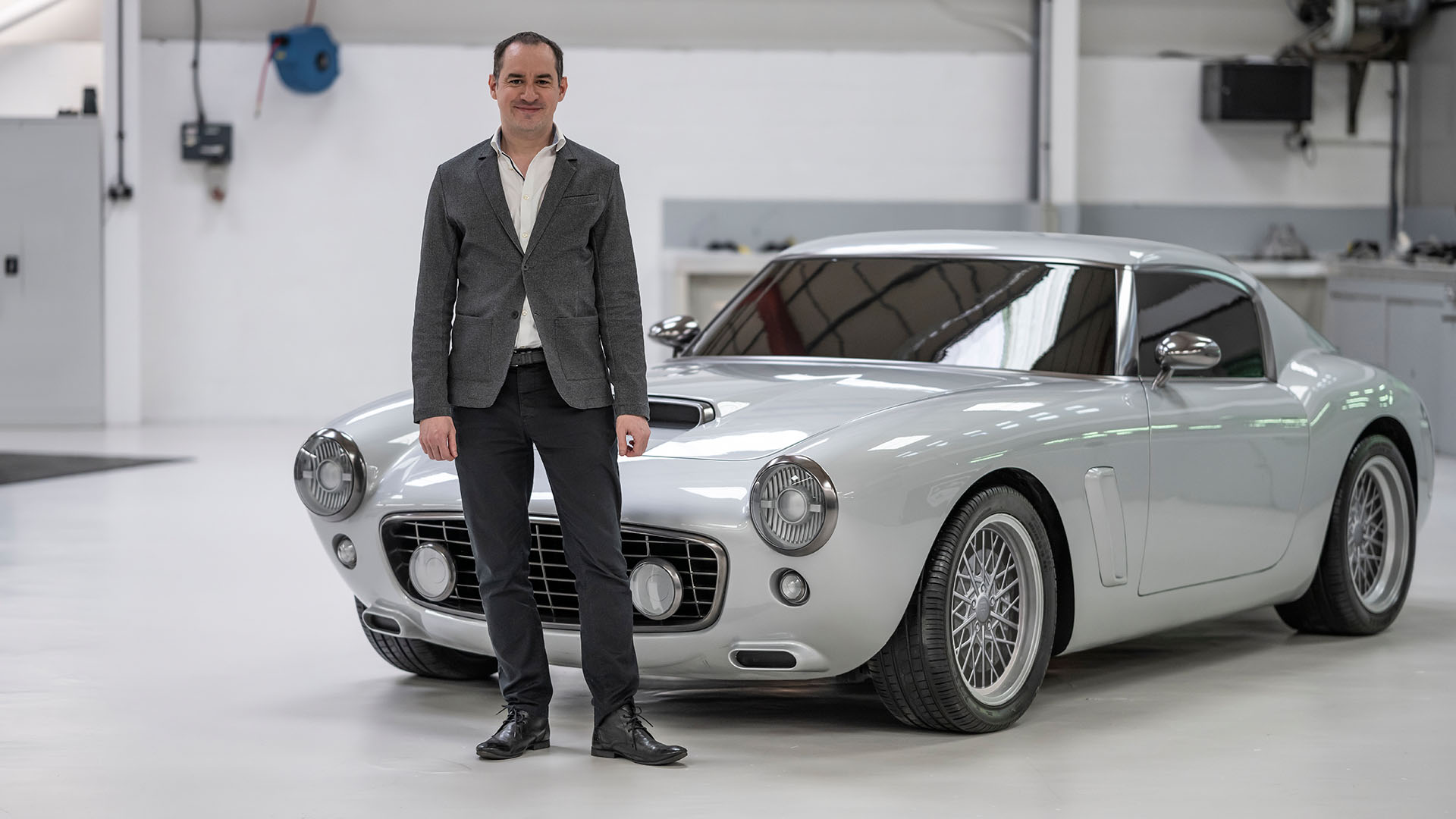
Remember the RLM SWB, which stands for Short Wheelbase we posted a while ago? Don’t worry, it’s still in the concept stage at this time, but it seems we’ll be seeing the first actual cars being delivered by Q1 2022, and if the renders are anything to go by, this might be a great looking, classic GT inspired by some of the greatest cars of the Fifties and Sixties.


A quick recap: RML Group located in Wellingborough, UK, will be building their “Short Wheelbase” as it is fully called, inspired by the legendary 250GT SWB from 1959, but while on one hand, the RLM SWB looks like a car from the Fifties, on the other hand, she will feature all the 21st-century amenities we’ve come to expect from a modern GT.
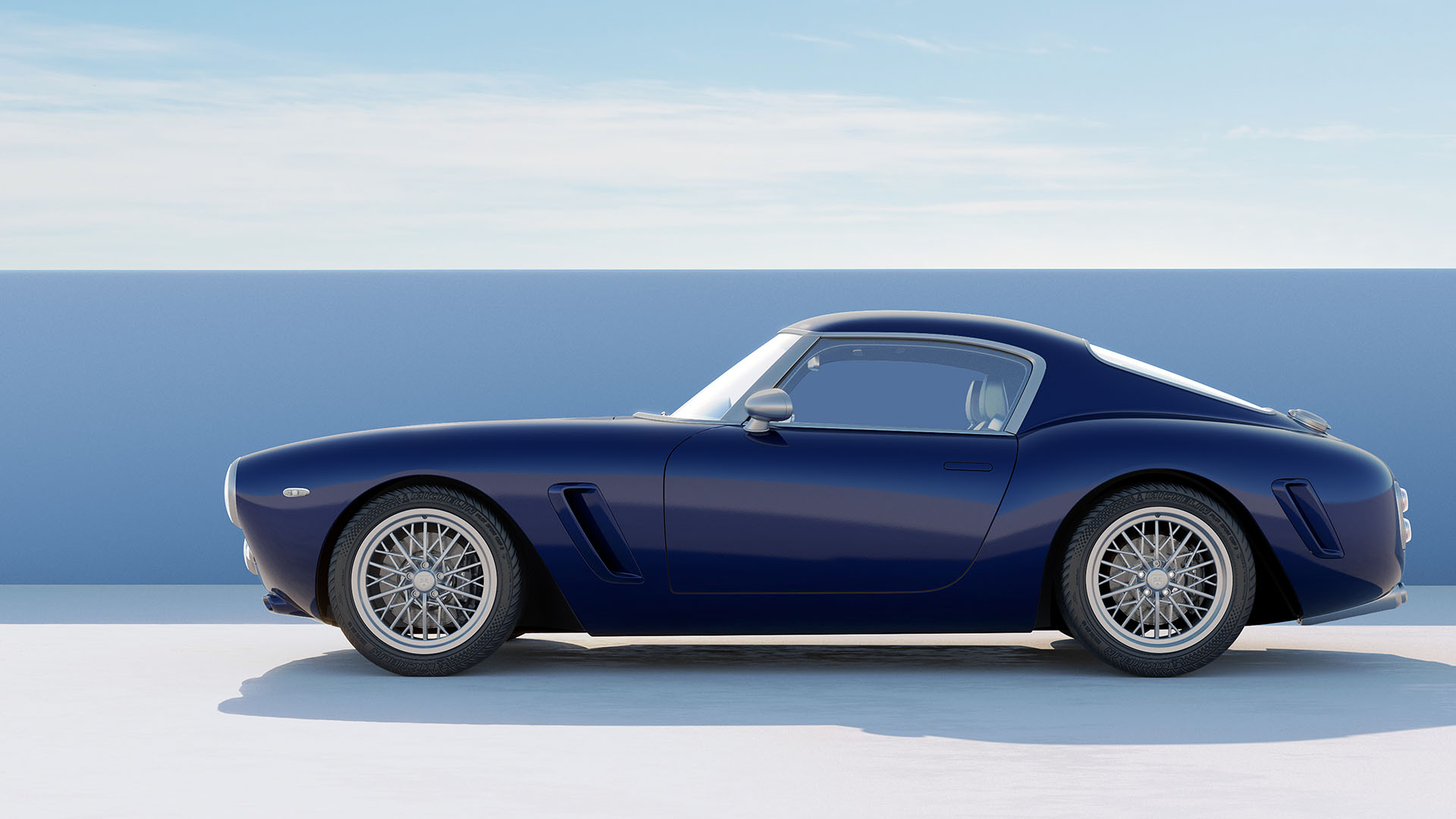

The RLM SWB will be using a genuine Ferrari engine, front-mounted, V12 with a displacement of 5474cc and a power output of 478 hp and 568 Nm of torque, all going to the rear wheels only, through a six-speed manual gearbox, the RML Short Wheelbase will not be available with an automatic paddle shifter for this modern-day classic GT, naturally the gearshift lever is mounted in an open-gated grid, just like in the good old days, and today RML finally reveals how the interior for this limited edition SWB will look like.
The body of the RML SWB is made from modern carbon fiber but still looks classic, that same idea has been taken into the interior too, it all looks classic and analog, but make no mistake, this is a very modern cabin that can easily fit drivers up to 6 ft 6 … the roofline for this amazing looking SWB was actually dictated by putting RML’s tallest employee inside the car, with a helmet on, none other than CEO Michael Mallock.
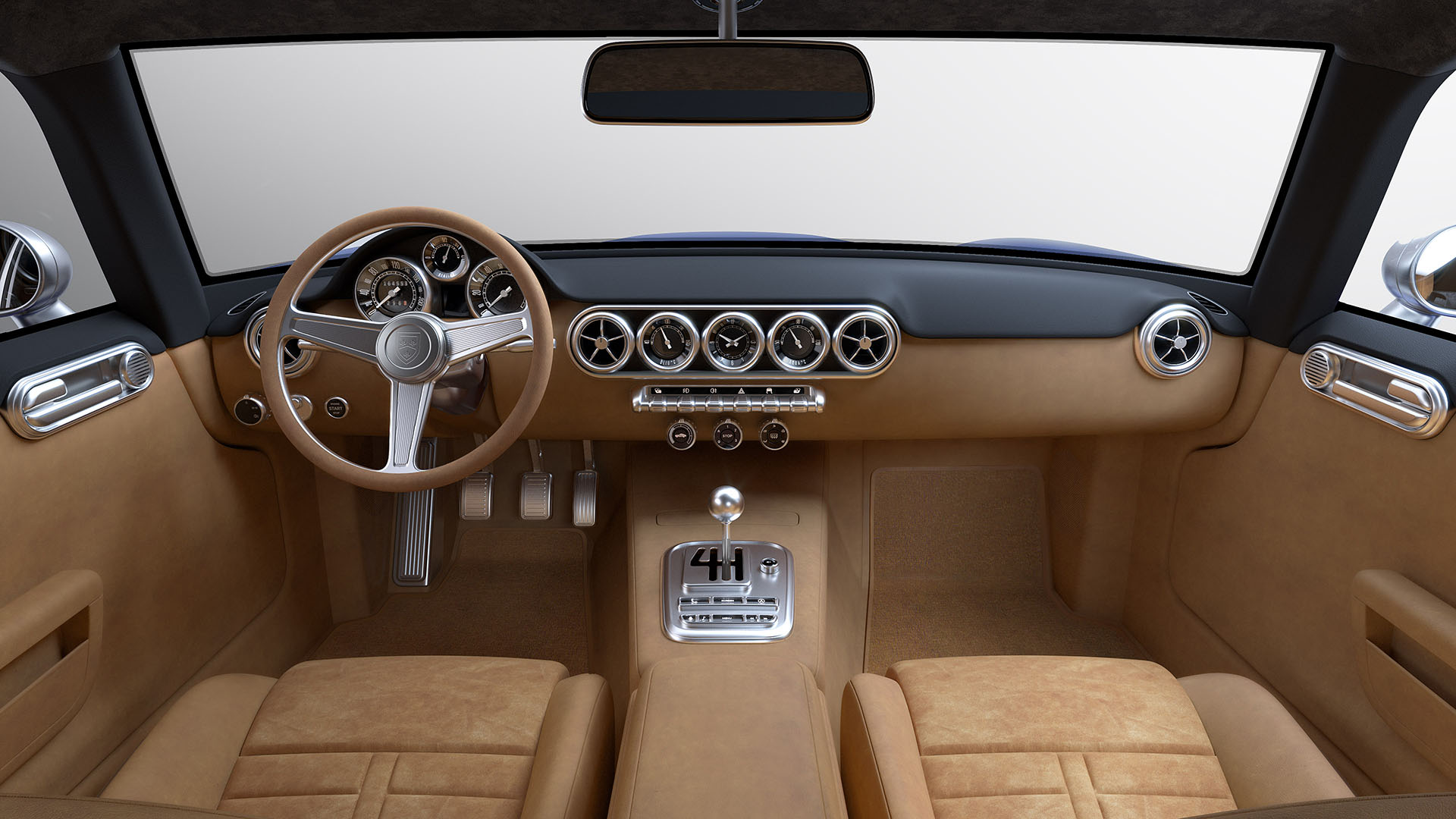

While an adjustable steering column was unheard of back in the Fifties, the RML SWB comes with both reach and rake adjustment of the stylish steering wheel, the seats inside this beautiful modern-day classic can be finished in either smooth leather or gripping Alcantara, but whatever upholstery the client requests, these seats offer so much adjustability just about any driver should be able to sit behind the wheel in the utmost comfort.
Some companies shop around for the more mundane items found inside the cockpit of their low-volume limited-edition car, but RML went the opposite route and spend a small fortune to make sure every little switch, every dial, and every stalk is a bespoke RML item, the stunning dials in front of the driver remind us of an expensive watch, and every surface on the inside of the RML SWB is either made from leather, Alcantara, aluminum, or glass … not a single piece of plastic will be found inside this GT.
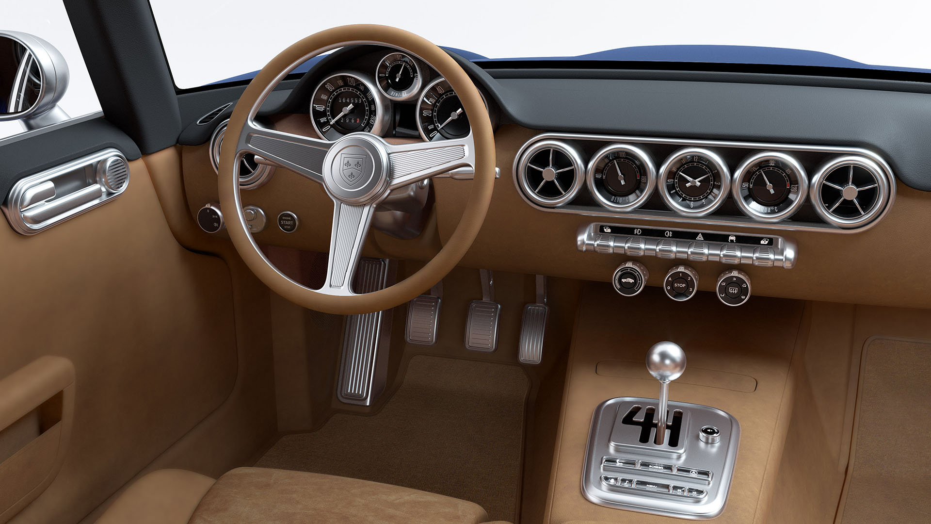

The RML SWB really is a modern car with classic looks, and this means a good working airconditioning system will be installed to keep both the driver and passenger cool, no matter what the climate is on the outside, this car even comes with cupholders, electric windows, electric seats, and electrically adjustable mirrors.
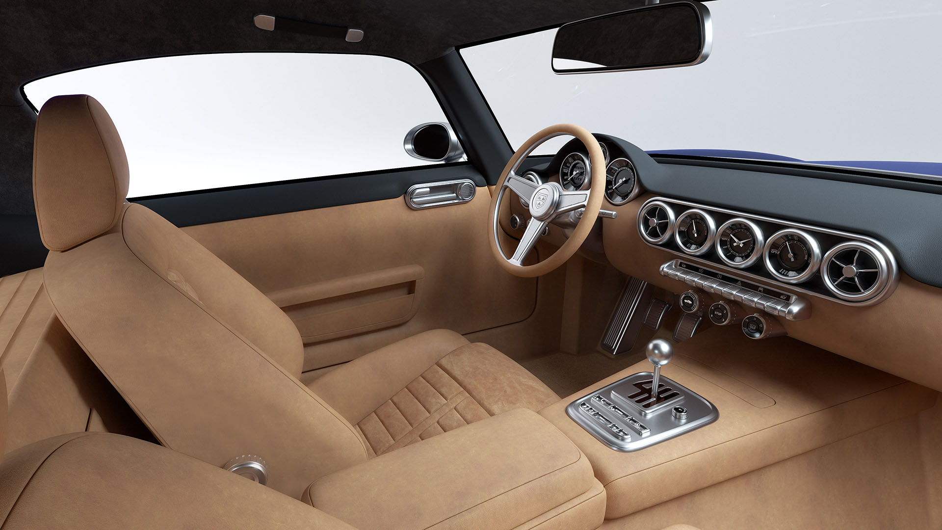

But how do you install a decent infotainment system in such a classically inspired car, both for the bodywork and for the interior, clients that are putting down this much money for a car these days expect to get the best of the best, not only in a pure driving experience but also in infotainment … so the RML SWB comes with a ‘hidden’ infotainment screen that only ‘pops up’ from the central console when needed. And it isn’t just a small, limited system either, it incorporates everything a customer expects these days from a high-end modern vehicle: Apple Car Play, Android Auto, and mobile phone connectivity.
