All posts in “Hermes”

The Phantom Oribe

Once you get to a point in life where you can walk into a Rolls Royce dealership and buy one of their top of the line Phantom models, you should feel a sense of achievement I guess, and if you are even able to custom order one of these flagship models with the exact options you like, that feeling gets even better, you’ll have to wait for it to be built in the UK, but in the end, you’ll have YOUR Rolls Royce Phantom, and your bank account will see a check for several hundreds of thousands of dollars being cashed … but you’ll be the proud owner of a Rolls Royce, you’ve made it in life.

But just like the world of yachts, you’ll have different degrees, and most of the superyachts or megayachts will be fully custom build to the exact wishes of the client, so you’ll either be rich … or super-rich, depending on the size of the yacht, and the people that are able to have Rolls Royce build them a truly bespoke car, with the help from one of the most famous designers in the world, will probably own one or more megayachts too, now I don’t know for sure if Japanese entrepreneur, art collector and supercar enthusiast Yusaku Maezawa owns a megayacht, but he is the proud customer for this Phantom Oribe, created in collaboration between Rolls Royce and Hermès.

This one-off gets its own, bespoke two-tone MZ Oribe Green and cream exterior finish, which was inspired by shades found in Mr. Maezawa ‘s private collection of ancient Japanese ceramics, this luxury on wheels has been specifically commissioned to complement a private jet the customer recently added to his collection.

The Rolls Royce Phantom Oribe is a one-of-a-kind car for sure, combining two houses with more than three centuries’ combined experience and heritage between them, the Oribe combines ancient and modern into one car, it shows unique stitching and upholstery techniques for the luxurious interior, while hand painting techniques were required for the stunning exterior.

The bespoke Oribe Green shade for this specific car has been created specifically for this single unit, matching the characteristic green and cream glazes of antique Japanese Oribe ware, and Rolls Royce even allowed the customer to use their bespoke paint mixture to be applied to his private jet, even after it took several months for the specialists in the Surface Finish Centre at Goodwood to match the lustrous, deep-green glaze that characterizes these 16th-century ceramics.

The Oribe style continues in the interior where it took Hermès designers and craftspeople in Paris, and the Rolls-Royce Bespoke Collective of designers, engineers, and craftspeople at Goodwood in West Sussex many months to create the individual components to showcase the tradition of both houses, mainly finished in Hermès Enea Green leather with Hermès piping on the headrest cushions and calf supports of the rear seats, while soft Seashell White accents and matching lambswool floor mats create a sense of light and space in this amazing interior.

As this was a collaboration between Rolls Royce and Hermès, the glove compartment lid proudly shows an embossed with Habillé par Hermès Paris signature, while Wooden speaker frets, are formed by meticulously perforating the Open Pore Royal Walnut veneer applied to the doors, and to really stand out, Hermès ‘Toile H’ canvas is used on the door armrests, center, and rear consoles and, most notably, the signature headliner … a first for Rolls Royce.

Because this is a Hermès edition Phantom, the leather upholstery boasts stitching and edge-painting techniques originally employed by master saddlers, while the dashboard fascia on this specific Rolls Royce Phantom has been adorned by a special commission artwork based on a design by the celebrated French artist and illustrator Pierre Péron (1905–1988), inspired by the famous Hermès horse motif, is hand-painted on Open Pore Royal Walnut and is shown in true art gallery style … behind glass.

I guess it might be true what they say, you drive a Bentley, you are chauffeured in a Rolls Royce, so Mr. Yusaku Maezawa will probably be found in the rear seat of this truly amazing looking Phantom, in the utmost luxury and style, another unique masterpiece made in Goodwood, the UK.

Time & Type: How Font Choice Can Shape a Watch Dial

From Issue Seven of Gear Patrol Magazine.

Many aspects of watch design are fascinating to analyze, and a true connoisseur can wax poetic about them all. Watchmakers, especially, will scrutinize every possible detail, but far too often, they fall short when it comes to one in particular: dial font.

Be it a generic typeface, one that doesn’t properly fill out dial space or simply a font that feels misplaced, there are a great many missteps that can kill an otherwise beautiful design. There are a few manufacturers, however, that know how important it is to develop a typeface that does a watch justice — here are three doing just that.

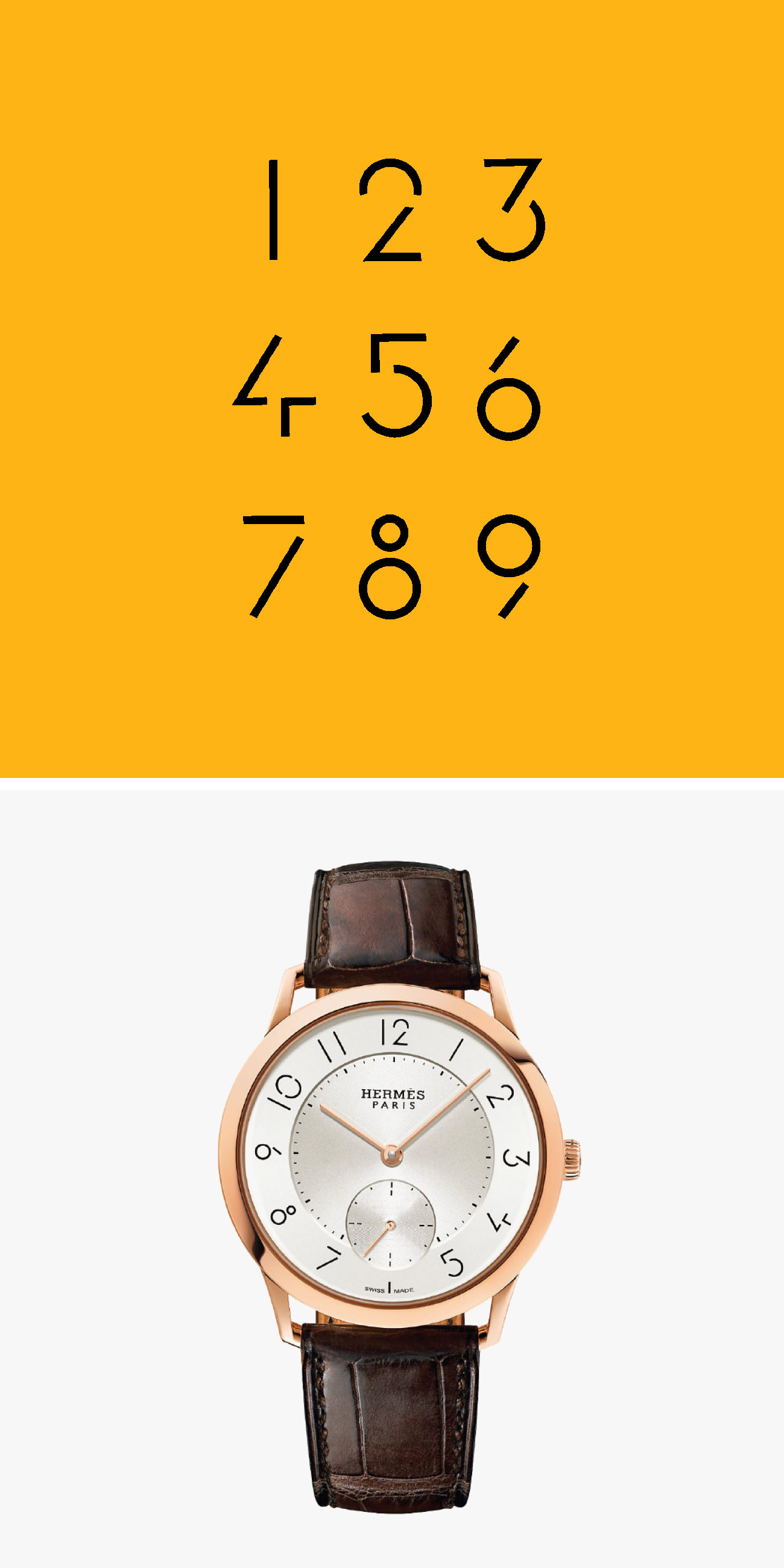
A few years ago, Hermès approached the French graphic designer Philippe Apeloig to create an all-new typeface for its upcoming Slim d’Hermès. The French fashion house, in the midst of adding more in-house movements to its collection, only stipulated that the font do justice to the light, sharp architecture of the minimalist timepiece. Apeloig — whose work with typography was well-known in France — delivered one of the most distinct typefaces the watch industry has ever seen.

“The challenge was to make the watch light visually speaking, pure and perfectly in harmony with a sense of minimalism,” Apeloig says with the kind of poeticism you’d expect from a Parisian designer. “Sobriety and minimalism were the qualities I was reaching for, so I built in constraints, limiting the number of shapes — circles, triangles, curves, dashes — that I could use to create the numbers.”

The typeface on the Slim d’Hermès is sleek and minimalist, but its most striking aspect is the presence of several “imperfections,” as Apeloig calls them, that bisect each character and were vital in helping Apeloig achieve his vision of visual lightness and balance. “They reduce each number to its elemental parts… when the numbers were assembled in a grid, a rhythm arose between the blackness of the line and the whiteness of the voids,” he says.

Interestingly, these imperfections have another, more functional effect: they’re naturally eye-catching, drawing the eye in and aiding in the kind of clear, at-a-glance legibility that so many watch critics laud in a timepiece. Here, Aeperloig created a font in which the concepts of function and form are not mutually exclusive, a fact he is fully cognizant of. As he puts it, “the functionality of an object should not be an obstacle to creating typography that is aesthetically beautiful.”


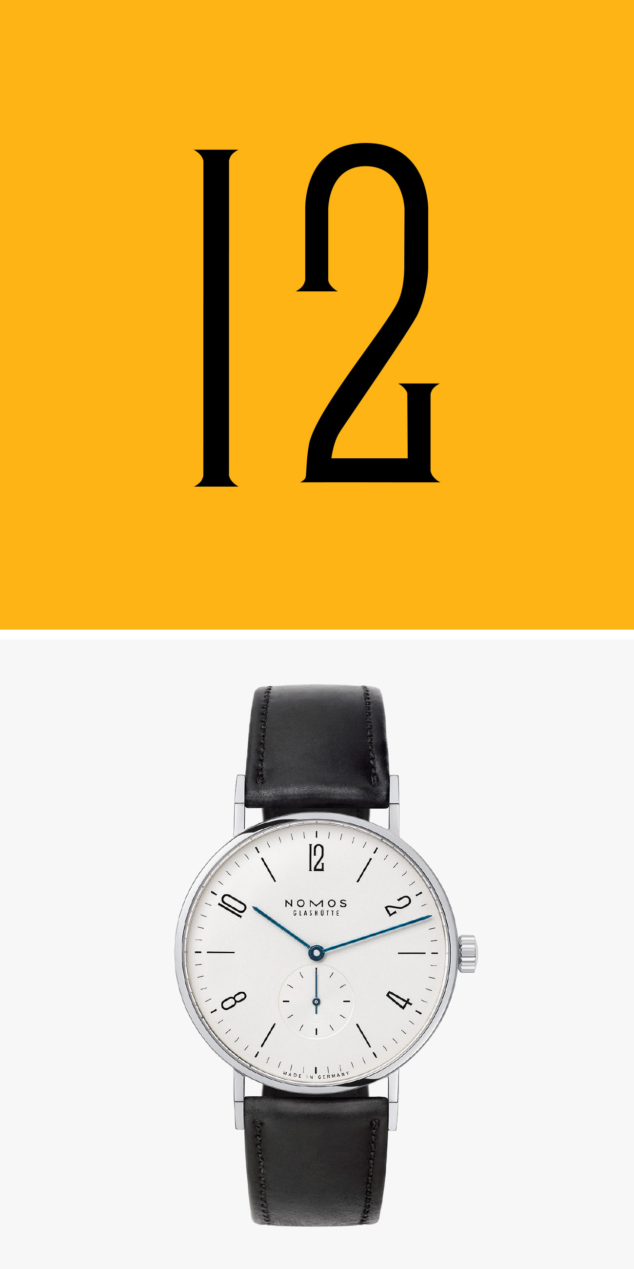
Since it launched in the early ’90s, Nomos has become one of the leading forces in modern watch design, thanks to its relentless adherence to the principles laid out both by the Bauhaus school of design and its predecessor, the Deutscher Werkbund movement of the early 20th century. According to Nomos designer Thomas Höhnel, “These principles include precise proportions, refined aesthetics, clear legibility, and a strong emphasis on functionality. The combination of these features inevitably leads to a certain look.”

Naturally, these principles extend to the typefaces used on Nomos timepieces. Perhaps most iconic to the brand is the Tangente, a watch inspired by a rare German timepiece from the 1930s. “The typography was completely redeveloped and features very straight linear Arabic numerals,” says Höhnel. “What makes the typography so unique, and therefore so striking, is its linearity and length.”

It’s this linearity that helps Nomos and its designers achieve its minimalist aesthetic. Too much negative space and the dial could look dull, but the length of the Tangente’s numeral breaks up that space by clearly and evenly segmenting it. “Space is extremely important for the segmentation of the dial, and to help find the right proportions. The logo and typography have to be placed on the dial in a way that creates a harmonious impression overall,” Höhnel says.

The Tangente is iconic to the brand, but as their lineup grows, Nomos designers need to find ways to stay true to both Bauhaus principles and its core aesthetic. In Höhlnel’s Red Dot Award-winning Ahoi diver, for example, they modified the Tangente’s numerals to be thinner and shorter, lending themselves to a sportier look.

For other models that further deviate from that formula — like the Nomos Club — the designers rethink the watch from the ground up, beginning with the case and finding a suitable font that satisfies both the brand’s identity and the purpose of the watch. “The Club, for example, is an entry-level, everyday watch for younger wearers, which is why it also has a more youthful typography, yet even here it is archetypal and modern,” Höhnel says. “Ultimately, all the design elements of a watch have to work together.”


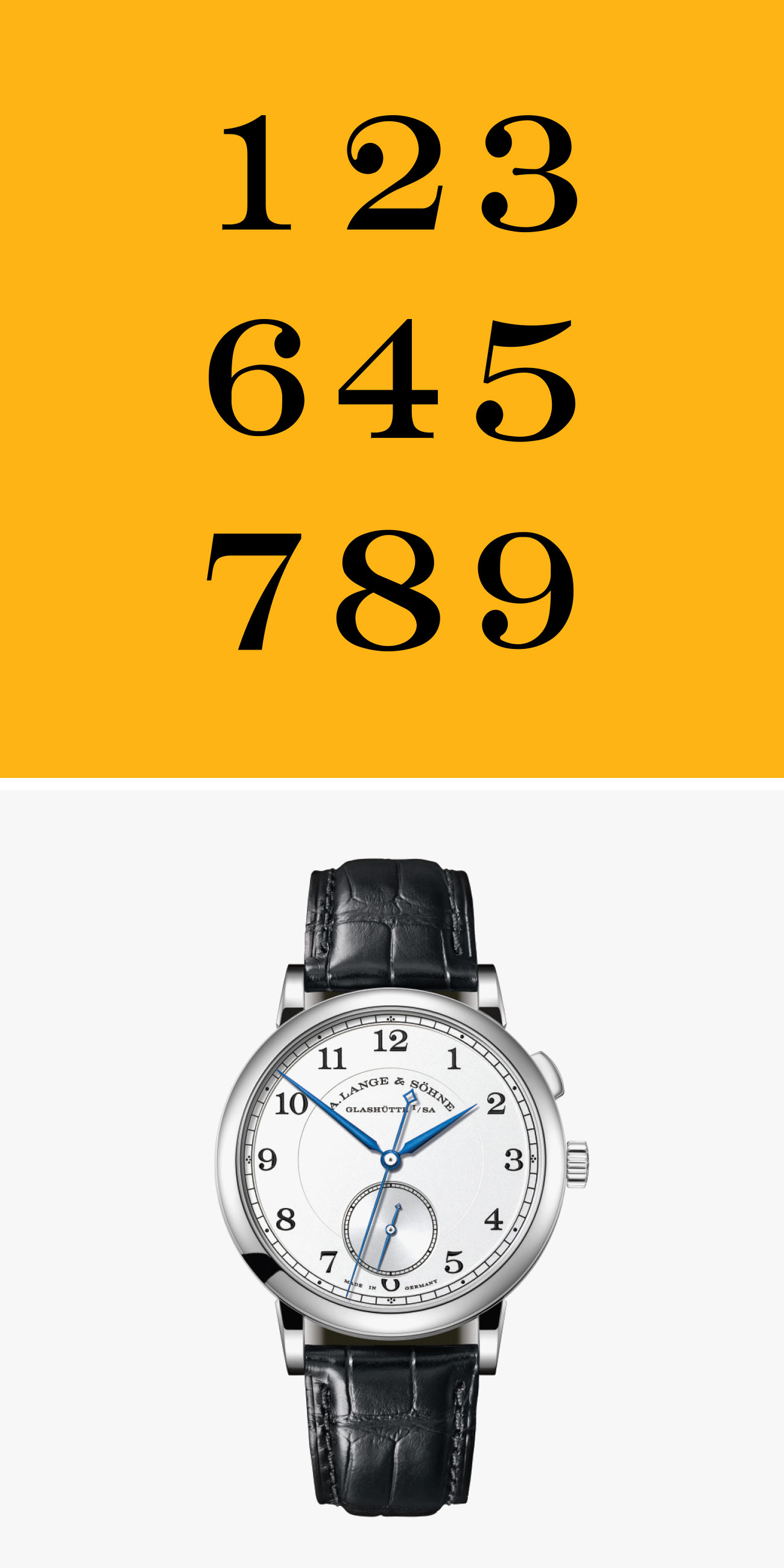
Though the A. Lange & Söhne as we know it was born in the 1990s, it has roots in Glashütte that stretch back to the mid-19th century when Ferdinand Adolph Lange (great-grandfather to founder Walter Lange) brought watchmaking to the sleepy German village. Thus, Lange’s approach to watchmaking is both simultaneously classic and modern, paying homage to its history while always looking forward and reinventing its high-end complications.

Naturally, Lange’s approach to typography is emblematic of that dichotomy. The font used by the manufacturer is, according to Director Product Development Anthony de Haas, “bespoke, inspired by Engravers, an all-caps font designed around 1900 by Robert Wiebking who at the beginning of his career worked as an engraver himself.” There are, of course, some major deviations from Engravers; notably, the letters are stretched wider and cut leaner. The result, Haas says, is clearer, finer and “a touch more modern.”

In placing typeface throughout the dial, A. Lange & Söhne has the challenge of its complex mechanics to contend with. The brand is known for its high-complication watches, things like chronographs and perpetual calendars that require sub-dials to convey more information. “At the beginning of the development process, calibre and product designers consider jointly how the indications should be arranged on the dial and which consequences this will have on the construction of the movement,” Haas says. “The aim is always to avoid intersections and give each indication space to breathe.

“Typography plays an important role in the design process,” Hass continues. “Sometimes, the first draft is already close to the final dial configuration. But very often, hardly perceptible details have to be modified many times before the designers are satisfied. This process can be summed up as follows: Letting ideas compete with each other filters the better from the good.”

Note: Purchasing products through our links may earn us a portion of the sale, which supports our editorial team’s mission. Learn more here.