All posts in “Design”

The ARES Design S1 Project

ARES Design is based in Modena, Italy, and you might know them for the reïncarnation of the De Tomaso Pantera, which they call the Panther Progettouno, a stunning, 21st-century remake of that amazing Lamborghini Countach competitor from the Eighties (the Pantara was built between 1971 and 1993 by the way).

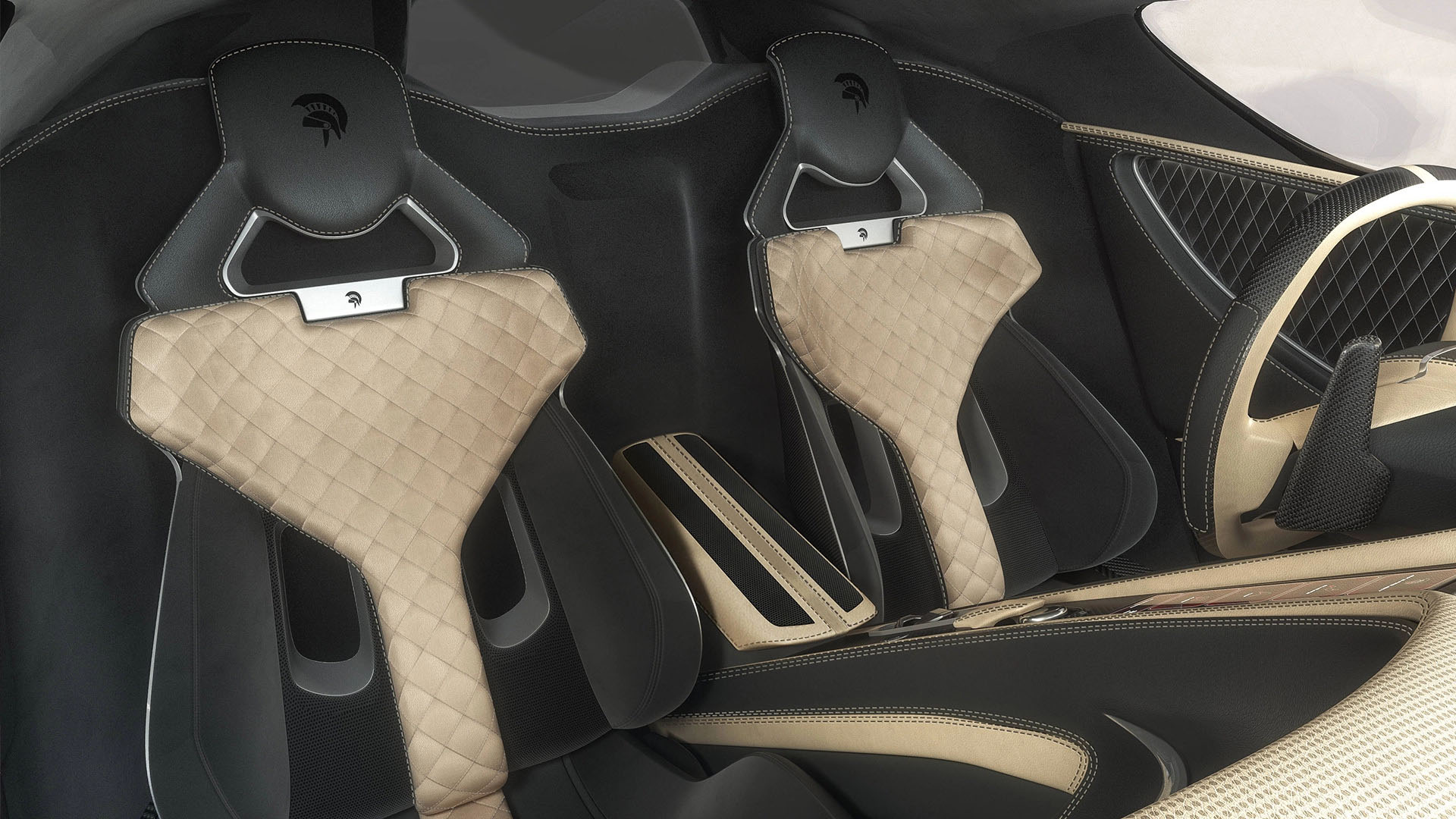
But ARES Design also created a very impressive concept car, the S1 Project, a mix between the looks of a hypercar, the speed of a supercar with the accessibility of a sportscar. All while taking inspiration from racecars from the Sixties and Seventies. ARES Desing’s Centro Stile made extensive use of CFD studies to create the best possible aerodynamic body, naturally made from carbon fiber, with a very low front splitter, stylish wheel arches that hold massive, bespoke wheels. The rear spoiler on the S1 Project is adjusted dynamically, while the exhausts come out of the engine cover, this way the entire tail section is extremely clean looking and boasts one single taillight design from left to right.

The side profile of the S1 clearly shows how far forward the cockpit sits in this design, creating an aggressive look, while still maintaining a very ‘flowing’ style and offering the maximum downforce possible with the least possible drag coefficient

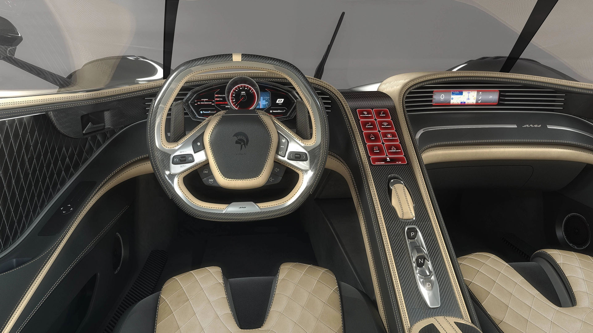
A concept design like the ARES S1 Project wouldn’t be complete without a bespoke, futuristic interior. A central console that runs from the top of the dashboard all the way down between the two seats, containing the HMI naturally, it seems the dashboard cluster will be made out of LCD displays anyway. Luxurious Alcantara will be combined with the finest Italian leather to create a perfect match with the carbon fiber used on various panels, there’s even an LCD in front of the passenger in the S1.

At this moment there isn’t a price set yet, and as far as we know, the S1 is still in the project stage, not even in the prototype stage … but it does look amazing nonetheless.

Some more photos of this amazing concept:

Tsai House

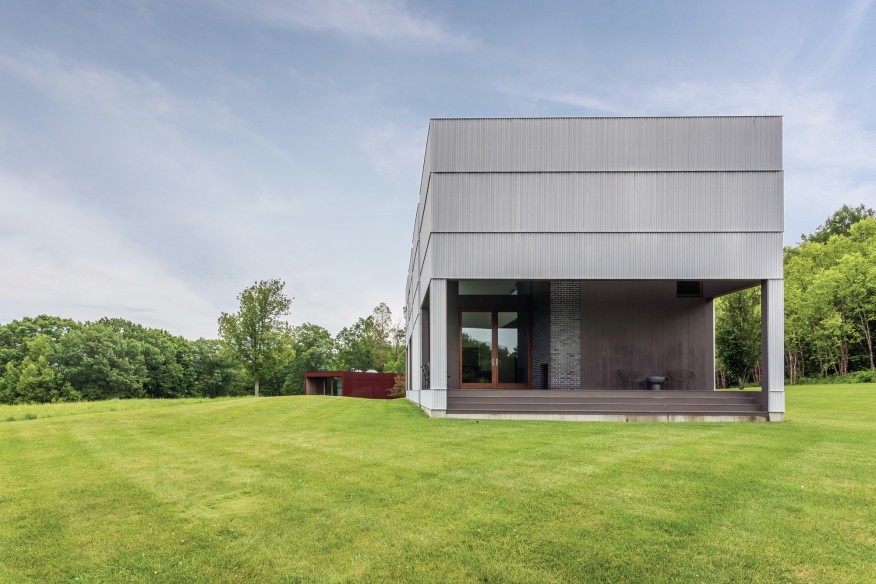
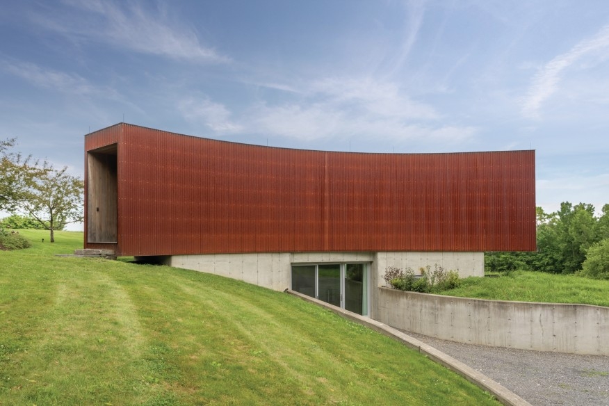
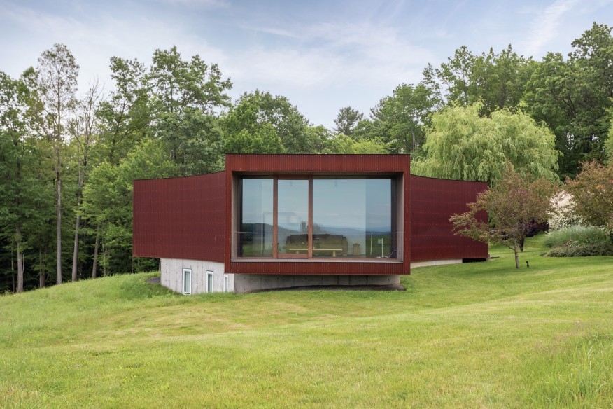
You’re looking at the only house in the United States legendary artists Ai Weiwei designed. And it’s yours if you have $5.25 million. The Tsai House, or Tsai Residence, sits in the town of Ancram in upstate New York, built there in 2006 as a weekend retreat of Christopher Tsai. Tsai is considered the foremost collector of Ai’s art.

Graham Klemm listed the house on June 2020. The current owners bought the home from Tsai in 2013 for $4.25 million, a million less than the current sticker price. Yes, real estate is a crazy industry. Of the owners, Klemm says:

“They are art lovers, and the house is livable art. It’s extremely finely detailed and extremely interesting.”

If you don’t know Ai Weiwei, shame on you. Just kidding. Seriously, though — he’s one of the most high-profile artists in existence, in large part because of his political activism. For the 2008 Summer Olympics, he collaborated with the architects Herzog & de Meuron on the Beijing National Stadium, also known as the Bird’s Nest.

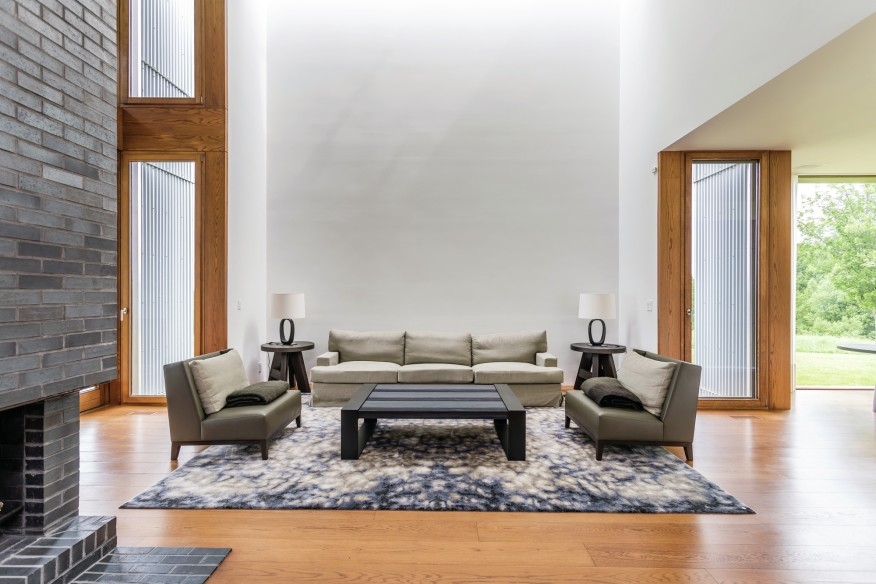
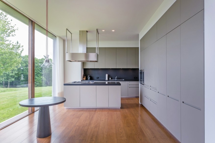
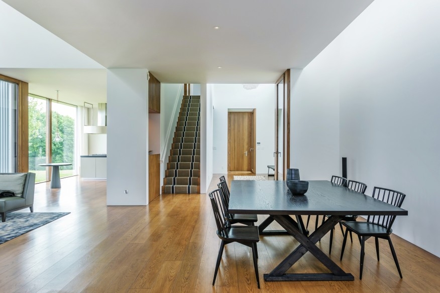
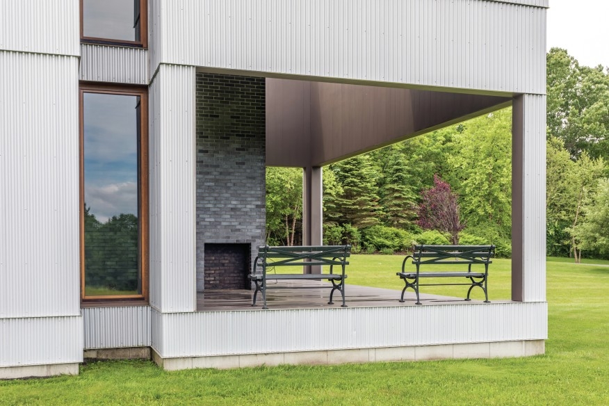
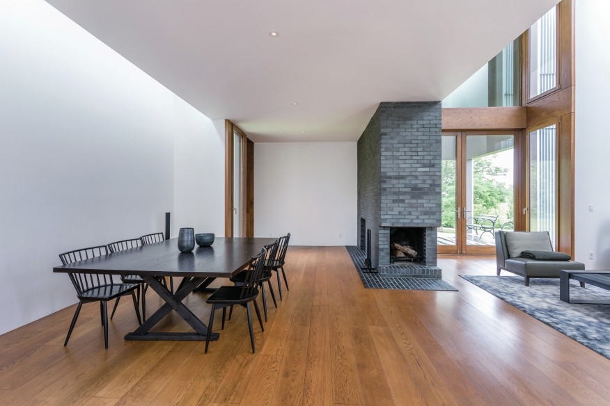
Enough about Ai Weiwei and more about the house. It sits on a hill at a property that spans 37 acres. The house features three bedrooms and the same number of bathrooms. Four connected modules make up the residents, clad with corrugated metal on the exterior. Then you have soft gypsum wood panels on the interior. You’ll find an abundance of large glass windows, which come coupled with solid walls to bring the outside in as much as possible. The empty wall spaces also invite potential owners to hang their favorite art.

Klemm considers the design as very minimalist. He adds that agricultural sheds of farms flocking the area inspired the overall design.

CHECK IT OUT

Photos courtesy of Klemm

Rosario House

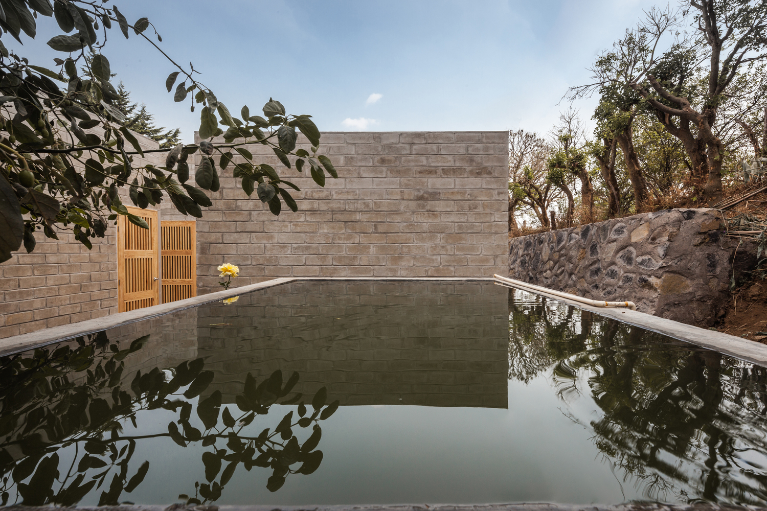
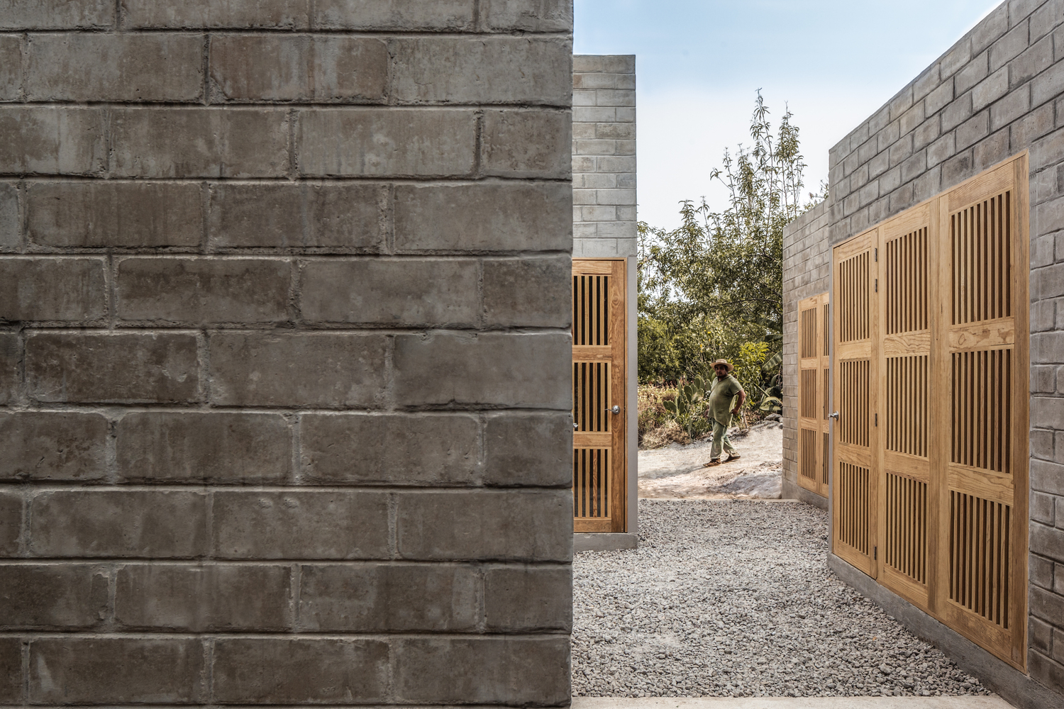
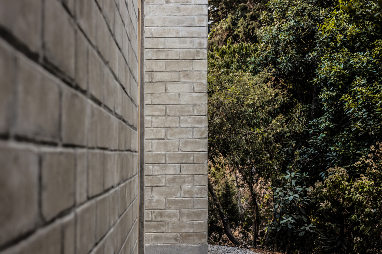
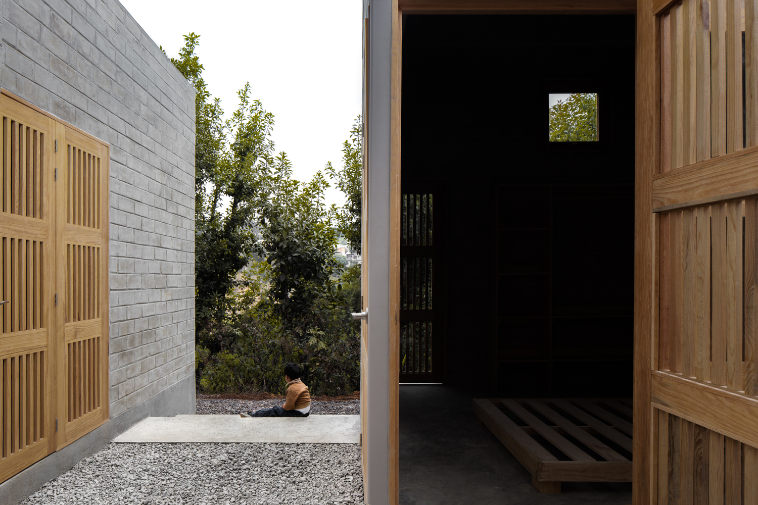
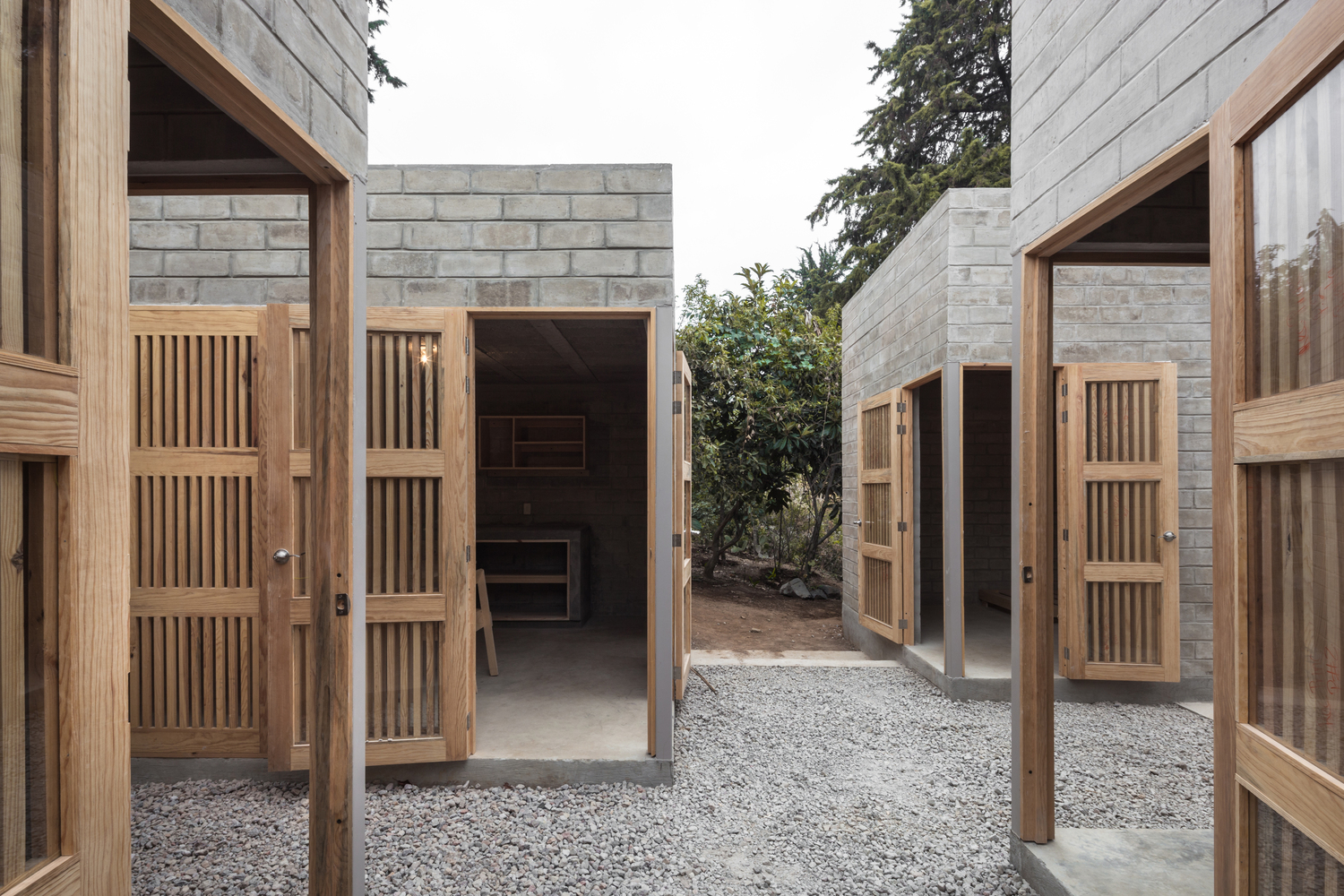
The Rosario House, as the name suggests, is a residence, built specifically for a family seeking solace by virtue of plant cultivation. Set in Ocuilán, Mexico, it comprises of four individual cubes connected via open-air circulation. Each feature a different height and width, and thus assumes an identity unique from its siblings. Large wooden openings serve as the glue that binds these cubes together.

A family of three lives here, and their dedication to plant cultivation is apparent in the design of their home. The architects made sure to emphasize the surrounding nature through openings toward the trees and magenta flowers of the bougainvillea. Since the house features four very disparate cubes, the designers sought to integrate all of them by virtue of a constant relationship. Here, that means various passages that evince a synergy without crowding the structures.

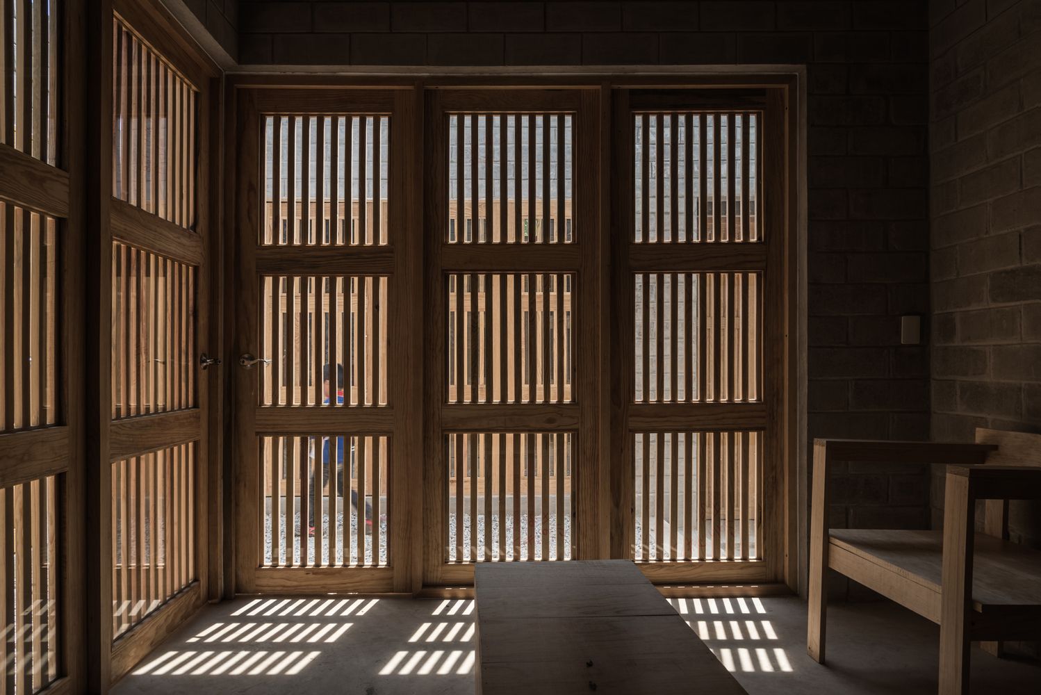
There’s a gravel lawn, and to get to it, you have to go through the wooden screens featured in each cube. When closed, the doors offer a boundary between rooms. But when opened, the interiors are allowed to spill outward, while also welcoming the outside in. It’s a delicate balance that prioritizes transformation instead of conventional definitions of shelter. Here you have a dwelling that recontextualizes the essence of space. As something that separates one plot from another, it succeeds. In the same vein, Rosario House makes sure to corrode the very notion of boundaries and find a way to stitch up the individual parts.

That’s a true achievement. Talk to any architect about broken space and they’ll tell you how difficult it is to connect them organically. Check out more photos below.

LEARN MORE

Photos courtesy of Moz & Oscar Hernández and Rojkind Arquitectos

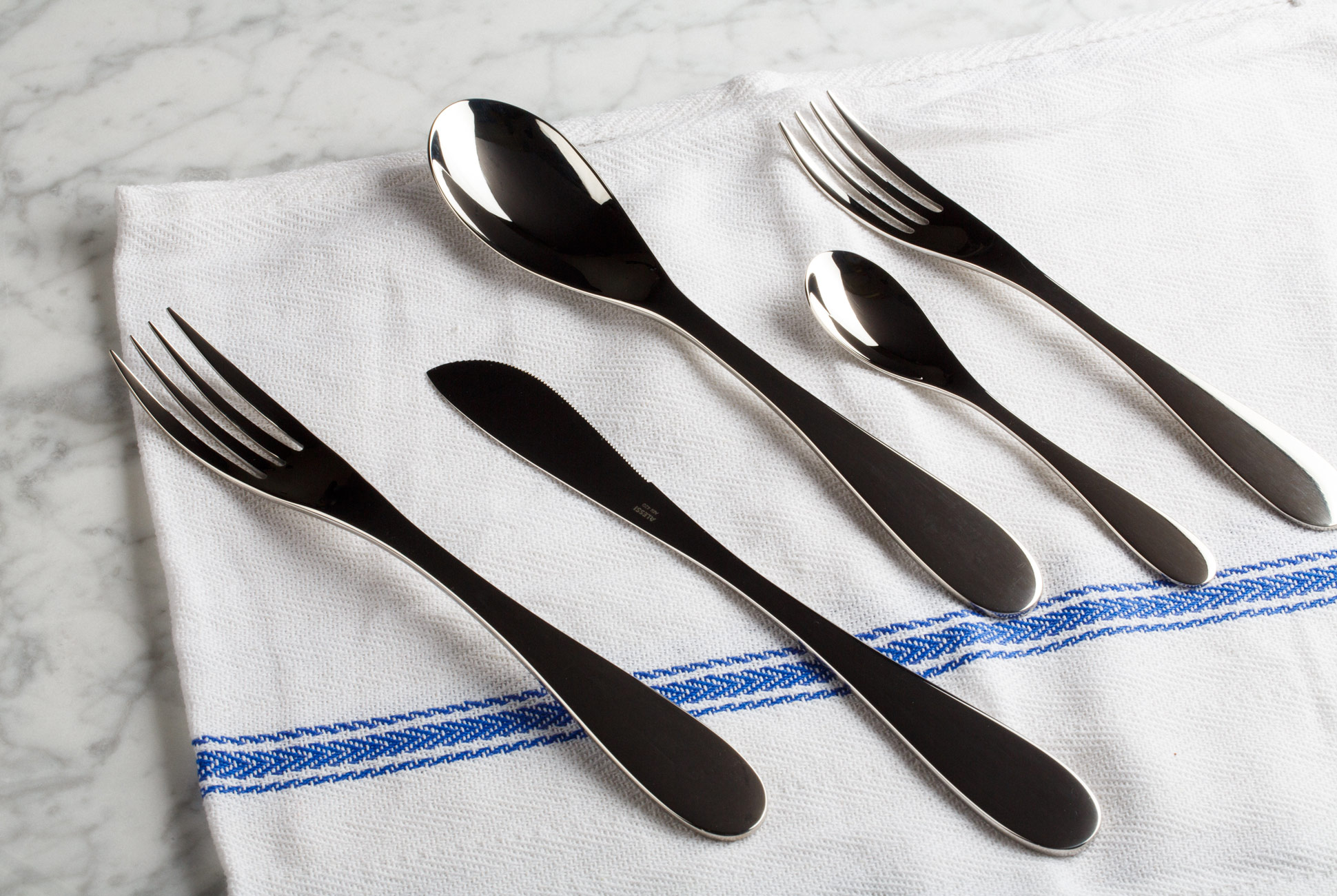
5 Modern Cutlery Sets Designed by Famous Architects

Architects design structures made to be lived in, worked in, studied in. Or simply seen and interacted with. Yet many distill their design ethos into functional tools for the home. More affordable and with shorter production times, everyday objects like chairs make an architect’s point of view more accessible to the masses. All the more so with silverware. While less common than furniture, architect-designed cutlery condenses the underlying ideologies of large-scale projects into handheld tools. Below, find five flatware kits from world-renowned architects, each of which reflects its maker’s signature style.

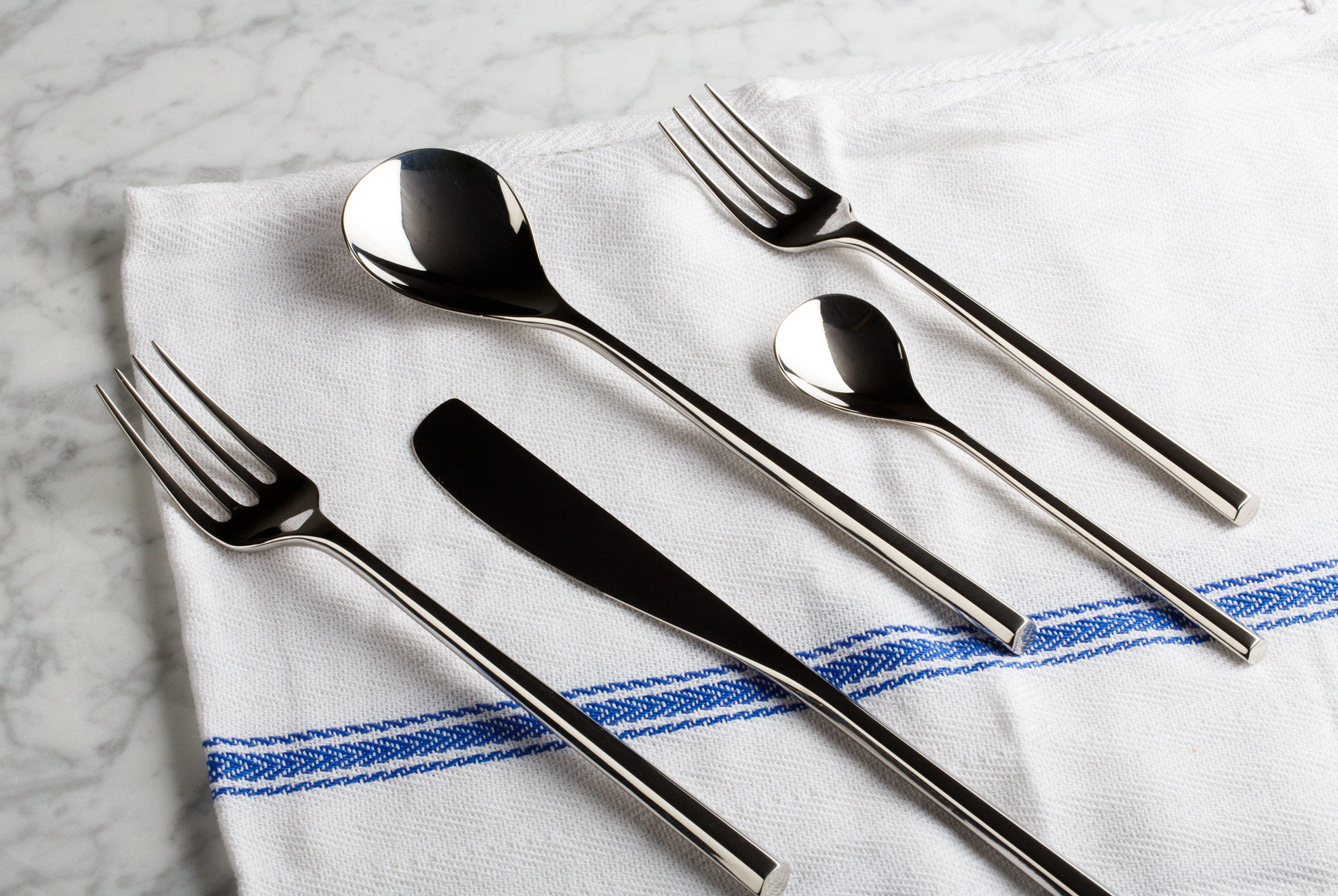
Alessi Mu


With handles that echo chopsticks and shallow spoon bowls inspired by gingko leaves, Pritzker Prize–winning architect Toyo Ito applied Japanese influences to Western-style cutlery in his Mu flatware collection. Ito has built his career on architecture intended to liberate buildings from the confines of an urban grid, relaxing boundaries by integrating negative space and faceted windows into solid forms.

Year Created: 2013
Architect: Toyo Ito
Notable Buildings: Kaohsiung National Stadium, Taiwan; Museo Internacional del Barroco, Mexico; Za-Koenji Public Theater, Tokyo; Taichung Opera House, Taiwan

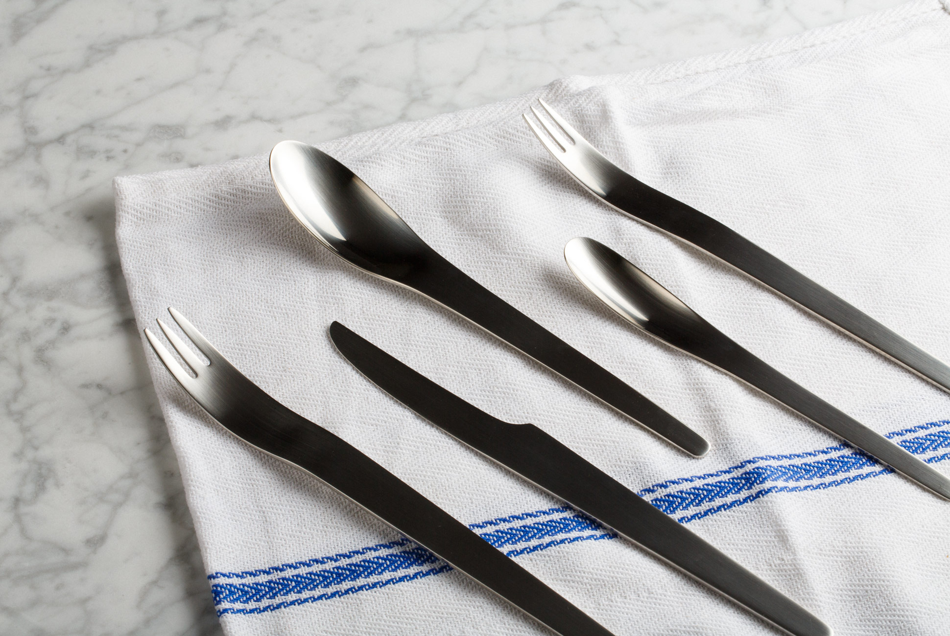
Georg Jensen Arne Jacobsen


Guided by a less-is-more mentality, Danish mid-century architect Arne Jacobsen remains best known for his 1958 Egg Chair, created for the lobby of Copenhagen’s SAS Royal Hotel — which he, too, designed. Jacobsen’s cutlery set, produced by Georg Jensen, maintains the same emphasis on minimal, futuristic shapes for which he came to be recognized — and was used by the crew of Discovery One in Stanley Kubrick’s 2001: A Space Odyssey.

Year Created: 1957
Architect: Arne Jacobsen
Notable Buildings: Danish National Bank, Copenhagen; SAS Royal Hotel, Copenhagen; St. Catherine’s College, Oxford

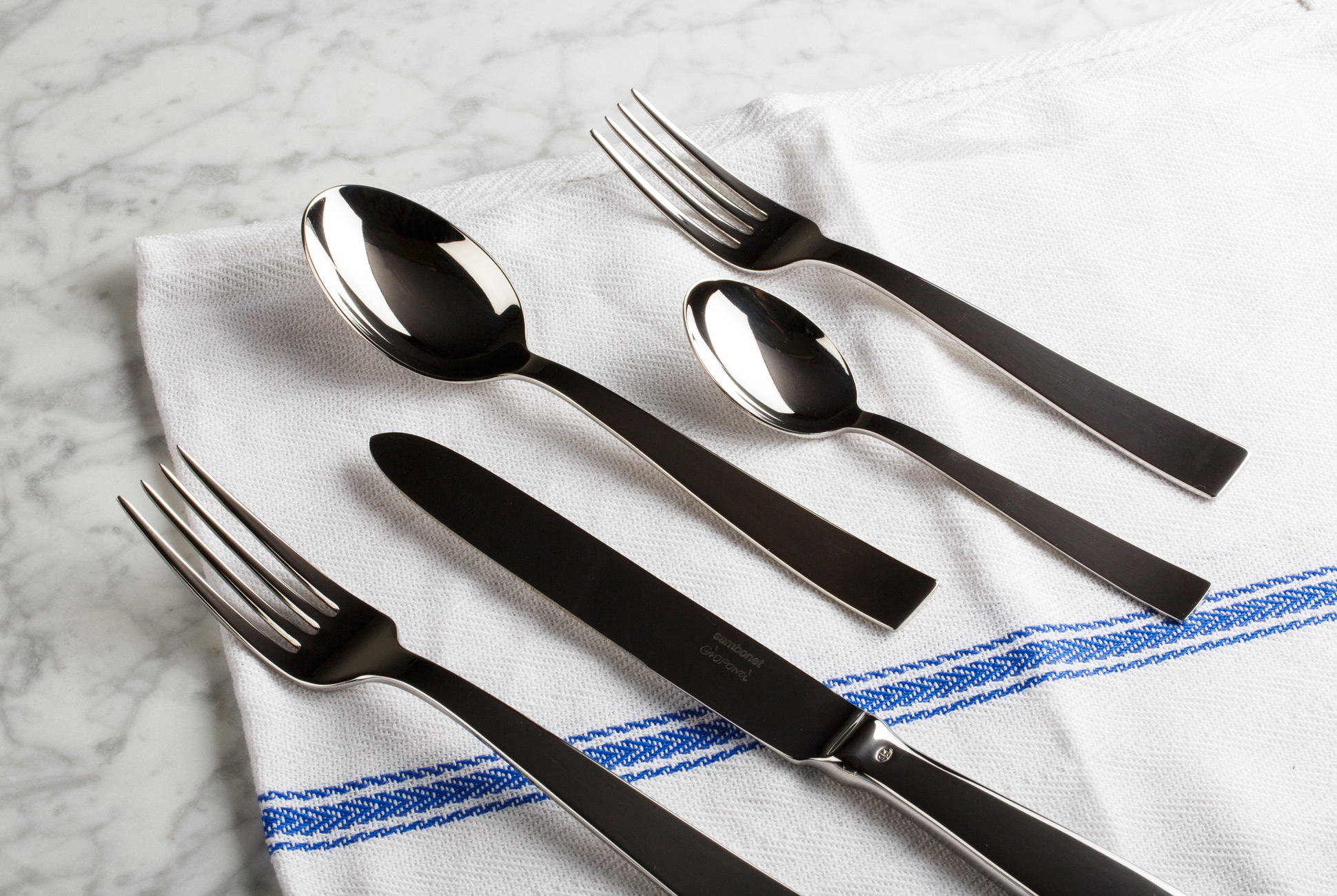
Sambonet Gio Ponti


Italian architect Gio Ponti’s wide-ranging output can seem disjointed, flitting from buildings to furniture, interiors and design objects without adhering to any one aesthetic. Yet Ponti, whose roots were in neo-classical Italian design, set out to create structures and objects that were just as satisfying to view as they were to engage with. Ponti’s utility-driven influences are apparent in his flatware set, with squared handles that provide a more comfortable, balanced grip.

Year Created: 1954
Architect: Gio Ponti
Notable Buildings: Pirelli Tower, Milan; Parco dei Principi Hotel, Sorrento; Denver Art Museum, Colorado

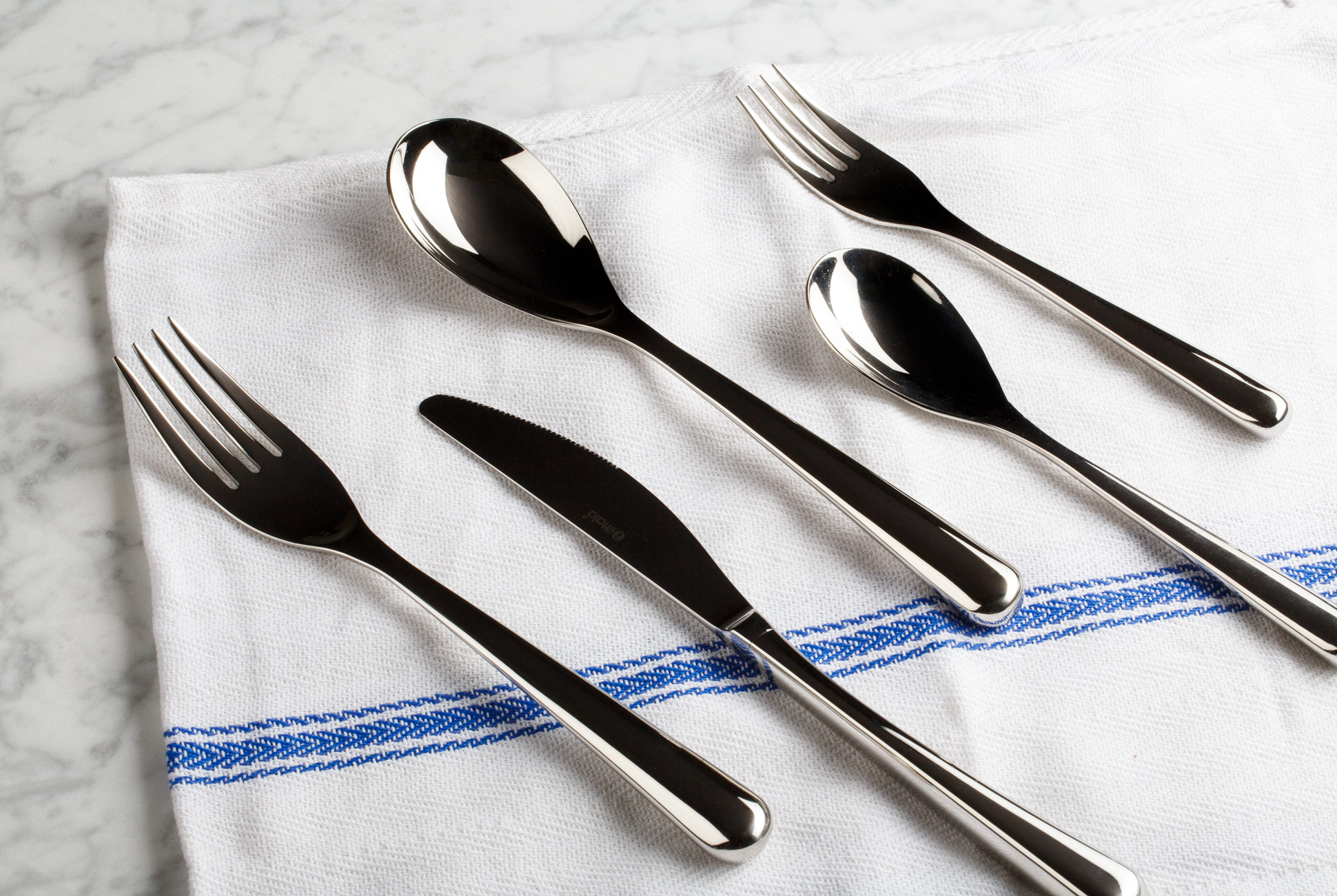
Iittala Piano


Born into a family of builders, Pritzker Prize–winning Italian architect Renzo Piano often leaves the structural elements of a building visible, integrating them within its final form, as in the case of Paris’ Centre Pompidou. Just as Piano designs both interiors and exteriors with a building’s intended purpose in mind, his flatware set, with smooth, rounded forms and hollow handles to reduce weight, is made to feel like an extension of the user’s hand.

Year Created: 1998
Architect: Renzo Piano
Notable Buildings: Whitney Museum, New York; Centre Georges Pompidou, Paris; The Shard, London

Alessi eat.it


Wiel Arets’ flatware set is designed to be stacked vertically, proposing a new way of setting a table. Reductive but not delicate, Arets’ architecture is characterized by minimal, geometric forms, with structures that integrate within the surrounding environment and remain amenable to future changes.

Year Created: 2014
Architect: Wiel Arets
Notable Buildings: Utrecht University Library, Netherlands; AvB Tower, Netherlands; Truman Plaza, Berlin

How to Design a Business Card, Explained by a Master Stationer

After a handshake and salutation, a meeting between businessmen ends with the exchange of cards. It’s a little antiquated; there are many other ways to find someone’s contact information in 2015. Yet, even today, a business card provides something that email, Twitter, LinkedIn, Facebook or Instagram cannot: a tangible representation of a person’s business. They are also, as Ted Harrington, President of Terrapin Stationers, points out, an extension of someone’s personal style.

Terrapin Stationers has been making engraved stationary, note cards and letters for over 105 years. In 2014 they relocated from Manhattan to New Haven, Connecticut. Today, Harrington estimates they make 100,000 sets of business cards a year. It’s a number, he admits, that isn’t tremendous. But the business cards Terrapin makes are what Harrington calls luxury — for the “one percent of the one percent.”

In the back room of Terrapin’s manufacturing facility, Harrington empties a box of business cards on the table. He explains that when somebody is handed a business card, and even before reading it, the first thing that person does is feel it. They feel its weight, size and, most importantly, the different processes that went into making the card, of which there are three: traditional offset printed, engraved or blind embossed, and letterpress.

Letterpress (black) and Blind Embossed (top)

Offset Printed (black) and Blind Embossed (top)

An offset printed (also known as lithographed) business card is flat printed and doesn’t leave any impression on the card’s back. “It’s probably the most budget-friendly business card,” says Harrington. “They’re great for companies who are ordering a ton of business cards.” They’re simple, but when printed on a good card stock, Harrington says they make beautiful, clean cards.

Engraved

Engraved

An engraved business card has raised type. They’re made when a negative copper plate, which is etched and coated with ink, then stamped down on top of the business card, leaving a positive impression. The process, which has been around since the medieval era, involves meticulously hand etching typesets into copper plates.

But in the past 25 years, technology has brought about photo engraving, which has made engraving decidedly easier. “We’re able to just etch type into a copper plate in an acid bath,” says Harrington. “It’s made our life a lot easier. We can turn around business cards that used to take six weeks in six days.”

Engraved and blind-embossed business cards are made the same way, but blind embossing doesn’t use ink. Both types of cards leave an impression (or “bruise”) on the back of the card. More of a refined taste, Harrington says engraved business cards are appropriate for investment bankers, attorneys, architects and designers. They’re also commonly carried by luxury hotels and watchmakers.

Engraved

Letterpress

Letterpress is the exact opposite of engraving. They use a positive magnesium plate to imprint into the paper, so the font is recessed or debossed. Cards can be printed on both sides, without leaving an impression on the other side. Harrington says he makes a lot of letterpress cards for younger people and younger brands.

But designing a business card isn’t as simple as choosing between letterpress, engraved and offset. Many of today’s cards combine a number of these processes into one. As an example Harrington points to his own card, which is blind embossed with “Terrapin” in its center, while his name and information are printed in offset.

One of the World’s Most Popular Kitchen Tools Was a Complete Fluke

From Issue Seven of Gear Patrol Magazine.

Richard Grace, inventor of one of the greatest tools the kitchen has ever seen, neither knows how to cook nor cares to learn. In the mid-’90s, he set out to make a wood-carving rasper and ended up with a culinary masterpiece called the Microplane: a cheese-grating, citrus-zesting, nutmeg-dusting revelation that today costs as little as $11 on Amazon. He’s an inventor in the truest spirit of the word, someone who treats ideation as a profession, not a calling. He doesn’t speak in buzzwords and has never hosted a TED Talk. He simply makes things and finds uses for them later.

“My father gets bored very quickly and he’s always thinking of different ways to solve a problem,” said Chris Grace, Richard’s son and the CEO of Grace Manufacturing, the family business that oversees Microplane. “Ask most people how many uses they could think of for a paper clip, they’d give you maybe half a page. My father might give you 10 pages. He’s still coming up with uses for that etched tooth.” He was referring to the dozens of razor-sharp, jagged teeth found on every Microplane.

When I asked Richard, at Microplane’s Arkansas factory, about potential uses for the tool, he leaned back in his chair, cracked a small grin and let loose: wall-hanging art, fasteners, interlocking washers, horseshoes, stints, medical instruments for optical surgery, table-saw blades and stainless steel sandpaper — which, according to him, would’ve worked if not for a tester using it improperly and hurting themselves. But never once did he expect the photo-etched tooth to make its way into the kitchen.

Microplane was conceived in a conference room in 1991. Back then, Grace Manufacturing was in the business of making small photo-etched parts for mechanical computer printers. Then the dot-matrix printer arrived, spelling an all-but-certain demise for the family business. The end in plain sight, Richard, his brother and a team of Grace’s brightest sat down in a whiteboard-filled room to brainstorm what they might do to stave off oblivion. “That was the cool term at the time, ‘brainstorming,’” Richard said.

The family was well-trained in the process of chemical photo-etching metals, and, as they had observed many, many times, the finished products were often exceptionally sharp. Richard swore he was buying Band-Aids “by the bushel.” So, as he tells it, “All those hours spent drawing up whiteboards, and we decided we were going to make something sharp.”

Richard Grace came up with dozens of uses for razor sharp photo-etched teeth but never once did he expect the to make its way into the kitchen.

The practice of chemically photo-etching was paramount to making parts for that bygone era of computer printers. Essentially, a film (not unlike camera film) is placed on top of sheets of metal, and an image (of a blade, for instance) is exposed on the film. The sheets are then sprayed with a chemical compound that dissolves all exposed areas of the image. The only serious thing left to do after that is punch your newly formed blades out.

This, according to Richard, is not all that difficult. “Give any real engineer half an hour of explaining and they could teach a seminar on it,” he said. Chris and Microplane’s VP of sales and marketing, Joel Arivett, don’t necessarily share this opinion.

Richard and his team set out to make a tall, thin blade with dozens of rounded, razor-sharp, photo-etched edges for the express use of carving and shaping wood. And they did; they just couldn’t sell any. “I mean, we probably didn’t make any money for a few years,” Richard lamented. “Not until that article published.”

In 1994, just three years after the original Microplanes were thought up, Lorraine and Leonard Lee, proprietors of Lee Valley Tools in Ottawa — a mail-order catalog that sold tools and gifts for Canada’s woodworking community — wrote the fate of the Grace family business.

Lorraine, a baker with an affinity for Armenian orange cake, wasn’t happy with her old kitchen grater. So she slid her husband’s Microplane over an orange. She was so astounded by the results, she had the description of the product changed in the store catalog to include its effectiveness at this seemingly niche kitchen task. This is how the story, “Test Kitchen; A Gift for the Cook, or Carpenter,” published by The New York Times four years later, began.

Before the Microplane brass could blink, they had become a kitchenware company — whether they liked it or not.

Penned by Amanda Hesser, who later cofounded the award-winning food publication Food52, this 516-word story was to become Microplane’s crossing of the Rubicon, from carpentry to culinary.

“After the Times article, basically everybody who sells anything contacted us,” Arivett told me. “Williams Sonoma; Bed, Bath & Beyond; Sur La Table — everybody. It was almost too much to keep up with.”

Before the Microplane brass could blink, they had become a kitchenware company — whether they liked it or not. Within the first month following the article’s publication, the brand saw its kitchen customers eclipse its woodworking customers ten times over. Microplane, the wood rasp, sold between $300,000 and $400,000 a year; by 2002, Microplane, the kitchen gadget, did that in a month. According to Chris, they weren’t able to project or map the company’s growth. “We’d list the monthly sales goal on the sales floor, and we’d crush it so hard it became worthless,” he said.

Then came an even bigger boom, one fueled by the power of the original kitchen influencers: celebrity chefs. Martha Stewart, Ina Garten, Rachel Ray and virtually anyone that mattered used a Microplane on their shows, calling it out by name for their audience. Julia Child liked the product so much, it earned a permanent spot hanging on the wall of her kitchen, which was later replicated at the Smithsonian. And Oprah’s personal chef, Art Smith, once called it “the most coveted tool in chefdom.”

But for all the brilliance of the original invention and the Grace family business savvy, they still weren’t sure what they were selling. “None of us were cooks,” Chris said when I asked him if the Grace family was culinarily inclined. Richard laughed when I asked him the same question, but he agreed: “I’d say, no, we’re not foodies.”

“We’d go into Sur La Table on business trips and find our packaging all over the floor, but all the Microplanes sold out.”

The product’s original packaging was a cardboard sleeve with no branding at all. Not that it mattered, because the sleeve would fall right off when hung on racks in stores. “We’d go into Sur La Table on business trips and find our packaging all over the floor, but all the Microplanes sold out,” Arivett said.

Around this time, Chris — who had left home for a job at TRW Automotive manufacturing seatbelts for the likes of Ford — made his return to the family business, bringing with him years of mass-volume manufacturing experience gained from working at factories in Mexico. Chris sped everything up, bought a factory in Mexico to assemble the products (the blades are still made in Arkansas) and also pushed Microplane into the European market, where, he only half-jokingly said, “they actually know how to cook.

“Sometimes, on a plane, I tell people what I do and they’ll just explode with joy, thanking me and everything,” Chris went on. “But I can’t help but think, ‘Gosh, it’s only a cheese grater.’”

And though Microplane would turn out to be an enormously effective, profitable venture, Richard isn’t quite ready to turn his back on the thing that sparked the fire in the first place: woodworking. “Anybody who manufactures things dreams of making their own product, like a writer wants to write their own book,” he told me. “I set out to make a professional-quality woodworking tool, and it just never really took off.”

“I set out to make a professional-quality woodworking tool, and it just never really took off.”

Chris has seen his dad’s frustration many times. Just after he rejoined the company, he and his family piled in around the TV to watch Microplane’s first scheduled time slot on QVC. “We had our own little eight-minute spot, and you can see how many are being purchased on the screen during the program. It’s a rush to see your work purchased in real time,” he remembered. “We looked over to my father when it ended, and he asked us, ‘When are you going to get the woodworking [product] on?’” By the end of the segment, more than 50,000 Microplanes had sold.

Today, Microplane employs more than 150 people and continues to dominate its little corner of the kitchen market with tools that cost little more than $10. Everyone, it seems, either has one or knows what it does. And people are still finding uses for Richard’s hyper-sharp photo-etched blades. Doctors once suggested they could work in surgery, and now bone saws almost identical to their grater counterparts are among Grace’s largest revenue streams.

“We received a very impassioned email from one lady who told us we had to make a foot file because her Microplane was so great at getting calluses off her hands and feet,” Arivett said. “So we did. We sell a ton of them now.”

The 9 Most Interesting Metro Cards Ever Released

New York City is one of the most art-influenced and art-influencing places in the entire world. Aside from being packed with museums, art houses, theaters, galleries, and music venues, it’s the kind of city whose…