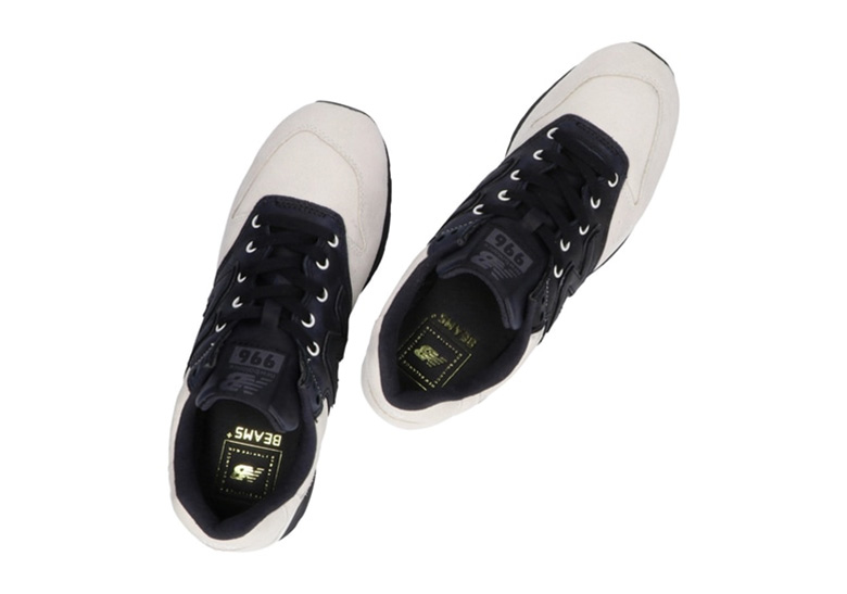
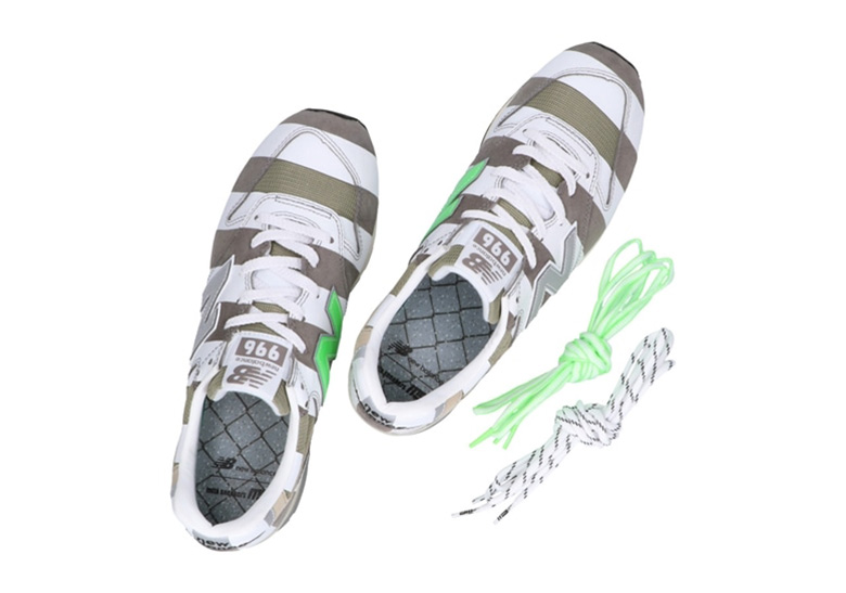
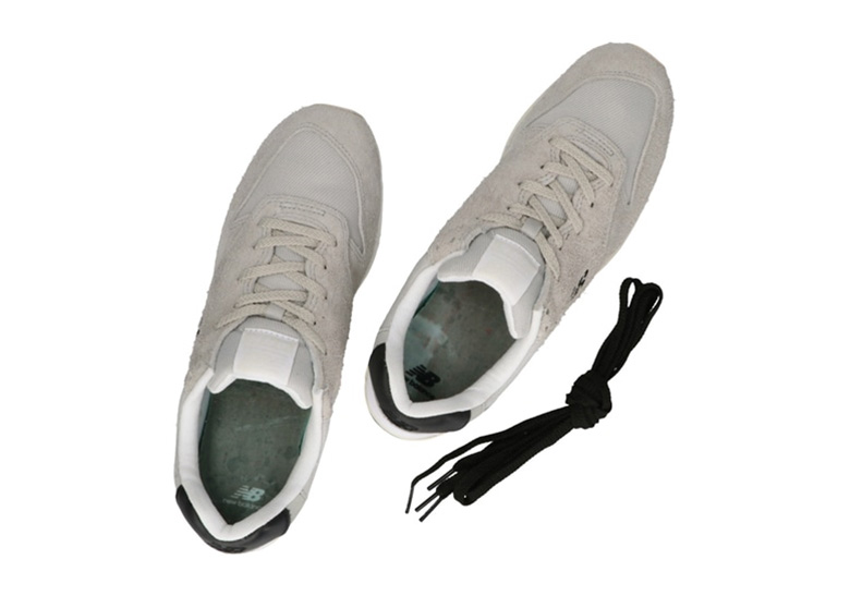
New Balance enlisted the help of several Japanese labels and together they came up with some pretty rad designs. Most notable of all for us is this New Balance 996 kicks from nonnative. For its 996 Collaboration Project, nonnative took a simple approach, reducing the kicks to their bare essentials.
The focus is on materials, not so much the branding. Which is why the shoes swap out the large “N” logo typically found on the 996 in favor of a smaller, subtler “NB” logo. This is a radical choice, but a sublime and very calculated one. The change seems small, sure, but it takes a lot away, including the cruft endemic to New Balance shoes.
There’s also a hairy suede, something you don’t see everyday from a pair of New Balance kicks. The brand added a yellowed sole on top of the suede to make it look like a used sneaker from the ‘80s. We’re not entirely we’re too pleased with this design choice, but it’s something. This variant also has a thicker tongue plus elastic straps, which means you can wear it comfortably even without lacing up.
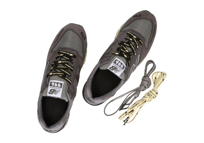
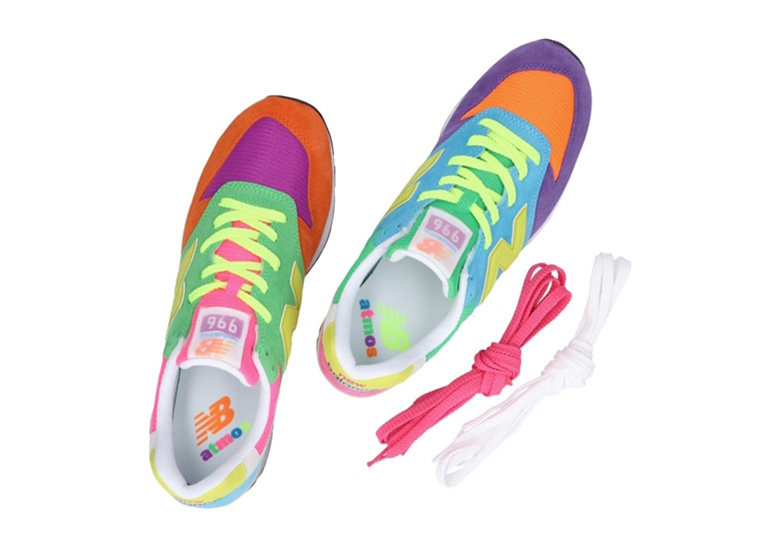
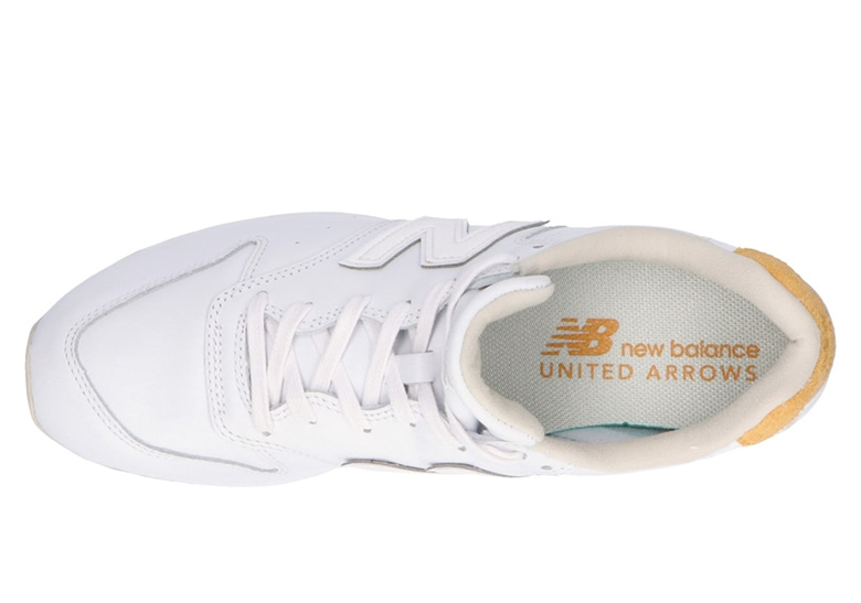
Other brands New Balance collaborated with for this project include United Arrows, N.Hoolywood, Beams+, atmos, and mita. They’re an oddball bunch — some drew inspiration from minimalist design choices while others took more risks. Still, any person will surely find something from this collection to like. But for us, nonnative’s simple, nondescript look reigns supreme. Hit the link below for more information.

Photos courtesy of New Balance

